## Chart: Difference in Entropy Estimates vs. Number of Samples
### Overview
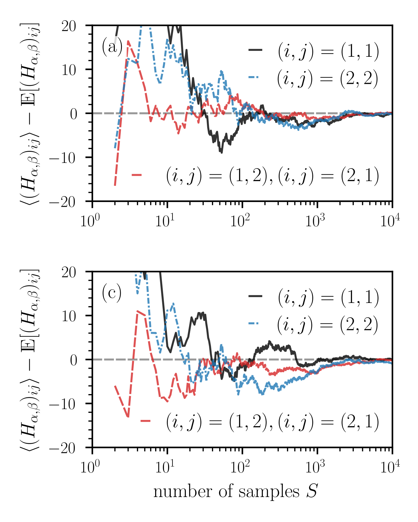
The image presents two line charts (labeled (a) and (c)) displaying the difference between the sample entropy estimate and the expected entropy estimate, denoted as `((Hα,β)ij) - E[(Hα,β)ij]`, plotted against the number of samples, `S`, on a logarithmic scale. Each chart contains four data series, distinguished by line style and color, representing different index pairs (i, j).
### Components/Axes
* **Y-axis:** `((Hα,β)ij) - E[(Hα,β)ij]` ranging from -20 to 20.
* **X-axis:** `number of samples S` on a logarithmic scale, ranging from 10⁰ to 10⁴.
* **Legend:** Located in the top-right corner of each chart.
* `(i, j) = (1, 1)`: Solid black line.
* `(i, j) = (2, 2)`: Dashed blue line.
* `(i, j) = (1, 2), (i, j) = (2, 1)`: Dashed red line.
* **Chart Labels:**
* (a) is positioned in the top-left corner.
* (c) is positioned in the bottom-left corner.
### Detailed Analysis or Content Details
**Chart (a):**
* **(i, j) = (1, 1) (Black Line):** The line starts at approximately 10, decreases to around -5 at S=10, fluctuates between -10 and 10, and then gradually approaches 0 as S increases towards 10⁴. There are significant oscillations between S=10 and S=100.
* **(i, j) = (2, 2) (Blue Dashed Line):** Starts at approximately 5, rapidly decreases to around -15 at S=10, then oscillates between -15 and 5, and approaches 0 as S increases. The initial drop is steeper than the black line.
* **(i, j) = (1, 2), (i, j) = (2, 1) (Red Dashed Line):** Starts at approximately -10, increases to around 10 at S=10, then oscillates between -15 and 10, and approaches 0 as S increases. This line exhibits the most pronounced oscillations.
**Chart (c):**
* **(i, j) = (1, 1) (Black Line):** Starts at approximately 10, decreases to around -5 at S=10, fluctuates between -10 and 5, and then gradually approaches 0 as S increases towards 10⁴. Similar to chart (a), but with slightly different oscillation patterns.
* **(i, j) = (2, 2) (Blue Dashed Line):** Starts at approximately 15, rapidly decreases to around -10 at S=10, then oscillates between -15 and 5, and approaches 0 as S increases. The initial drop is steep.
* **(i, j) = (1, 2), (i, j) = (2, 1) (Red Dashed Line):** Starts at approximately -15, increases to around 5 at S=10, then oscillates between -15 and 10, and approaches 0 as S increases. This line exhibits significant oscillations.
### Key Observations
* All four data series in both charts converge towards 0 as the number of samples (S) increases. This suggests that the difference between the sample entropy estimate and the expected entropy estimate decreases with increasing sample size.
* The initial difference is most pronounced for the (2, 2) index pair (blue dashed line), indicating that this pair requires a larger sample size to achieve a stable entropy estimate.
* The (1, 2) and (2, 1) index pairs (red dashed line) exhibit the most significant oscillations, suggesting that their entropy estimates are more sensitive to sample variations.
* The charts (a) and (c) show similar trends, but with different initial values and oscillation amplitudes.
### Interpretation
The charts demonstrate the convergence of entropy estimates as the number of samples increases. The difference between the sample estimate and the expected value represents the error in the estimation. As S grows, this error diminishes, indicating that the sample entropy estimate becomes a more reliable approximation of the true entropy.
The varying convergence rates for different index pairs (i, j) suggest that the complexity of the underlying system or the relationship between the variables represented by i and j influences the required sample size for accurate entropy estimation. The (2,2) pair appears to be more sensitive to sample size, requiring more data to stabilize. The oscillations in the (1,2) and (2,1) pairs suggest a more complex relationship or higher variability in the data associated with those indices.
The fact that all lines converge to zero implies that, given enough data, the entropy estimates will become consistent and accurate, regardless of the initial index pair. The differences between the charts (a) and (c) could be due to different underlying data sets or experimental conditions. Further investigation would be needed to determine the specific reasons for these variations.