## Line Chart: Convergence of Estimator Deviations
### Overview
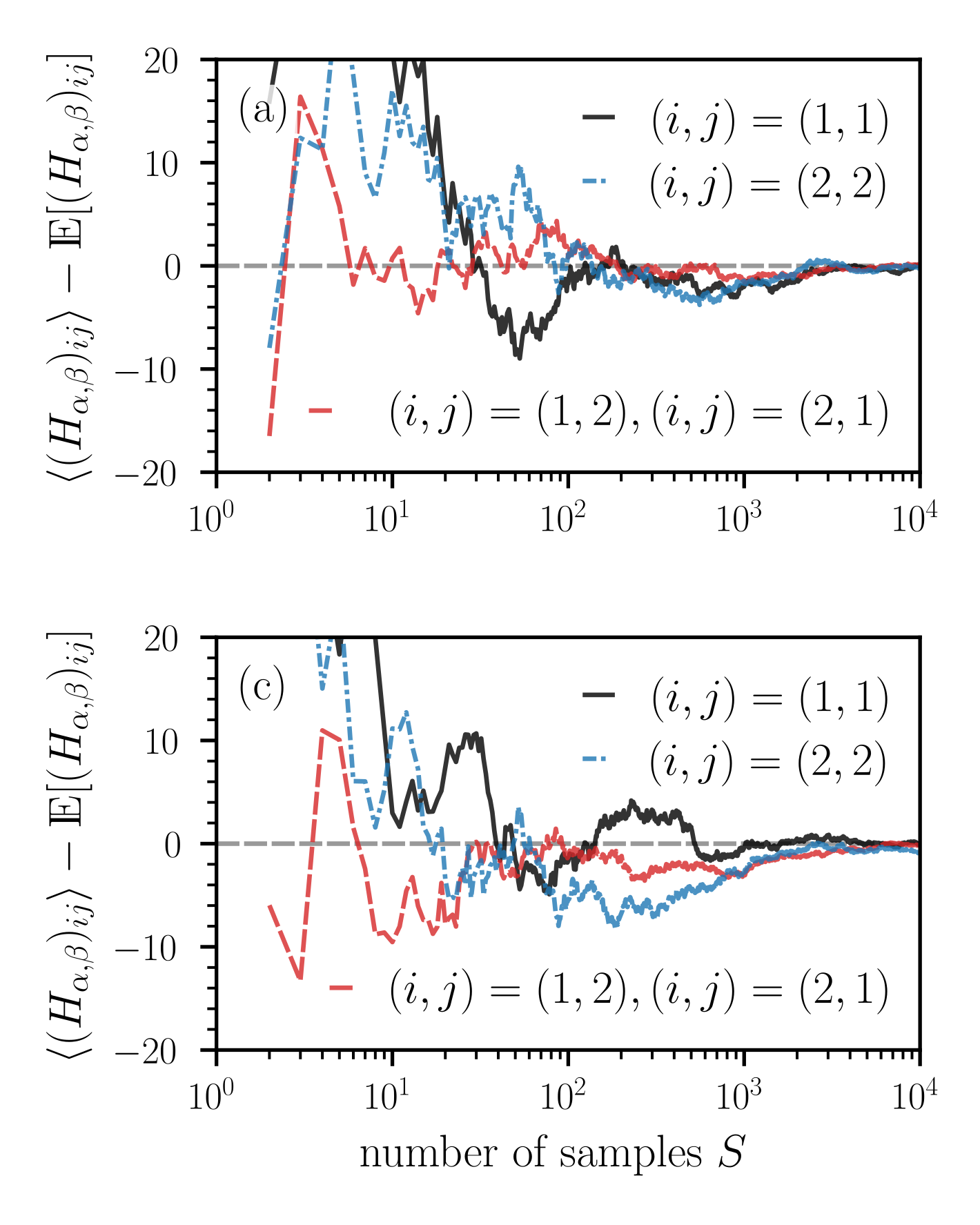
The image contains two vertically stacked line charts, labeled (a) and (c), displaying the deviation of an estimated quantity from its expected value as a function of the number of samples. Both charts share identical axes, scales, and legend structures. The data shows how the difference between an average value and its expectation converges toward zero as the sample size increases.
### Components/Axes
* **Chart Labels:** The top chart is labeled "(a)" in its top-left corner. The bottom chart is labeled "(c)" in its top-left corner.
* **X-Axis (Both Charts):**
* **Title:** `number of samples S`
* **Scale:** Logarithmic (base 10).
* **Range:** From `10^0` (1) to `10^4` (10,000).
* **Major Ticks:** At `10^0`, `10^1`, `10^2`, `10^3`, `10^4`.
* **Y-Axis (Both Charts):**
* **Title:** `⟨(H_{α,β})_{ij}⟩ - 𝔼[(H_{α,β})_{ij}]`
* This represents the sample average (⟨...⟩) of a quantity `(H_{α,β})_{ij}` minus its expected value (𝔼[...]).
* **Scale:** Linear.
* **Range:** From -20 to +20.
* **Major Ticks:** At -20, -10, 0, 10, 20.
* **Reference Line:** A dashed gray horizontal line is drawn at y=0.
* **Legend (Both Charts, positioned in the top-right quadrant):**
* **Solid Black Line:** `(i, j) = (1, 1)`
* **Dashed Blue Line:** `(i, j) = (2, 2)`
* **Dashed Red Line:** `(i, j) = (1, 2), (i, j) = (2, 1)` (This single red line represents two symmetric index pairs).
### Detailed Analysis
**Chart (a):**
* **Trend for (1,1) [Black Line]:** Starts at a high positive value (>20) for S=1. Shows large, erratic fluctuations between approximately S=2 and S=100, with values ranging from ~+20 down to ~-10. After S≈100, the fluctuations dampen significantly, and the line converges tightly to the y=0 axis by S=10^4.
* **Trend for (2,2) [Blue Dashed Line]:** Also starts high (>20). Exhibits sharp oscillations, notably a deep dip to ~-10 around S=3-4, followed by a peak near +20 around S=5-6. Like the black line, its volatility decreases after S≈100, and it converges to zero.
* **Trend for (1,2)/(2,1) [Red Dashed Line]:** Begins at a large negative value (~-18) for S=2. Rises sharply to a peak near +15 around S=4, then oscillates with decreasing amplitude. It crosses the zero line multiple times before stabilizing near zero for S > 1000.
**Chart (c):**
* **Trend for (1,1) [Black Line]:** Starts high (>20). Shows a distinct pattern of oscillation with a notable dip to ~-5 around S=20-30, followed by a rise and then a gradual convergence to zero. The convergence appears slightly noisier than in chart (a) for S between 100 and 1000.
* **Trend for (2,2) [Blue Dashed Line]:** Starts high, dips sharply to ~-10 around S=3, then oscillates. It shows a prolonged period of negative values between S≈100 and S≈1000 before finally converging to zero.
* **Trend for (1,2)/(2,1) [Red Dashed Line]:** Starts negative (~-6 at S=2), dips further to ~-13 around S=3, then rises to a peak near +10 around S=5. It oscillates and spends significant time in negative territory between S=10 and S=100 before converging.
### Key Observations
1. **Universal Convergence:** All data series in both plots converge to the y=0 line as the number of samples `S` increases towards 10^4. This indicates the estimator is consistent.
2. **High Initial Volatility:** The most dramatic fluctuations occur for small sample sizes (S < 100). The deviations can be large in both positive and negative directions.
3. **Series-Specific Behavior:** While all converge, the path to convergence differs. The off-diagonal terms (red line) often start negative, while the diagonal terms (black, blue) start positive. The blue line (2,2) in chart (c) shows a distinct, sustained negative deviation in the mid-range of S.
4. **Plot Similarity:** Charts (a) and (c) are qualitatively similar but not identical. The specific trajectories and the timing/magnitude of peaks and troughs differ, suggesting they may represent results from different experimental conditions, parameters, or datasets.
### Interpretation
This visualization demonstrates the **law of large numbers** in action for a specific statistical estimator `H`. The y-axis shows the *error* of the sample mean as an estimator of the true expected value.
* **What the data suggests:** The estimator is unbiased (converges to the correct expectation) but exhibits high variance for small sample sizes. The initial large swings indicate that estimates based on few samples are unreliable and can be significantly above or below the true value.
* **How elements relate:** The x-axis (sample size) is the independent variable controlling the precision of the estimate. The y-axis is the measure of error. The different colored lines track this error for different components (`ij` indices) of the quantity being estimated. The convergence of all lines to zero confirms that with enough data, the error for all components diminishes.
* **Notable patterns/anomalies:** The fact that the red line (off-diagonal terms) often starts negative while diagonal terms start positive could indicate a systematic bias in the estimator for small samples that affects different matrix elements differently. The sustained negative deviation of the blue line in chart (c) is an anomaly worth investigating—it suggests that for that specific condition, the estimator for the (2,2) element consistently underestimates the true value over a wide range of moderate sample sizes before correcting. The difference between plots (a) and (c) implies that the convergence behavior is sensitive to some underlying parameter not shown on the axes.