## Sankey Diagram: Clue Topics vs. Inference Topics
### Overview
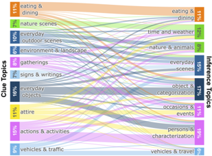
This image is a Sankey diagram illustrating the flow and distribution of data between two sets of categories: "Clue Topics" on the left and "Inference Topics" on the right. The diagram visualizes how specific visual clues (input data) are mapped to various inferred topics (output data). The width of the connecting bands represents the volume or proportion of the data flowing from a specific Clue Topic to an Inference Topic.
### Components/Axes
* **Left Axis (Clue Topics):** Contains 10 distinct categories, each with a percentage value representing its share of the total clues.
* **Right Axis (Inference Topics):** Contains 8 distinct categories, each with a percentage value representing its share of the total inferences.
* **Flows:** Colored bands connect the left categories to the right. The color of the band typically originates from the color of the Clue Topic on the left.
* **Orientation:** The diagram is read from left to right.
### Detailed Analysis
#### Clue Topics (Left Side)
The categories are listed from top to bottom with their associated percentages:
1. **Eating & dining (11%)**: Orange
2. **Nature scenes (7%)**: Light Green
3. **Everyday outdoor scenes (10%)**: Blue
4. **Environment & landscape (6%)**: Dark Blue
5. **Gatherings (8%)**: Pink
6. **Signs & writings (7%)**: Light Blue
7. **Everyday objects (16%)**: Dark Grey
8. **Attire (11%)**: Yellow
9. **Actions & activities (15%)**: Purple
10. **Vehicles & traffic (9%)**: Light Blue/Grey
#### Inference Topics (Right Side)
The categories are listed from top to bottom with their associated percentages:
1. **Eating & dining (11%)**: Orange
2. **Time and weather (12%)**: Light Green
3. **Nature & animals (8%)**: Light Pink/Red
4. **Everyday scenes (15%)**: Blue
5. **Object & categorization (17%)**: Dark Grey
6. **Occasions & events (11%)**: Purple
7. **Persons & characterization (19%)**: Bright Pink
8. **Vehicles & travel (6%)**: Light Blue
#### Flow Analysis (Mapping Clues to Inferences)
* **Eating & dining (11%)**: Almost exclusively flows to the "eating & dining" inference category.
* **Nature scenes (7%)**: Primarily flows to "time and weather" and "nature & animals," with a smaller portion to "everyday scenes."
* **Everyday outdoor scenes (10%)**: Splits significantly between "time and weather," "everyday scenes," and "vehicles & travel."
* **Environment & landscape (6%)**: Flows primarily to "time and weather" and "everyday scenes."
* **Gatherings (8%)**: A major contributor to "occasions & events" and "persons & characterization," with a smaller flow to "everyday scenes."
* **Signs & writings (7%)**: Distributes across "everyday scenes," "object & categorization," and "vehicles & travel."
* **Everyday objects (16%)**: The largest Clue category. It flows heavily into "object & categorization," with significant secondary flows to "everyday scenes" and "persons & characterization."
* **Attire (11%)**: Flows primarily to "persons & characterization" and "occasions & events," with a smaller flow to "everyday scenes."
* **Actions & activities (15%)**: A major contributor to "persons & characterization," "occasions & events," and "everyday scenes."
* **Vehicles & traffic (9%)**: Flows primarily to "vehicles & travel," with a secondary flow to "everyday scenes."
### Key Observations
* **Central Hub:** "Everyday scenes" (15% on the right) acts as a central sink, receiving significant flows from almost every Clue Topic on the left.
* **Dominant Categories:** "Everyday objects" (16%) is the most prominent Clue Topic, while "Persons & characterization" (19%) is the most prominent Inference Topic.
* **High Dispersion:** Most Clue Topics do not map to a single Inference Topic. For example, "Actions & activities" and "Attire" are distributed across multiple inference categories, suggesting that these visual clues are ambiguous or context-dependent.
* **High Specificity:** "Eating & dining" is the most specific category, showing a very high correlation between the clue and the inference.
### Interpretation
This diagram likely represents the internal logic of a computer vision or machine learning model (such as an image captioning or visual question-answering system).
* **Data Mapping:** It demonstrates how the model translates raw visual features ("Clue Topics") into semantic labels ("Inference Topics").
* **Model Ambiguity:** The "many-to-many" nature of the flows suggests that the model encounters ambiguity. For instance, seeing "Attire" (a clue) could lead the model to infer "Persons & characterization" (the person wearing it) or "Occasions & events" (the context of the attire).
* **Categorization Strategy:** The presence of "Everyday scenes" as a major sink suggests it serves as a "catch-all" category for the model when visual clues are present but do not strongly map to more specific categories like "Nature" or "Vehicles."
* **Investigative Insight:** The data suggests that "Persons & characterization" is the most complex inference to make, as it draws from a wide variety of clues including "Gatherings," "Everyday objects," "Attire," and "Actions & activities."