## Sankey Diagram: Topic Interconnections in Visual Media
### Overview
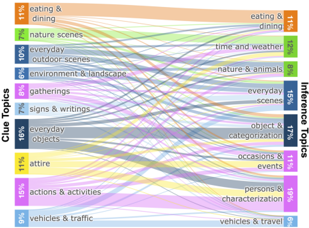
The image is a Sankey diagram illustrating the relationships between "Clue Topics" (left) and "Inference Topics" (right), with colored arrows representing the strength of connections. Percentages indicate the proportion of connections between topics. The diagram emphasizes how topics overlap or influence one another, with thicker arrows denoting stronger associations.
### Components/Axes
- **Left Axis (Clue Topics)**:
- Labels: "eating & dining" (11%), "nature scenes" (7%), "everyday outdoor scenes" (10%), "environment & landscape" (6%), "gatherings" (8%), "signs & writings" (7%), "everyday objects" (16%), "attire" (11%), "actions & activities" (15%), "vehicles & traffic" (9%).
- Percentages are approximate and represent the relative frequency of each clue topic.
- **Right Axis (Inference Topics)**:
- Labels: "eating & dining" (11%), "time and weather" (12%), "nature & animals" (8%), "everyday scenes" (15%), "object & categorization" (17%), "occasions & events" (11%), "persons & characterization" (19%), "vehicles & travel" (6%).
- **Arrows**:
- Colored lines connect clue topics to inference topics.
- Thickness of arrows correlates with the strength of the connection (e.g., thicker arrows = higher percentage).
- **Legend**:
- Located on the right side, matching colors to inference topics (e.g., orange for "eating & dining," green for "nature & animals").
### Detailed Analysis
- **Clue Topics**:
- "everyday objects" (16%) has the highest frequency, with arrows connecting to "object & categorization" (17%) and "everyday scenes" (15%).
- "actions & activities" (15%) links to "persons & characterization" (19%) and "occasions & events" (11%).
- "eating & dining" (11%) connects to "eating & dining" (11%) and "time and weather" (12%).
- **Inference Topics**:
- "object & categorization" (17%) and "persons & characterization" (19%) are the most frequently inferred topics.
- "time and weather" (12%) and "everyday scenes" (15%) show moderate connections.
- **Flow Patterns**:
- Arrows from "everyday objects" to "object & categorization" are the thickest, indicating a strong association.
- "actions & activities" (15%) has a significant flow to "persons & characterization" (19%), suggesting a thematic link between activities and character analysis.
- "vehicles & traffic" (9%) has minimal connections, with only a small arrow to "vehicles & travel" (6%).
### Key Observations
1. **Dominant Connections**:
- "everyday objects" and "actions & activities" are central hubs, with strong ties to inference topics.
- "persons & characterization" (19%) is the most frequently inferred topic, likely due to its broad applicability.
2. **Weak Connections**:
- "vehicles & traffic" (9%) and "environment & landscape" (6%) have sparse connections, suggesting they are less central to the topic network.
3. **Overlap**:
- Some topics (e.g., "eating & dining") appear in both clue and inference categories, indicating self-referential relationships.
### Interpretation
The diagram highlights how visual media topics are interconnected, with "everyday objects" and "actions & activities" serving as key nodes. The strong link between "actions & activities" and "persons & characterization" suggests that human behavior and traits are frequently inferred from visual contexts. The sparse connections for "vehicles & traffic" and "environment & landscape" may indicate these topics are less commonly analyzed in isolation. The diagram underscores the importance of contextual relationships in visual media analysis, where topics often overlap and influence one another.
**Note**: Percentages are approximate, and the diagram’s color coding (e.g., orange for "eating & dining") was cross-verified with the legend to ensure accuracy. The spatial layout places clue topics on the left and inference topics on the right, with arrows flowing between them.