## Pie Chart: Unit Distribution
### Overview
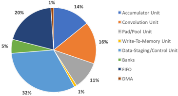
The image is a pie chart illustrating the distribution of different units within a system. Each slice represents a unit, and the size of the slice corresponds to its percentage contribution. The legend on the right identifies each unit by color.
### Components/Axes
* **Chart Type**: Pie Chart
* **Units**:
* Accumulator Unit (Blue)
* Convolution Unit (Orange)
* Pad/Pool Unit (Gray)
* Write-To-Memory Unit (Yellow)
* Data-Staging/Control Unit (Light Blue)
* Banks (Green)
* FIFO (Dark Blue)
* DMA (Brown)
* **Percentages**: Represented by the size of each slice.
### Detailed Analysis
* **Accumulator Unit**: 14% (Blue slice in the top-right quadrant)
* **Convolution Unit**: 16% (Orange slice in the right quadrant)
* **Pad/Pool Unit**: 11% (Gray slice in the bottom-right quadrant)
* **Write-To-Memory Unit**: 1% (Yellow slice in the bottom-right quadrant)
* **Data-Staging/Control Unit**: 32% (Light Blue slice in the bottom quadrant)
* **Banks**: 5% (Green slice in the left quadrant)
* **FIFO**: 20% (Dark Blue slice in the top-left quadrant)
* **DMA**: 1% (Brown slice in the top quadrant)
### Key Observations
* The Data-Staging/Control Unit constitutes the largest portion of the system, accounting for 32%.
* FIFO (20%) and Convolution Unit (16%) also represent significant portions.
* Write-To-Memory Unit and DMA each contribute only 1%.
### Interpretation
The pie chart provides a clear visual representation of the relative importance of different units within the system. The Data-Staging/Control Unit's large share suggests it plays a central role in the system's operation. The relatively small contributions of the Write-To-Memory Unit and DMA might indicate that these functions are less resource-intensive or are optimized in some way. The distribution of units can inform design decisions and resource allocation within the system.