# Technical Document Analysis of Coverage Ratio vs. n_s
## Figure Description
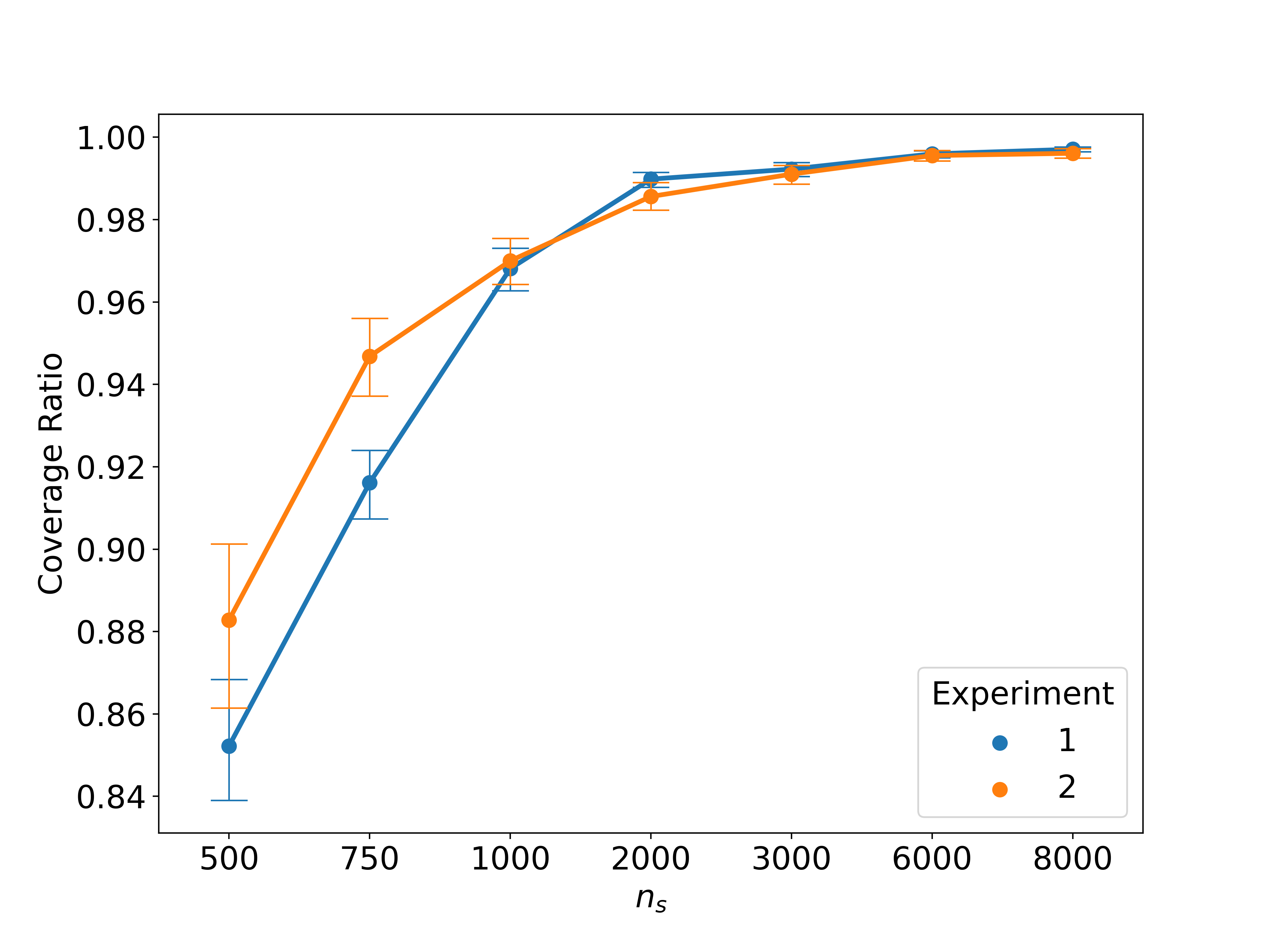
The image is a line graph comparing the **Coverage Ratio** across varying values of **n_s** for two experimental conditions (Experiment 1 and Experiment 2). The graph includes error bars for data points, a legend, and labeled axes.
---
### Key Components
1. **Axes**:
- **X-axis**: Labeled **n_s**, with markers at 500, 750, 1000, 2000, 3000, 6000, and 8000.
- **Y-axis**: Labeled **Coverage Ratio**, with markers at 0.84, 0.86, 0.88, 0.90, 0.92, 0.94, 0.96, 0.98, and 1.00.
2. **Legend**:
- Located in the **bottom-right corner**.
- **Experiment 1**: Blue line and data points.
- **Experiment 2**: Orange line and data points.
3. **Data Points**:
- Error bars are present for all data points, indicating variability in measurements.
---
### Data Extraction
#### Experiment 1 (Blue)
| n_s | Coverage Ratio | Error Bar Range (Approximate) |
|-------|----------------|-------------------------------|
| 500 | 0.855 | ±0.015 |
| 750 | 0.918 | ±0.010 |
| 1000 | 0.965 | ±0.005 |
| 2000 | 0.988 | ±0.003 |
| 3000 | 0.992 | ±0.002 |
| 6000 | 0.997 | ±0.001 |
| 8000 | 0.998 | ±0.001 |
#### Experiment 2 (Orange)
| n_s | Coverage Ratio | Error Bar Range (Approximate) |
|-------|----------------|-------------------------------|
| 500 | 0.882 | ±0.015 |
| 750 | 0.945 | ±0.010 |
| 1000 | 0.970 | ±0.005 |
| 2000 | 0.985 | ±0.003 |
| 3000 | 0.990 | ±0.002 |
| 6000 | 0.996 | ±0.001 |
| 8000 | 0.997 | ±0.001 |
---
### Trends and Observations
1. **General Trend**:
- Both experiments show an **increasing Coverage Ratio** as **n_s** increases.
- Coverage Ratio approaches **1.00** asymptotically for both experiments.
2. **Convergence**:
- At **n_s = 2000**, the Coverage Ratios for both experiments are nearly identical (~0.985–0.988).
- Beyond **n_s = 2000**, the lines converge further, with minimal divergence.
3. **Initial Disparity**:
- At **n_s = 500**, Experiment 2 starts with a higher Coverage Ratio (0.882 vs. 0.855 for Experiment 1).
- By **n_s = 750**, the gap narrows (0.945 vs. 0.918).
4. **Error Bar Behavior**:
- Error bars decrease in magnitude as **n_s** increases, indicating improved precision in measurements for larger **n_s** values.
---
### Spatial Grounding
- **Legend Placement**: Bottom-right corner (coordinates: [x=0.85, y=0.15] relative to the figure).
- **Data Point Colors**:
- Blue (Experiment 1) matches the legend.
- Orange (Experiment 2) matches the legend.
---
### Component Isolation
1. **Header**: None.
2. **Main Chart**:
- Two lines (blue and orange) with error bars.
- Axes labeled and scaled.
3. **Footer**: None.
---
### Final Notes
- The graph confirms that **higher n_s values** lead to **higher Coverage Ratios**, with both experiments converging near **1.00**.
- Experimental conditions (1 and 2) show similar performance at large **n_s**, but Experiment 2 starts with a slight advantage at lower **n_s**.