# Technical Data Extraction: Coverage Ratio vs. $n_s$
## 1. Image Overview
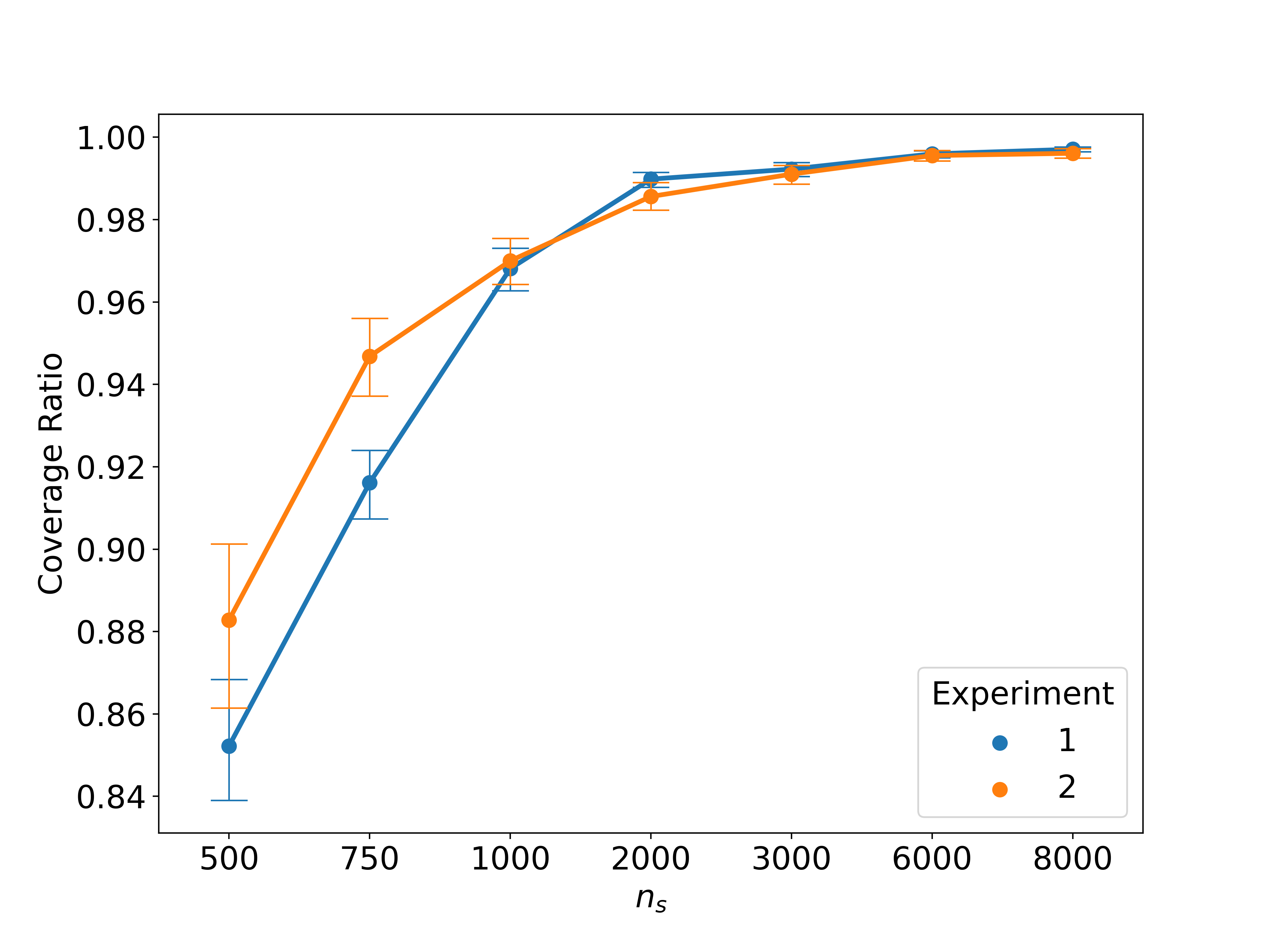
This image is a line graph with error bars comparing two experimental datasets. It illustrates the relationship between a sample size or parameter denoted as $n_s$ and a "Coverage Ratio."
## 2. Component Isolation
### Header/Title
* No explicit title is present within the image frame.
### Main Chart Area
* **X-Axis Label:** $n_s$
* **X-Axis Markers (Categorical/Log-spaced):** 500, 750, 1000, 2000, 3000, 6000, 8000. Note: The spacing on the x-axis is not linear; it appears to be treated as categorical or semi-logarithmic.
* **Y-Axis Label:** Coverage Ratio
* **Y-Axis Markers:** 0.84, 0.86, 0.88, 0.90, 0.92, 0.94, 0.96, 0.98, 1.00.
### Legend
* **Location:** Bottom right [approximate coordinates: x=0.85, y=0.20].
* **Title:** Experiment
* **Series 1:** Blue circle ($\bullet$) - Experiment 1
* **Series 2:** Orange circle ($\bullet$) - Experiment 2
---
## 3. Trend Verification and Data Extraction
### Trend Analysis
* **Experiment 1 (Blue):** Shows a steep upward slope from $n_s = 500$ to $n_s = 2000$, after which the growth rate decelerates significantly, approaching an asymptote near 1.00.
* **Experiment 2 (Orange):** Starts at a higher coverage ratio than Experiment 1 at $n_s = 500$. It follows a similar upward trajectory but with a less steep initial slope. It is surpassed by Experiment 1 at $n_s = 2000$, then converges toward the same asymptote near 1.00.
### Data Table (Estimated Values)
Values are extracted based on visual alignment with axis markers. Error bars indicate standard deviation or confidence intervals.
| $n_s$ (X-axis) | Experiment 1 (Blue) | Experiment 2 (Orange) |
| :--- | :--- | :--- |
| **500** | ~0.852 | ~0.883 |
| **750** | ~0.916 | ~0.947 |
| **1000** | ~0.969 | ~0.970 |
| **2000** | ~0.990 | ~0.986 |
| **3000** | ~0.992 | ~0.991 |
| **6000** | ~0.996 | ~0.995 |
| **8000** | ~0.997 | ~0.996 |
---
## 4. Detailed Observations
* **Crossover Point:** A significant crossover occurs between $n_s = 1000$ and $n_s = 2000$. At $n_s = 1000$, the two experiments are nearly identical. By $n_s = 2000$, Experiment 1 (Blue) achieves a higher coverage ratio than Experiment 2 (Orange).
* **Error Bars:**
* Experiment 1 (Blue) has larger error bars at lower $n_s$ values (500, 750), suggesting higher variance in results for smaller sample sizes.
* Experiment 2 (Orange) has relatively consistent error bar sizes until $n_s = 2000$.
* For both series, error bars become extremely small as $n_s$ reaches 6000 and 8000, indicating high precision and convergence as the coverage ratio nears 1.00.
* **Saturation:** Both experiments show "saturation" behavior, where increasing $n_s$ beyond 3000 yields diminishing returns in the Coverage Ratio, as both are already >0.99.