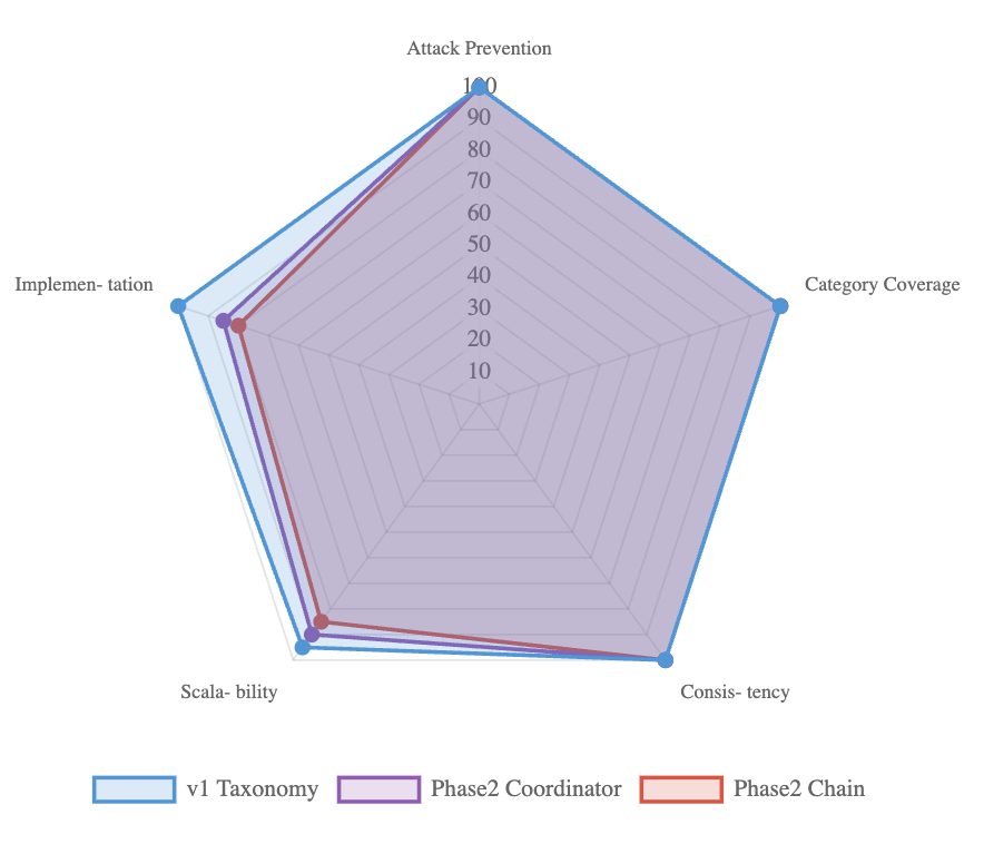
## Radar Chart: System Performance Comparison (v1 Taxonomy, Phase2 Coordinator, Phase2 Chain)
### Overview
This is a **radar (spider) chart** comparing three systems—*v1 Taxonomy* (blue), *Phase2 Coordinator* (purple), and *Phase2 Chain* (red)—across five performance metrics: *Attack Prevention*, *Category Coverage*, *Consistency*, *Scalability*, and *Implementation*. The chart uses a pentagonal grid with a 0–100 scale (10-point increments) on each radial axis.
### Components/Axes
- **Radial Axes (Metrics)**: 5 axes, each labeled with a performance metric:
- Top: *Attack Prevention*
- Right: *Category Coverage*
- Bottom-right: *Consistency*
- Bottom-left: *Scalability*
- Left: *Implementation*
- **Scale**: Each axis ranges from 0 (center) to 100 (outer edge), marked in 10-point increments (10, 20, ..., 100).
- **Legend**: Located at the bottom, with three entries:
- Blue outline: *v1 Taxonomy*
- Purple outline: *Phase2 Coordinator*
- Red outline: *Phase2 Chain*
- **Data Series**: Each system is represented by a polygon connecting colored markers (blue, purple, red) on each axis.
### Detailed Analysis
We extract approximate values (with visual uncertainty) for each system across all metrics, cross-referencing legend colors and axis positions:
| Metric | v1 Taxonomy (Blue) | Phase2 Coordinator (Purple) | Phase2 Chain (Red) |
|---------------------|--------------------|-----------------------------|--------------------|
| Attack Prevention | ~100 (outermost) | ~95 (slightly inside blue) | ~90 (inside purple)|
| Category Coverage | ~100 (outermost) | ~95 (slightly inside blue) | ~90 (inside purple)|
| Consistency | ~100 (outermost) | ~95 (slightly inside blue) | ~90 (inside purple)|
| Scalability | ~95 (near outer) | ~90 (inside blue) | ~85 (inside purple)|
| Implementation | ~95 (near outer) | ~90 (inside blue) | ~85 (inside purple)|
### Key Observations
1. **Consistent Performance**: All three systems score above 85 across all metrics, indicating strong overall performance.
2. **v1 Taxonomy Dominance**: *v1 Taxonomy* consistently scores the highest (near 100) on *Attack Prevention*, *Category Coverage*, and *Consistency*, and slightly lower (but still high) on *Scalability* and *Implementation*.
3. **Phase2 Coordinator vs. Chain**: *Phase2 Coordinator* outperforms *Phase2 Chain* across all metrics, with a small but consistent gap (≈5 points on most axes).
4. **Metric Similarity**: *Attack Prevention*, *Category Coverage*, and *Consistency* have nearly identical score distributions for all systems, suggesting these metrics are closely related or the systems perform similarly in these areas.
### Interpretation
- **Performance Hierarchy**: *v1 Taxonomy* is the top-performing system, likely reflecting maturity or robust design. *Phase2 Coordinator* is a strong second, with *Phase2 Chain* trailing slightly.
- **Metric Relationships**: High scores on *Attack Prevention*, *Category Coverage*, and *Consistency* suggest these are core strengths (e.g., security, comprehensive coverage). *Scalability* and *Implementation* show a slight drop, possibly indicating trade-offs (e.g., complexity vs. ease of use).
- **Design Implications**: The consistent gap between *Phase2 Coordinator* and *Phase2 Chain* suggests the Coordinator component (or its design) is more effective. This could guide future development (e.g., prioritizing Coordinator-like features).
- **Stability**: No outliers exist; all data points follow a consistent pattern, indicating stable performance across metrics for each system.
This chart provides a clear visual comparison of system performance, highlighting strengths, trade-offs, and design implications for the three systems.