\n
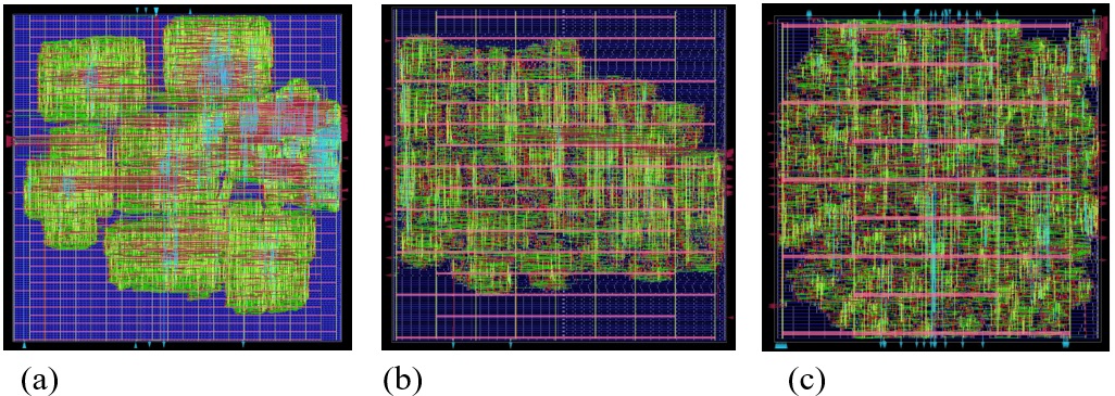
## Heatmap: Microstructure Visualization
### Overview
The image presents three heatmaps (labeled a, b, and c) visualizing a microstructure. Each heatmap displays a grid-like structure with color variations representing different properties or concentrations within the material. The heatmaps appear to represent the same area, but with differing levels of granularity or processing. There are no explicit axis labels or legends provided within the images themselves.
### Components/Axes
The images consist of a grid overlayed with colored regions. The grid appears to be uniform across all three images. The color scheme appears to be consistent across all three images, with shades of green, red, and pink/purple. There are no visible axis titles or scales. The images are labeled (a), (b), and (c) at the bottom-left corner.
### Detailed Analysis or Content Details
Due to the lack of a legend, precise quantification of the color values is impossible. However, we can describe the distribution of colors within each heatmap:
* **(a):** This heatmap shows large, clustered regions of color. Predominantly, there are large areas of orange/red, interspersed with green and pink/purple. The red regions are more concentrated and form distinct, blocky shapes. The green and pink/purple are more dispersed within and around the red regions.
* **(b):** This heatmap exhibits a more refined structure compared to (a). The red regions are smaller and more fragmented, with a greater proportion of green and pink/purple. The overall distribution appears more uniform, with less distinct clustering.
* **(c):** This heatmap displays the highest level of granularity. The red regions are even more fragmented and dispersed, with a significant increase in green and pink/purple. The structure appears almost entirely composed of a fine network of colored regions.
The grid lines are visible in all three images, providing a reference for spatial distribution. The grid appears to be approximately 20x20.
### Key Observations
The primary trend observed is a decrease in the size and concentration of red regions from (a) to (c), accompanied by an increase in the proportion of green and pink/purple. This suggests a process of refinement or dispersion occurring across the three stages represented by the heatmaps. The images suggest a transition from a coarse, clustered microstructure (a) to a fine, dispersed microstructure (c).
### Interpretation
The heatmaps likely represent a process of material transformation, such as diffusion, phase separation, or etching. The red color could represent a specific element or phase, while green and pink/purple represent other components or the matrix material.
* **(a)** could represent the initial state of the material, with large concentrations of the red component.
* **(b)** could represent an intermediate stage, where the red component begins to diffuse or break down.
* **(c)** could represent the final state, where the red component is evenly dispersed throughout the material.
The increasing granularity from (a) to (c) suggests that the process is leading to a more homogeneous microstructure. Without a legend, it is impossible to determine the exact nature of the process or the meaning of the colors. However, the visual trend clearly indicates a change in the material's microstructure over time or under different conditions. The images are descriptive and do not provide quantitative data.