## Heatmap/Grid Diagram: Colored Line Distribution Analysis
### Overview
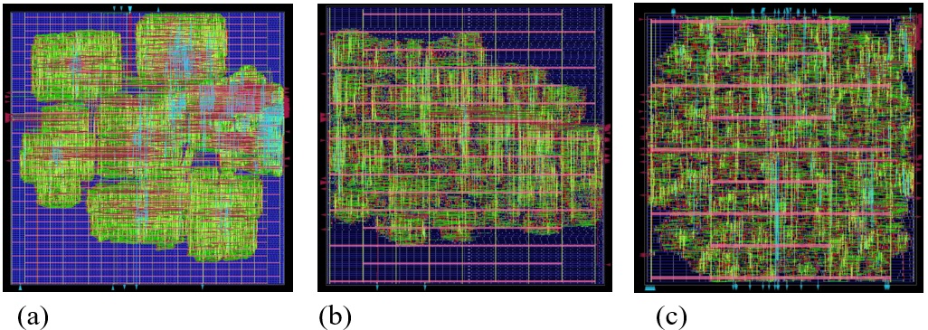
The image presents three side-by-side grid-based visualizations (a, b, c) depicting colored line distributions across a structured matrix. Each panel uses a dark blue background with white grid lines, overlaid with green, red, and blue lines of varying density and orientation. The visualizations appear to represent spatial or network data with color-coded categories.
### Components/Axes
- **Grid Structure**:
- All panels feature a 2D grid with white lines on a dark blue background.
- Grid density varies slightly between panels but maintains consistent alignment.
- **Color Legend**:
- Located in the top-left corner of each panel (spatial grounding: top-left).
- Colors correspond to categories:
- **Green**: Primary data points (highest density in panel a).
- **Red**: Secondary data points (dominant in panels b and c).
- **Blue**: Tertiary data points (sparse across all panels).
- **Line Orientation**:
- Panel (a): Predominantly horizontal/vertical lines with clustered groupings.
- Panel (b): Horizontal red lines dominate, with green lines forming irregular clusters.
- Panel (c): Vertical red lines dominate, with green lines forming fragmented patterns.
### Detailed Analysis
- **Panel (a)**:
- Green lines form dense, irregular clusters (≈60% of grid area).
- Red lines appear as sparse, isolated segments (≈20%).
- Blue lines are minimal (≈5%).
- **Panel (b)**:
- Horizontal red lines span ≈70% of the grid, creating uniform bands.
- Green lines form smaller clusters (≈25%) between red bands.
- Blue lines remain sparse (≈5%).
- **Panel (c)**:
- Vertical red lines dominate (≈80% of grid height).
- Green lines form fragmented, non-continuous segments (≈15%).
- Blue lines are nearly absent (≈0.5%).
### Key Observations
1. **Color Consistency**: Red lines shift from sparse (panel a) to dominant (panels b/c), suggesting a progression or variable emphasis.
2. **Line Density**: Green line density decreases from panel (a) to (c), while red line orientation shifts from horizontal to vertical.
3. **Grid Segmentation**: Panel (c) shows increased fragmentation, with red lines creating isolated vertical zones.
### Interpretation
The visualizations likely represent sequential data layers or comparative analyses:
- **Panel (a)**: Baseline state with clustered primary (green) data.
- **Panel (b)**: Introduction of a secondary metric (red) that dominates horizontally, potentially indicating a new constraint or variable.
- **Panel (c)**: Further evolution where red lines become vertical, suggesting a structural shift (e.g., time-based progression or axis inversion).
The absence of explicit labels necessitates inference: green may represent "active nodes," red "constraints," and blue "outliers." The progression from clustered to segmented patterns could model network evolution, resource allocation changes, or spatial-temporal dynamics. Outliers (blue lines) remain consistently rare, implying stable secondary metrics across iterations.