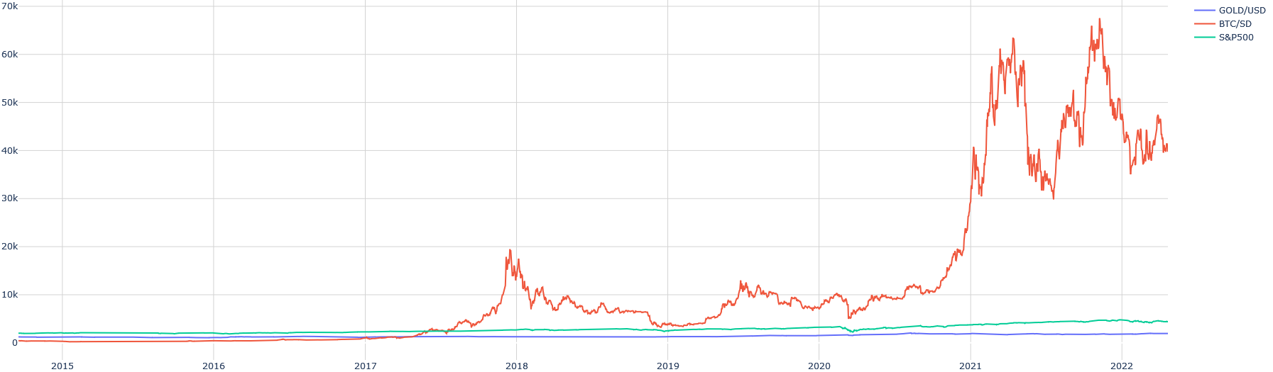
## Multi-Line Time Series Chart: Comparative Asset Performance (2015-2022)
### Overview
The image is a line chart comparing the price performance of three financial assets—Gold (GOLD/USD), Bitcoin (BTC/USD), and the S&P 500 index (S&P500)—over a period from approximately the start of 2015 to the start of 2022. The chart uses a linear scale on the Y-axis (price in USD) and a time scale on the X-axis.
### Components/Axes
* **X-Axis (Horizontal):** Time. Major tick marks and labels are present for the years: `2015`, `2016`, `2017`, `2018`, `2019`, `2020`, `2021`, `2022`. The axis spans from just before 2015 to just after the start of 2022.
* **Y-Axis (Vertical):** Price in US Dollars (USD). The scale is linear, with major grid lines and labels at: `0`, `10k`, `20k`, `30k`, `40k`, `50k`, `60k`, `70k`. The "k" denotes thousands.
* **Legend:** Located in the top-right corner of the chart area. It contains three entries:
1. **GOLD/USD** - Represented by a **blue** line.
2. **BTC/USD** - Represented by a **red/orange** line.
3. **S&P500** - Represented by a **green/teal** line.
### Detailed Analysis
**1. GOLD/USD (Blue Line)**
* **Trend:** The line is relatively flat and stable throughout the entire period, showing a very gradual, slight upward trend. It exhibits low volatility compared to the other assets.
* **Key Points/Values (Approximate):**
* Starts near the `0` line in 2015 (likely in the $1,000-$1,500 range, but compressed by the scale).
* Remains in a narrow band, mostly below the `5k` level, for the entire timeline.
* Shows minor fluctuations but no dramatic spikes or crashes visible at this scale.
**2. BTC/USD (Red/Orange Line)**
* **Trend:** This line shows extreme volatility and massive growth, dominating the visual scale of the chart. It features two major parabolic bull runs followed by significant corrections.
* **Key Points/Values (Approximate):**
* **2015-2017:** Trades near the `0` line, with minimal visible movement until mid-2017.
* **Late 2017 Peak:** Rises sharply to a peak just below the `20k` line (~$19,000-$20,000) in late 2017/early 2018.
* **2018-2019:** Experiences a major correction, falling back towards the `5k` level, followed by a period of consolidation between roughly `5k` and `10k`.
* **2020-2021 Bull Run:** Begins a steep ascent in late 2020, breaking past previous highs. It reaches an initial peak above `60k` in early 2021, corrects sharply to near `30k`, then rallies to a new all-time high near the `70k` line (approximately $68,000-$69,000) in late 2021.
* **2022 Start:** Shows a decline from the late 2021 peak, ending the chart period in the `40k` range.
**3. S&P500 (Green/Teal Line)**
* **Trend:** Shows a consistent, steady upward trend over the period, with one notable sharp dip. It is significantly less volatile than BTC but shows more growth than Gold.
* **Key Points/Values (Approximate):**
* Starts slightly above the `0` line in 2015 (likely representing an index value around 2,000, again compressed by the scale).
* Maintains a gradual upward slope from 2015 through 2019.
* **Early 2020 Dip:** Exhibits a distinct, sharp V-shaped dip in early 2020 (consistent with the COVID-19 market crash), falling from a level near `3k` to near `2k` before recovering.
* **Post-2020 Recovery:** Shows a strong and sustained recovery and upward trend from mid-2020 through the end of the chart in 2022, ending at its highest point, likely in the `4k`-$5k range on this scale.
### Key Observations
1. **Scale Distortion:** The enormous price scale of Bitcoin (reaching ~$70k) compresses the visual representation of Gold and the S&P 500, making their movements appear minimal even though the S&P 500 had significant percentage gains.
2. **Volatility Contrast:** The chart starkly contrasts the extreme volatility of Bitcoin (red line) with the relative stability of Gold (blue line) and the steady, cyclical growth of the S&P 500 (green line).
3. **Correlation Events:** All three assets show some reaction around early 2020. Gold appears stable, the S&P 500 has a sharp crash and recovery, and Bitcoin experiences a significant but shorter-lived dip before its major bull run.
4. **Dominant Visual Element:** The BTC/USD line is the primary focus due to its dramatic peaks and valleys, which occupy the majority of the chart's vertical space.
### Interpretation
This chart visually narrates the story of three very different asset classes over a seven-year period. It demonstrates Bitcoin's emergence as a highly speculative and volatile asset, capable of generating massive returns (and losses) that dwarf traditional markets. The S&P 500 represents the broader equity market's resilience and long-term growth trend, punctuated by a systemic shock (the 2020 crash). Gold acts as a baseline, illustrating its traditional role as a stable store of value with low volatility relative to other assets.
The primary takeaway is the **risk-return profile dichotomy**: an investor in Bitcoin during this period would have experienced a rollercoaster of dramatic gains and drawdowns, while an investor in the S&P 500 would have seen steadier, though still significant, growth. Gold provided stability but minimal nominal price appreciation on this scale. The chart effectively argues that Bitcoin behaves fundamentally differently from traditional safe-haven assets (Gold) and equity indices (S&P 500).