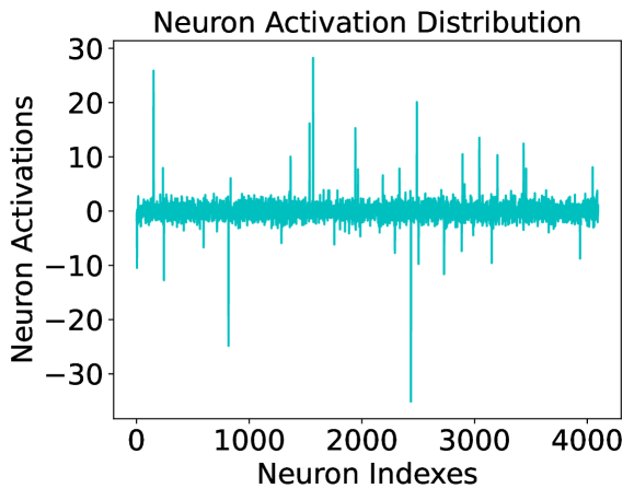
## Line Chart: Neuron Activation Distribution
### Overview
This image is a line chart titled "Neuron Activation Distribution." It visualizes the activation values for a set of approximately 4,096 individual neurons (likely from a specific layer in a neural network). The data is represented by a single cyan-colored line that fluctuates across the neuron indices. The chart shows a high degree of sparsity, with most neurons having activations near zero, punctuated by several extreme positive and negative outliers.
### Components/Axes
* **Title**: "Neuron Activation Distribution" (Top-center)
* **Y-Axis (Vertical)**:
* **Label**: "Neuron Activations" (Left-center, rotated 90 degrees)
* **Scale**: Ranges from -30 to 30.
* **Major Tick Marks**: -30, -20, -10, 0, 10, 20, 30.
* **X-Axis (Horizontal)**:
* **Label**: "Neuron Indexes" (Bottom-center)
* **Scale**: Ranges from 0 to approximately 4,100.
* **Major Tick Marks**: 0, 1000, 2000, 3000, 4000.
* **Data Series**: A single continuous line plotted in a cyan/teal color. There is no legend, as only one variable is being tracked.
### Detailed Analysis
The chart displays a "spiky" distribution. To analyze the data, we can segment the behavior into the "baseline" and the "outliers."
**1. Baseline Activity (The Dense Band):**
* **Visual Trend**: The line forms a very dense, horizontal band centered exactly at $y = 0$.
* **Range**: The vast majority of data points (estimated >95%) fall within a narrow range of approximately $[-3, +3]$.
* **Consistency**: This baseline is consistent across the entire x-axis from index 0 to 4096.
**2. Positive Outliers (Spikes):**
* **Visual Trend**: Sharp, vertical lines extending upward from the baseline.
* **Notable Points (Approximate):**
* Index ~180: Activation $\approx +26$
* Index ~1550: Activation $\approx +16$
* Index ~1580: Activation $\approx +28$ (The highest positive peak)
* Index ~1950: Activation $\approx +15$
* Index ~2480: Activation $\approx +20$
* Index ~2900: Activation $\approx +11$
* Index ~3050: Activation $\approx +14$
* Index ~3450: Activation $\approx +13$
**3. Negative Outliers (Dips):**
* **Visual Trend**: Sharp, vertical lines extending downward from the baseline.
* **Notable Points (Approximate):**
* Index ~10: Activation $\approx -11$
* Index ~250: Activation $\approx -13$
* Index ~820: Activation $\approx -25$
* Index ~2420: Activation $\approx -35$ (The most extreme outlier, extending below the -30 axis marker)
* Index ~2750: Activation $\approx -12$
* Index ~3180: Activation $\approx -10$
### Key Observations
* **High Kurtosis**: The distribution has very "heavy tails," meaning that while most values are near the mean (zero), there are infrequent but extreme deviations.
* **Symmetry**: The distribution is roughly symmetric around zero, with significant spikes occurring in both positive and negative directions.
* **Extreme Outlier**: The most significant single data point is a negative spike near index 2420, reaching an activation level of approximately -35.
* **Sparsity**: The visual density of the line at $y=0$ suggests that the model or layer being visualized utilizes "sparse activation," where only a small subset of neurons are highly active for a given input.
### Interpretation
* **Neural Network Health**: This chart is typical of a healthy, trained neural network layer. The fact that most neurons are near zero suggests the network has learned to be selective, only "firing" specific neurons (the spikes) in response to certain features.
* **Feature Detection**: Each spike likely represents a neuron that has strongly identified a specific feature in the input data. The magnitude (e.g., +28 or -35) indicates the strength of that detection.
* **Potential for Pruning**: Because so many neurons (the dense band at zero) have near-zero activation, this layer might be a good candidate for "weight pruning," where inactive neurons are removed to make the model smaller and faster without significantly losing accuracy.
* **Numerical Stability**: The presence of values as high as 30 and as low as -35 suggests a wide dynamic range. If these values were to grow much larger (e.g., into the hundreds), it might indicate an "exploding gradient" problem, but at this scale, it appears controlled.