\n
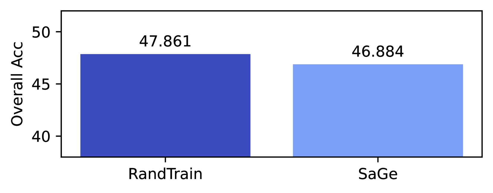
## Bar Chart: Overall Accuracy Comparison
### Overview
This image presents a bar chart comparing the "Overall ACC" (Accuracy) of two training methods: "RandTrain" and "SaGe". The chart uses blue bars to represent the accuracy values for each method.
### Components/Axes
* **X-axis:** Represents the training method. Categories are "RandTrain" and "SaGe".
* **Y-axis:** Labeled "Overall ACC", representing the overall accuracy. The scale ranges from approximately 35 to 50, with markings at 40, 45, and 50.
* **Bars:** Two blue bars, one for each training method.
* **Data Labels:** Numerical values are displayed above each bar, indicating the accuracy score.
### Detailed Analysis
* **RandTrain:** The bar for "RandTrain" reaches approximately 47.861 on the "Overall ACC" scale. The bar is positioned on the left side of the chart.
* **SaGe:** The bar for "SaGe" reaches approximately 46.884 on the "Overall ACC" scale. The bar is positioned on the right side of the chart.
* **Trend:** The "RandTrain" bar is slightly taller than the "SaGe" bar, indicating a higher accuracy score.
### Key Observations
* "RandTrain" exhibits a slightly higher overall accuracy compared to "SaGe".
* The difference in accuracy between the two methods is relatively small, approximately 0.977.
### Interpretation
The data suggests that "RandTrain" performs marginally better than "SaGe" in terms of overall accuracy. This could indicate that the random training approach is more effective for this particular dataset or task. However, the small difference in accuracy suggests that the choice between the two methods may not be critical. Further investigation might be needed to determine if the observed difference is statistically significant and whether it holds across different datasets or experimental conditions. The chart provides a direct comparison of the two methods, allowing for a quick assessment of their relative performance.