## Bar Chart: Overall Accuracy Comparison of RandTrain and SaGe
### Overview
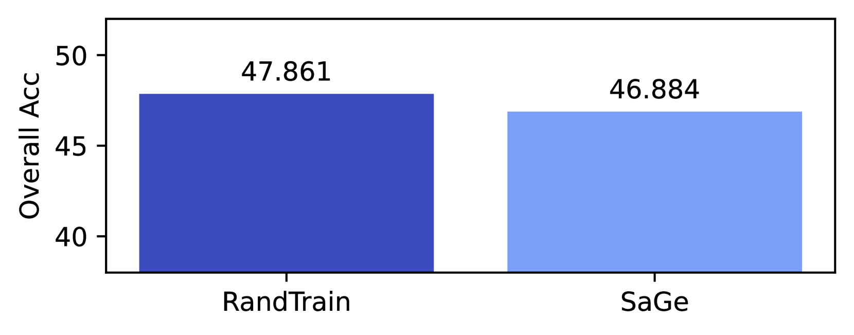
The chart compares the overall accuracy of two methods, **RandTrain** and **SaGe**, using vertical bars. The y-axis represents accuracy percentages, while the x-axis lists the methods. Values are explicitly labeled on top of each bar.
### Components/Axes
- **X-axis (Categories)**:
- Labels: "RandTrain" (left), "SaGe" (right)
- Positioning: Centered under each bar
- **Y-axis (Values)**:
- Title: "Overall Acc"
- Scale: 40 to 50 (increments of 5)
- Positioning: Left-aligned, vertical axis
- **Legend**:
- Position: Bottom-center
- Entries:
- Dark blue: "RandTrain"
- Light blue: "SaGe"
- **Data Labels**:
- "47.861" (RandTrain bar)
- "46.884" (SaGe bar)
- Positioning: Top-center of each bar
### Detailed Analysis
- **RandTrain**:
- Bar color: Dark blue
- Accuracy: 47.861%
- Position: Leftmost bar
- **SaGe**:
- Bar color: Light blue
- Accuracy: 46.884%
- Position: Rightmost bar
### Key Observations
1. **RandTrain** achieves a higher overall accuracy (47.861%) compared to **SaGe** (46.884%).
2. The difference between the two methods is **0.977 percentage points**.
3. Both values fall within the 45–50% range, indicating moderate performance.
### Interpretation
The chart demonstrates that **RandTrain** outperforms **SaGe** in overall accuracy, though the margin is relatively small. The use of distinct colors (dark blue vs. light blue) and explicit numerical labels ensures clarity in comparing the two methods. The slight edge of RandTrain suggests it may be more robust or optimized for the task being measured. However, the minimal difference implies that both methods are comparable in performance, and further analysis (e.g., statistical significance, sample size, or contextual factors) would be needed to draw definitive conclusions.