## Line Graph with Bar Chart: Achieved Throughput vs Arithmetic Intensity and Compute/Memory Time Breakdown
### Overview
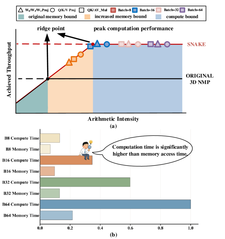
The image contains two primary components:
1. A **line graph** (a) showing the relationship between arithmetic intensity and achieved throughput, with regions demarcating memory/compute bounds and batch size configurations.
2. A **bar chart** (b) comparing compute and memory access times across different batch sizes (B8, B16, B32, B64).
---
### Components/Axes
#### Line Graph (a)
- **X-axis**: "Arithmetic Intensity" (no explicit scale, but labeled with "ridge point" and "peak computation performance").
- **Y-axis**: "Achieved Throughput" (units unspecified, but normalized to a 0–1 scale).
- **Legend**:
- Symbols:
- Triangles (▲): W0/W1/W2 Proj
- Circles (●): Q/K/V Proj
- Squares (■): QK/AV_Mul
- Filled squares (■): Batch=8 (red), Batch=16 (blue), Batch=32 (pink), Batch=64 (purple)
- Colors:
- Green: Original memory bound
- Orange: Increased memory bound
- Blue: Compute bound
- **Key Markers**:
- Red dashed line labeled "SNAKE" (horizontal, spans high arithmetic intensity).
- Black dashed line labeled "ORIGINAL 3D NMP" (horizontal, baseline throughput).
- Arrows labeled "ridge point" (intersection of original memory bound and increased memory bound) and "peak computation performance" (transition to compute bound).
#### Bar Chart (b)
- **X-axis**: Normalized time (0.0–1.0, no units).
- **Y-axis**: Batch sizes and time categories:
- B8 Compute Time
- B8 Memory Time
- B16 Compute Time
- B16 Memory Time
- B32 Compute Time
- B32 Memory Time
- B64 Compute Time
- B64 Memory Time
- **Colors**:
- Orange: Compute Time
- Green: Memory Time
---
### Detailed Analysis
#### Line Graph (a)
- **Trends**:
- Throughput increases linearly with arithmetic intensity until the "ridge point" (~0.3 arithmetic intensity), after which it plateaus.
- The "peak computation performance" occurs at the transition to the blue "compute bound" region (~0.5 arithmetic intensity).
- Batch sizes (B8–B64) are plotted as points along the curve, with larger batches (B64) achieving higher throughput.
- **Data Points**:
- Ridge point: ~0.3 arithmetic intensity, ~0.45 throughput.
- Peak computation performance: ~0.5 arithmetic intensity, ~0.7 throughput.
- SNAKE line: Horizontal at ~0.7 throughput, spanning high arithmetic intensity.
#### Bar Chart (b)
- **Values** (approximate):
- **B8**:
- Compute Time: ~0.15
- Memory Time: ~0.08
- **B16**:
- Compute Time: ~0.35
- Memory Time: ~0.12
- **B32**:
- Compute Time: ~0.60
- Memory Time: ~0.18
- **B64**:
- Compute Time: ~1.00
- Memory Time: ~0.22
- **Speech Bubble**: "Computation time is significantly higher than memory access time" (emphasizes compute dominance).
---
### Key Observations
1. **Memory vs. Compute Bound**:
- Below the ridge point, memory access limits throughput (green/orange regions).
- Beyond the ridge point, compute becomes the bottleneck (blue region).
2. **Batch Size Impact**:
- Larger batches (B64) achieve higher throughput but require more compute resources.
- Memory time remains relatively constant across batches, while compute time scales linearly.
3. **SNAKE Line**:
- Represents an optimal throughput threshold (~0.7) achievable at high arithmetic intensity.
---
### Interpretation
- **Performance Bottlenecks**:
- At low arithmetic intensity, memory access (W0/W1/W2, Q/K/V projections) dominates.
- At high arithmetic intensity, compute resources (QK/AV_Mul) become critical.
- **Batch Size Tradeoffs**:
- Larger batches improve throughput but increase compute time disproportionately (e.g., B64 compute time = 1.0 vs. B8 = 0.15).
- **SNAKE Line Significance**:
- Likely represents a target or theoretical maximum throughput achievable under ideal conditions.
- **Original 3D NMP Baseline**:
- The black dashed line indicates the original model’s performance, which is surpassed by optimized configurations (e.g., B64).
The data suggests that optimizing for compute-bound scenarios (via larger batches and efficient memory projections) is critical for maximizing throughput in arithmetic-intensive workloads. The "SNAKE" line may indicate a design goal or upper limit for system performance.