\n
## Diagram: Binary Pattern Comparison Across Temperature Regimes
### Overview
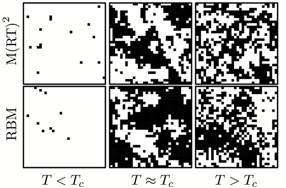
The image is a 2x3 grid of square panels displaying binary (black and white) pixel patterns. It compares the output or state of two different models or methods—labeled **M(RT)²** (top row) and **RBM** (bottom row)—across three distinct temperature conditions relative to a critical temperature, **T_c**. The patterns visually demonstrate how the system's configuration changes from an ordered, sparse state at low temperature, through a clustered, critical state, to a disordered, noisy state at high temperature.
### Components/Axes
* **Row Labels (Left Side):**
* Top Row: `M(RT)²`
* Bottom Row: `RBM`
* **Column Labels (Bottom):**
* Left Column: `T < T_c` (Temperature below critical)
* Middle Column: `T ≈ T_c` (Temperature near critical)
* Right Column: `T > T_c` (Temperature above critical)
* **Panel Content:** Each of the six panels contains a square grid of black pixels on a white background (or vice-versa, depending on interpretation). The grid resolution appears consistent across all panels, approximately 30x30 to 40x40 pixels.
* **Spatial Layout:** The diagram is organized in a strict grid. The row labels are vertically centered to the left of their respective rows. The column labels are horizontally centered beneath their respective columns.
### Detailed Analysis
**Panel-by-Panel Description:**
1. **Top-Left (M(RT)², T < T_c):** The pattern is very sparse. Approximately 10-15 isolated black pixels are scattered randomly across the white field. There is no visible clustering or large-scale structure.
2. **Bottom-Left (RBM, T < T_c):** Similarly sparse, with roughly 8-12 isolated black pixels. The distribution appears random, comparable to the panel above it.
3. **Top-Middle (M(RT)², T ≈ T_c):** The pattern shows significant structure. Large, irregular clusters of black pixels form, connected in a web-like or percolating fashion. Corresponding large white clusters are also present. This is characteristic of a system near a phase transition.
4. **Bottom-Middle (RBM, T ≈ T_c):** Also exhibits large, connected clusters of black and white. The morphology is qualitatively very similar to the panel above, suggesting both models capture the critical behavior similarly.
5. **Top-Right (M(RT)², T > T_c):** The pattern becomes fine-grained and noisy. Black and white pixels are thoroughly mixed, forming many small, disconnected clusters. No large-scale structure is visible, indicating a disordered state.
6. **Bottom-Right (RBM, T > T_c):** Displays a similarly disordered, noisy pattern. The cluster size distribution appears comparable to the top-right panel, though the exact configuration differs due to randomness.
### Key Observations
* **Trend Consistency:** Both rows (M(RT)² and RBM) exhibit the same fundamental trend: sparse/isolated → large clusters → fine-grained noise as temperature increases from `T < T_c` to `T > T_c`.
* **Model Similarity:** For each temperature condition, the visual characteristics of the patterns generated by M(RT)² and RBM are qualitatively alike. This suggests both methods are modeling similar underlying statistical mechanics.
* **Critical Phenomena:** The middle column (`T ≈ T_c`) clearly shows the hallmark of a critical point: the emergence of structure at all scales (large clusters with intricate boundaries), distinct from both the ordered (sparse) and disordered (noisy) phases.
### Interpretation
This diagram is a visual comparison of how two computational models—likely a **Restricted Boltzmann Machine (RBM)** and another method denoted **M(RT)²**—reproduce the statistical configurations of a binary system (e.g., Ising model spins) at different temperatures.
* **What it demonstrates:** It provides empirical, visual evidence that both models can successfully capture the three canonical phases of a system undergoing a second-order phase transition: the ordered phase (low T), the critical region (near T_c), and the disordered phase (high T).
* **Relationship between elements:** The rows represent different modeling approaches, while the columns represent the control parameter (temperature). The direct visual comparison in the grid format allows for immediate assessment of each model's performance across the phase diagram.
* **Notable implication:** The strong qualitative agreement between the two rows suggests that the RBM, a well-known machine learning model, is capable of learning and generating configurations that are statistically similar to those produced by the M(RT)² method (which may be a traditional Monte Carlo simulation or another theoretical approach). This could be used to validate the RBM's ability to model physical systems or to demonstrate the efficiency of one method over the other. The lack of quantitative data (e.g., specific energy or magnetization values) means the comparison is purely morphological.