\n
## Heatmap: Correlation Analysis at Different Temperatures
### Overview
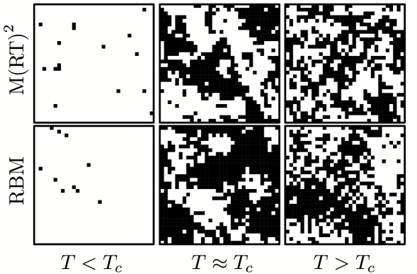
The image presents a 2x3 grid of heatmaps illustrating the correlation between two variables, M(RT)² and RBM, at three different temperature regimes: T < Tc, T ≈ Tc, and T > Tc. Each cell in the grid represents a heatmap, with darker squares indicating a stronger correlation. The heatmaps appear to be based on a square grid of data points.
### Components/Axes
* **Y-axis:** M(RT)² (top row) and RBM (bottom row). These are the two variables being correlated.
* **X-axis:** Temperature regimes: T < Tc, T ≈ Tc, and T > Tc. Tc represents a critical temperature.
* **Heatmap Color:** Black squares represent high correlation, while white squares represent low or no correlation. Shades of gray indicate intermediate correlation levels.
* **Grid Structure:** The image is organized as a 2x3 grid, with the rows representing the variables (M(RT)² and RBM) and the columns representing the temperature regimes.
### Detailed Analysis
The heatmaps show a clear trend in correlation strength as temperature increases.
* **T < Tc (Left Column):** Both heatmaps (M(RT)² and RBM) show very sparse black squares, indicating a very weak correlation between the variables at temperatures below the critical temperature. The black squares are clustered towards the bottom-left corner of each heatmap.
* **T ≈ Tc (Middle Column):** The correlation increases significantly at temperatures around the critical temperature. The heatmaps show a moderate density of black squares, distributed more randomly than in the T < Tc case. There are some visible clusters of black squares.
* **T > Tc (Right Column):** The correlation is strongest at temperatures above the critical temperature. The heatmaps are almost entirely filled with black squares, indicating a strong correlation between the variables. The distribution of black squares appears more uniform and random than in the other two cases.
It is difficult to extract precise numerical values from the heatmaps without the underlying data. However, we can qualitatively assess the correlation strength based on the density of black squares.
### Key Observations
* The correlation between M(RT)² and RBM increases dramatically as the temperature approaches and exceeds the critical temperature Tc.
* At temperatures below Tc, the correlation is minimal.
* The distribution of correlation changes from clustered (T < Tc) to more random (T ≈ Tc and T > Tc) as the temperature increases.
### Interpretation
The data suggests a phase transition occurring at the critical temperature Tc. Below Tc, the variables M(RT)² and RBM are largely uncorrelated, indicating that they behave independently. As the temperature approaches and exceeds Tc, a strong correlation emerges, suggesting that the two variables become strongly coupled. This could indicate a change in the underlying system's behavior, such as the emergence of long-range order or a collective phenomenon. The increasing randomness of the correlation pattern at higher temperatures might indicate a more disordered state. The heatmaps visually demonstrate how the relationship between these two variables changes drastically with temperature, highlighting the importance of the critical temperature Tc. The data suggests that the system undergoes a transition from a weakly correlated state to a strongly correlated state at Tc.