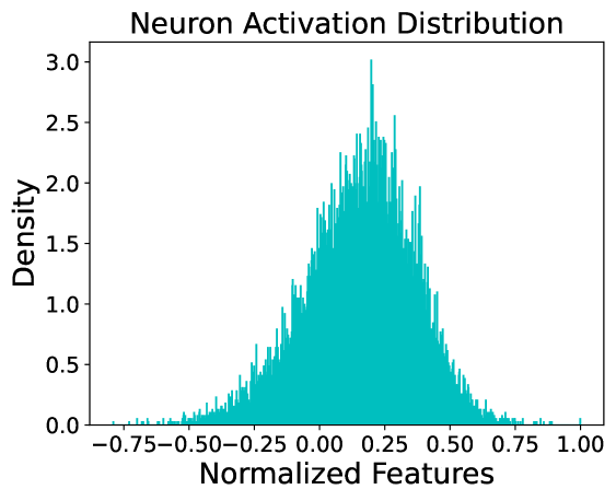
## Histogram: Neuron Activation Distribution
### Overview
The image is a histogram showing the distribution of neuron activations. The x-axis represents normalized features, and the y-axis represents density. The distribution appears roughly normal, centered around a positive value.
### Components/Axes
* **Title:** Neuron Activation Distribution
* **X-axis:** Normalized Features
* Scale: -0.75 to 1.00, with increments of 0.25
* **Y-axis:** Density
* Scale: 0.0 to 3.0, with increments of 0.5
* **Data:** The distribution is shown in teal.
### Detailed Analysis
The histogram shows the density of neuron activations across a range of normalized feature values. The distribution is unimodal and appears to be skewed slightly to the right.
* The peak density occurs around 0.25.
* The density is close to zero for normalized features less than -0.75 and greater than 1.00.
* The distribution is not perfectly symmetrical, with a longer tail on the right side.
### Key Observations
* The neuron activations are concentrated around a positive value of normalized features.
* There is a significant range of activation values, indicating that the neurons are responding to a variety of features.
* The slight skewness suggests that there may be some features that tend to activate the neurons more strongly than others.
### Interpretation
The histogram provides insights into how neurons in a neural network respond to different features. The distribution suggests that the neurons are most sensitive to features with normalized values around 0.25, but they also respond to a wider range of features. The skewness of the distribution could indicate that certain features are more important for the task the network is trained to perform. The data suggests that the neurons are not uniformly activated, but rather exhibit a preference for certain feature ranges. This could be due to the specific architecture of the network or the nature of the training data.