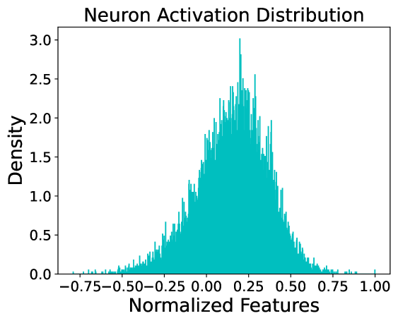
## Chart Type: Histogram / Density Plot: Neuron Activation Distribution
### Overview
This image is a technical chart representing the distribution of neuron activations within a computational model, likely a neural network. It displays a frequency-based density of "Normalized Features" across a specific range. The data follows a roughly bell-shaped (Gaussian-like) distribution, centered slightly to the right of the zero mark.
### Components/Axes
* **Title**: "Neuron Activation Distribution" (Centered at the top).
* **Y-Axis (Vertical)**:
* **Label**: "Density" (Positioned on the left).
* **Scale**: Linear, ranging from 0.0 to 3.0.
* **Markers**: 0.0, 0.5, 1.0, 1.5, 2.0, 2.5, 3.0.
* **X-Axis (Horizontal)**:
* **Label**: "Normalized Features" (Positioned at the bottom).
* **Scale**: Linear, ranging from approximately -0.80 to 1.00.
* **Markers**: -0.75, -0.50, -0.25, 0.00, 0.25, 0.50, 0.75, 1.00.
* **Legend**: None present; the chart contains a single data series represented by cyan/teal vertical bars.
### Content Details
The chart utilizes a high-resolution histogram with many narrow bins to show the density of values.
* **Trend Verification**: The data series starts with near-zero density at the far left (~ -0.80), slopes upward steadily until it reaches a peak just before the 0.25 mark, and then slopes downward toward the right, tapering off near 1.00.
* **Peak (Mode)**: The highest density spike occurs at approximately **x ≈ 0.21**, reaching a density value of **~3.0**.
* **Distribution Spread**:
* **Left Tail**: Extends to approximately **-0.75**, though density is negligible below -0.50.
* **Right Tail**: Extends to approximately **1.00**, with a very small outlier visible at the far right edge.
* **Bulk of Data**: The majority of the activation density is concentrated between **-0.25 and 0.60**.
* **Symmetry**: The distribution is slightly asymmetrical, with a visible "right shift" or positive mean.
### Key Observations
* **Positive Bias**: The center of the distribution (mean/median) is clearly positive, situated around 0.15 to 0.20.
* **Granularity**: The use of very thin bars suggests a large sample size of neurons or features being measured.
* **Zero-Crossing**: A significant portion of the distribution exists below zero, indicating that the "Normalized Features" are not strictly non-negative (as would be seen with a standard ReLU activation function).
### Interpretation
* **Model Health**: The distribution shows a healthy spread of activations. There is no evidence of "dead neurons" (which would show a massive spike exactly at 0.0) or "saturated neurons" (which would show spikes at the extreme ends of the range).
* **Activation Function Inference**: The presence of values in the negative range suggests the use of an activation function that allows negative output, such as **Leaky ReLU, ELU, or SELU**, or that this plot represents **pre-activation** values or values after **Batch Normalization**.
* **Normalization**: The "Normalized Features" label and the scale (mostly within -1 to 1) suggest that the data has been processed through a normalization layer (like LayerNorm or BatchNorm) which typically aims for a mean of 0 and a standard deviation of 1; however, the slight positive shift suggests the model has learned a specific bias for this layer.
* **Peircean Investigative Note**: The sharp, jagged nature of the peaks (rather than a smooth KDE curve) indicates raw binning of discrete data points. The single outlier at exactly 1.00 might suggest a clipping or "ceiling" effect in the normalization or activation logic.