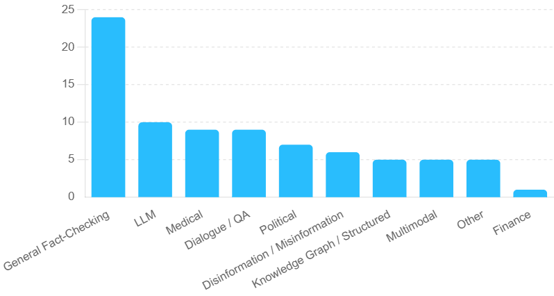
## Bar Chart: Category Distribution
### Overview
The image is a bar chart displaying the distribution of items across different categories. The y-axis represents a numerical value, and the x-axis represents the categories. The bars are all the same color (light blue).
### Components/Axes
* **X-axis:** Categories: General Fact-Checking, LLM, Medical, Dialogue / QA, Political, Disinformation / Misinformation, Knowledge Graph / Structured, Multimodal, Other, Finance.
* **Y-axis:** Numerical scale from 0 to 25, with increments of 5 (0, 5, 10, 15, 20, 25).
* **Bars:** Light blue bars representing the count for each category.
### Detailed Analysis
Here's a breakdown of the approximate values for each category:
* **General Fact-Checking:** Approximately 24
* **LLM:** Approximately 10
* **Medical:** Approximately 9
* **Dialogue / QA:** Approximately 9
* **Political:** Approximately 7
* **Disinformation / Misinformation:** Approximately 6
* **Knowledge Graph / Structured:** Approximately 5
* **Multimodal:** Approximately 5
* **Other:** Approximately 5
* **Finance:** Approximately 1
### Key Observations
* "General Fact-Checking" has a significantly higher value than all other categories.
* "LLM", "Medical", and "Dialogue / QA" have similar values.
* "Finance" has the lowest value.
* The categories "Knowledge Graph / Structured", "Multimodal", and "Other" have the same value.
### Interpretation
The bar chart indicates the relative frequency or importance of different categories. "General Fact-Checking" is the most prominent category, suggesting it is the most frequent or significant. "Finance" is the least prominent, suggesting it is the least frequent or significant. The other categories fall in between, with varying degrees of prominence. The data suggests a strong focus on general fact-checking compared to other areas.