\n
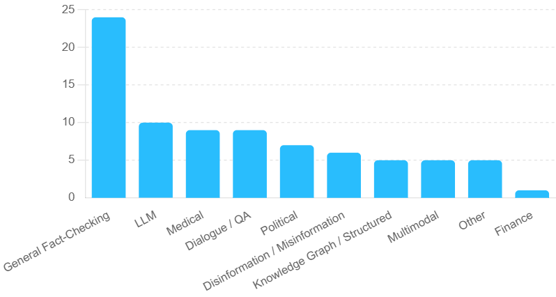
## Bar Chart: Distribution of Tasks by Category
### Overview
The image presents a bar chart illustrating the distribution of tasks across different categories. The chart uses vertical bars to represent the quantity of tasks within each category. The x-axis labels the categories, and the y-axis represents the number of tasks, ranging from 0 to 25.
### Components/Axes
* **X-axis Label:** Categories of tasks: "General Fact-Checking", "LLM", "Medical", "Dialogue / QA", "Political", "Disinformation / Misinformation", "Knowledge Graph / Structured", "Multimodal", "Other", "Finance".
* **Y-axis Label:** Number of Tasks (Scale: 0 to 25, increments of 5).
* **Bar Color:** Light Blue.
* **Gridlines:** Horizontal, faint gray lines at y-axis intervals of 5.
### Detailed Analysis
The chart displays the following approximate task counts for each category:
* **General Fact-Checking:** Approximately 23 tasks. The bar reaches slightly above the 20 mark, but is below 25.
* **LLM:** Approximately 10 tasks. The bar reaches the 10 mark.
* **Medical:** Approximately 9 tasks. The bar is slightly below the 10 mark.
* **Dialogue / QA:** Approximately 9 tasks. The bar is slightly below the 10 mark.
* **Political:** Approximately 7 tasks. The bar is between the 5 and 10 mark.
* **Disinformation / Misinformation:** Approximately 6 tasks. The bar is between the 5 and 10 mark.
* **Knowledge Graph / Structured:** Approximately 5 tasks. The bar reaches the 5 mark.
* **Multimodal:** Approximately 4 tasks. The bar is between the 0 and 5 mark.
* **Other:** Approximately 4 tasks. The bar is between the 0 and 5 mark.
* **Finance:** Approximately 2 tasks. The bar is between the 0 and 5 mark.
The bars generally decrease in height from left to right, indicating a decreasing number of tasks as you move across the categories.
### Key Observations
* "General Fact-Checking" has a significantly higher number of tasks compared to all other categories.
* "LLM", "Medical", and "Dialogue / QA" have similar numbers of tasks, around 9-10.
* "Finance" has the fewest tasks, with only approximately 2.
* There is a noticeable drop in task count between "Political" and "Knowledge Graph / Structured".
### Interpretation
The data suggests a strong focus on "General Fact-Checking" within the tasks being performed. This could indicate a prioritization of verifying broad factual claims. The relatively high number of tasks in "LLM", "Medical", and "Dialogue / QA" suggests these areas are also receiving considerable attention. The low number of tasks in "Finance" might indicate a smaller scope of work or a lower priority in this context. The decreasing trend in task counts across the categories could reflect a natural distribution of effort based on the importance or complexity of each area. The chart provides a snapshot of task allocation, potentially revealing resource distribution or areas of expertise within a team or organization.