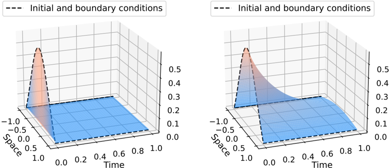
## 3D Surface Plot Comparison: Initial and Boundary Conditions
### Overview
The image displays two side-by-side 3D surface plots. Each plot visualizes a scalar field over a two-dimensional domain defined by "Space" and "Time." The plots appear to compare two different scenarios or solutions, likely from a simulation of a physical process (e.g., diffusion, wave propagation, or a partial differential equation). The primary visual difference is the shape and decay rate of the surface from an initial peak.
### Components/Axes
**Common Elements for Both Plots:**
* **Chart Type:** 3D Surface Plot.
* **Legend:** Located at the top center of each plot's frame. It contains a dashed black line symbol (`---`) and the text "Initial and boundary conditions."
* **Axes:**
* **X-axis (Front-Left):** Labeled "Space." The axis runs from -1.0 to 1.0, with major tick marks at -1.0, -0.5, 0.0, 0.5, and 1.0.
* **Y-axis (Front-Right):** Labeled "Time." The axis runs from 0.0 to 1.0, with major tick marks at 0.0, 0.2, 0.4, 0.6, 0.8, and 1.0.
* **Z-axis (Vertical):** Unlabeled, but represents the magnitude of the plotted quantity. The axis runs from 0.0 to approximately 0.55, with major tick marks at 0.0, 0.1, 0.2, 0.3, 0.4, and 0.5.
* **Surface Color Mapping:** The surface uses a color gradient. Lower values (near 0.0) are colored blue. Higher values transition through lighter blue/white to a peak colored in orange/red.
**Left Plot Specifics:**
* **Surface Shape:** Features a very sharp, narrow peak centered near `Space = 0.0` and `Time = 0.0`. The peak height reaches the top of the Z-axis (~0.5). The surface decays extremely rapidly away from this peak, becoming nearly flat (blue) across most of the domain by `Time = 0.2`.
* **Spatial Grounding:** The high-value (orange) region is tightly confined to the immediate vicinity of the origin (Space=0, Time=0).
**Right Plot Specifics:**
* **Surface Shape:** Also features a peak centered near `Space = 0.0` and `Time = 0.0`, with a similar maximum height (~0.5). However, the decay from this peak is significantly more gradual. The elevated surface (lighter blue/white) extends further along the Time axis and spreads wider along the Space axis compared to the left plot. A visible "ridge" or slower decay path extends along the `Space = 0` line as Time increases.
* **Spatial Grounding:** The region of elevated values (lighter colors) is much broader, indicating a slower dissipation or propagation of the initial condition.
### Detailed Analysis
* **Initial Condition (t=0):** Both plots show an identical initial condition: a sharp, localized peak (approx. Gaussian shape) centered at `Space = 0.0` with a maximum value of ~0.5.
* **Temporal Evolution (t > 0):**
* **Left Plot Trend:** The surface demonstrates **extremely rapid dissipation**. By `Time = 0.2`, the value across nearly the entire spatial domain has fallen to near zero (dark blue). The process appears highly diffusive or damped.
* **Right Plot Trend:** The surface demonstrates **slower, more persistent evolution**. At `Time = 0.2`, a significant elevated region remains. The value along the centerline (`Space = 0.0`) decays gradually, still showing a light blue/white color (value ~0.2-0.3) at `Time = 0.6`. This suggests a process with less damping or a different underlying mechanism (e.g., advection-dominated or wave-like).
* **Boundary Conditions:** The behavior at the spatial boundaries (`Space = -1.0` and `Space = 1.0`) appears to be a fixed value of zero (dark blue) for all time in both plots, consistent with Dirichlet boundary conditions.
### Key Observations
1. **Identical Initial State, Divergent Evolution:** The core observation is that two systems starting from the same localized initial condition evolve in dramatically different ways over time.
2. **Decay Rate Discrepancy:** The most notable difference is the timescale of decay. The left system's solution collapses to near-zero almost immediately, while the right system's solution persists and spreads over the entire observed time window.
3. **Spatial Spread:** The right plot shows a much wider spatial influence of the initial condition as time progresses, particularly along the `Space = 0` axis.
4. **Color as Value Indicator:** The color gradient effectively reinforces the numerical values on the Z-axis, making the rapid vs. slow decay visually intuitive.
### Interpretation
This comparison likely illustrates the effect of changing a key parameter in a mathematical model or simulation. The plots could represent:
* **Different Diffusion Coefficients:** The left plot may show a high diffusion coefficient (rapid smoothing), while the right shows a low one (slow smoothing).
* **Different Physical Models:** The left could be a pure diffusion equation, while the right might be a convection-diffusion equation or a wave equation with damping.
* **Numerical Method Comparison:** They might compare the results of two different numerical schemes solving the same equation, where one introduces significant artificial dissipation (left) and the other is more accurate (right).
The data suggests that the system on the right retains information about the initial condition for a much longer duration. In a physical context, this could mean a pollutant plume (left) dissipates quickly, while a heat signature (right) lingers. In a numerical context, it highlights the importance of choosing a solver that minimizes unwanted numerical diffusion to capture true system behavior. The "Initial and boundary conditions" legend confirms that the dashed lines (visible at the edges of the surfaces, especially at `Time=0`) represent the enforced constraints for the simulation.