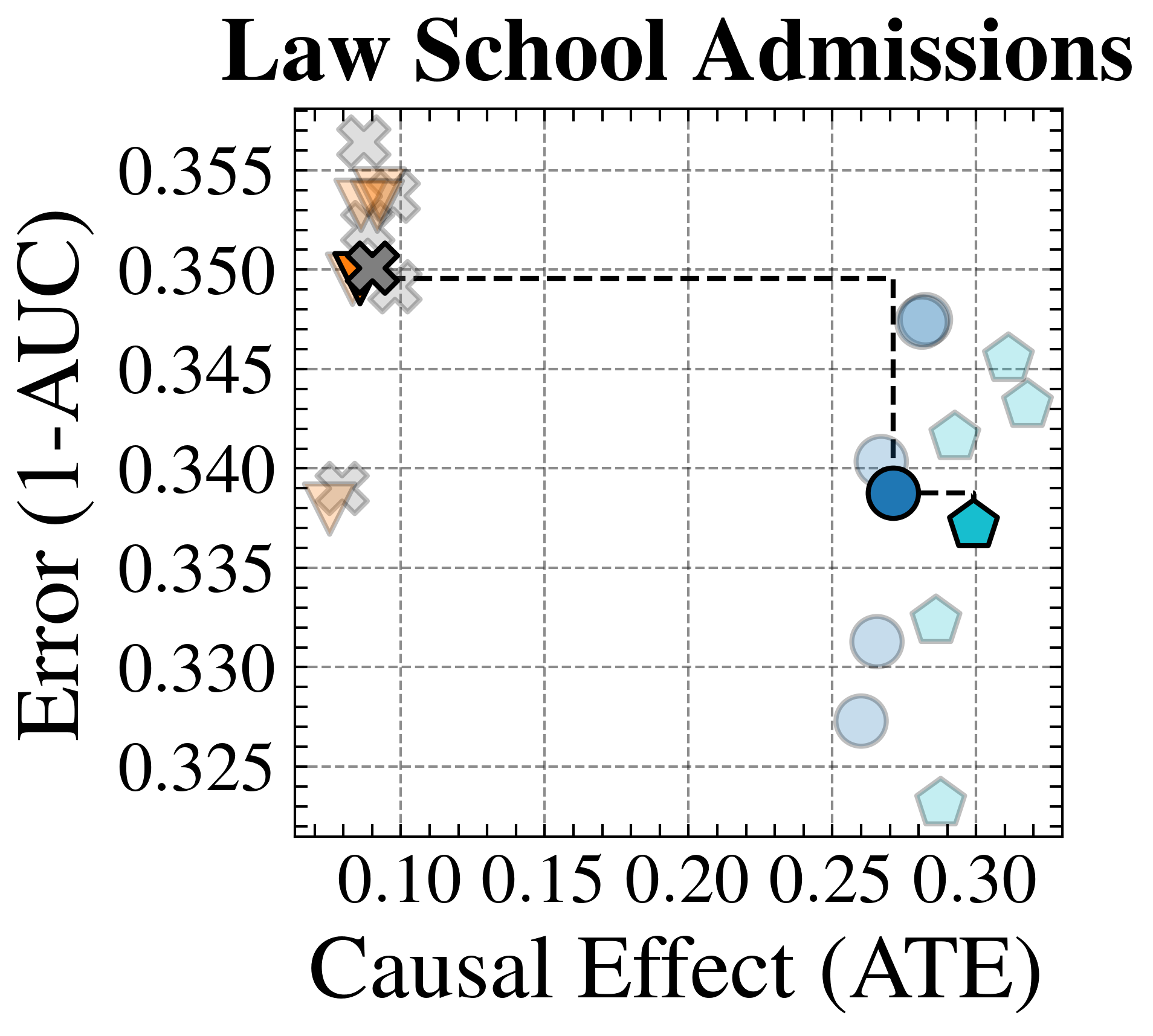
## Scatter Plot: Law School Admissions
### Overview
The image is a scatter plot titled "Law School Admissions." It plots data points on a two-dimensional grid, comparing a model's predictive error against its estimated causal effect. The plot uses different marker shapes and colors to represent distinct data series or model variants.
### Components/Axes
* **Title:** "Law School Admissions" (centered at the top).
* **X-Axis:** Labeled "Causal Effect (ATE)". The scale runs from approximately 0.08 to 0.32, with major tick marks labeled at 0.10, 0.15, 0.20, 0.25, and 0.30.
* **Y-Axis:** Labeled "Error (1-AUC)". The scale runs from approximately 0.322 to 0.358, with major tick marks labeled at 0.325, 0.330, 0.335, 0.340, 0.345, 0.350, and 0.355.
* **Grid:** A light gray dashed grid is present, aligned with the major tick marks on both axes.
* **Data Series (Markers):** There is no explicit legend box. Different series are distinguished by marker shape and color:
* **Orange/Brown Inverted Triangles:** Clustered in the top-left region.
* **Gray 'X' Marks:** Overlapping with the orange triangles in the top-left.
* **Light Blue Circles:** Scattered in the right half of the plot.
* **Light Blue Pentagons:** Scattered in the right half, generally to the right of the circles.
* **Dark Blue Circle:** A single, prominent point in the center-right.
* **Cyan Pentagon:** A single, prominent point to the right of the dark blue circle.
* **Annotation:** A black dashed line connects three specific points: a gray 'X' in the top-left, a dark blue circle in the center-right, and a cyan pentagon to its right.
### Detailed Analysis
**Spatial Grounding & Data Points (Approximate Coordinates):**
* **Top-Left Cluster (High Error, Low Causal Effect):**
* **Orange Inverted Triangles:** Two points. One at approximately (ATE=0.09, Error=0.354). Another lower point at (ATE=0.08, Error=0.339).
* **Gray 'X' Marks:** Multiple overlapping points. The most prominent one, connected by the dashed line, is at approximately (ATE=0.09, Error=0.350). Others are clustered around (ATE=0.08-0.10, Error=0.348-0.356).
* **Right-Side Scatter (Lower Error, Higher Causal Effect):**
* **Light Blue Circles:** Five points. Their approximate coordinates are:
1. (ATE=0.26, Error=0.327)
2. (ATE=0.26, Error=0.331)
3. (ATE=0.27, Error=0.340)
4. (ATE=0.28, Error=0.347)
5. (ATE=0.25, Error=0.323) - This is the lowest point on the plot.
* **Light Blue Pentagons:** Five points. Their approximate coordinates are:
1. (ATE=0.28, Error=0.322) - This is the lowest point on the plot.
2. (ATE=0.28, Error=0.332)
3. (ATE=0.29, Error=0.341)
4. (ATE=0.30, Error=0.343)
5. (ATE=0.31, Error=0.345)
* **Prominent Connected Points (Dashed Line Path):**
1. **Start:** Gray 'X' at (ATE≈0.09, Error≈0.350).
2. **Middle:** Dark Blue Circle at (ATE≈0.27, Error≈0.339).
3. **End:** Cyan Pentagon at (ATE≈0.29, Error≈0.337).
### Key Observations
1. **Clear Trade-off:** There is a distinct negative correlation visible. Models with low causal effect (ATE < 0.12) have high error (1-AUC > 0.348). Models with higher causal effect (ATE > 0.25) generally have lower error (1-AUC < 0.348).
2. **Clustering:** Data points form two primary clusters: a tight, high-error cluster on the left and a more dispersed, lower-error cluster on the right.
3. **The Dashed Line:** This line traces a specific path from a high-error/low-effect model to a lower-error/higher-effect model, and finally to a model with slightly higher effect and slightly lower error. It may represent a model selection or optimization trajectory.
4. **Outlier:** The light blue circle at (ATE≈0.25, Error≈0.323) and the light blue pentagon at (ATE≈0.28, Error≈0.322) are notable for having the lowest error values on the plot.
5. **Marker Consistency:** The two prominent single points (dark blue circle, cyan pentagon) are connected by the dashed line and are positioned within the general scatter of their respective shape groups (circles and pentagons).
### Interpretation
This chart visualizes the performance of different models or methods applied to a law school admissions dataset, evaluated on two competing objectives: predictive accuracy (where lower 1-AUC is better) and the magnitude of the estimated causal effect (Average Treatment Effect, where a higher ATE is presumably desirable or meaningful).
The data suggests a fundamental tension: models that achieve a very high estimated causal effect (ATE > 0.25) tend to have better predictive performance (lower error) than those with low estimated effects. This could imply that the factors driving a strong causal signal in this context are also predictive of the outcome.
The dashed line is particularly insightful. It likely highlights a specific methodological progression. Starting from a baseline model (gray 'X') with poor performance on both metrics, an intervention or alternative method (dark blue circle) dramatically increases the causal effect while also reducing error. A further refinement (cyan pentagon) yields a small additional gain in causal effect with a minor further reduction in error. This path demonstrates a desirable direction of model improvement: moving from the top-left (undesirable) to the bottom-right (more desirable) of the plot.
The presence of multiple points for each marker type suggests variability, possibly from different model initializations, hyperparameter settings, or data subsamples. The overall pattern indicates that for this problem, seeking models with higher estimated causal effects is correlated with, and may even be conducive to, achieving better predictive accuracy.