## Scatter Plot: Law School Admissions
### Overview
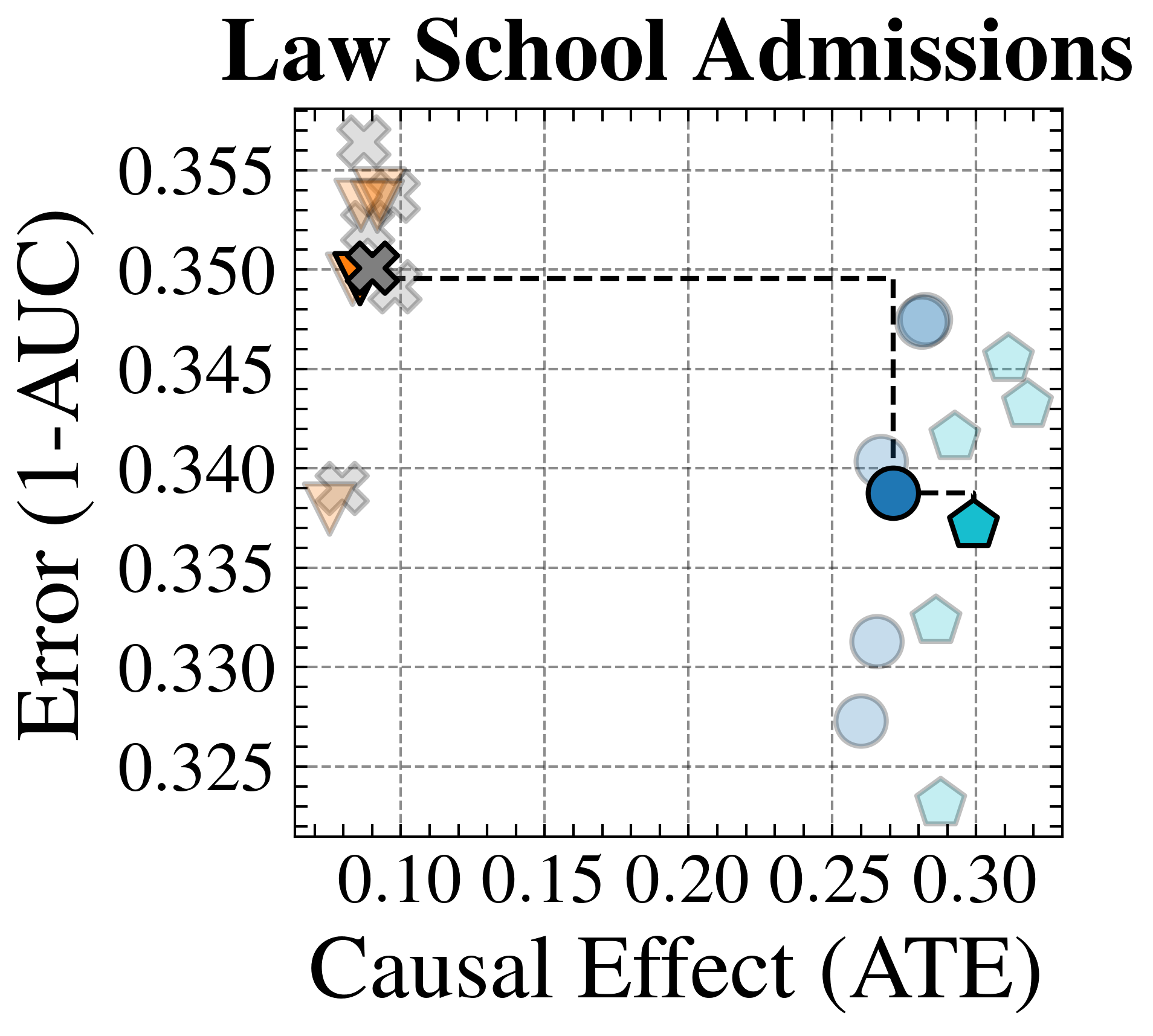
The image is a scatter plot titled "Law School Admissions," visualizing the relationship between **Causal Effect (ATE)** and **Error (1-AUC)**. Data points are represented by geometric shapes (triangles, circles, pentagons) in distinct colors (gray, orange, blue, light blue), with a dashed line connecting two specific points. The plot uses a grid with dashed lines for reference.
---
### Components/Axes
- **X-axis (Causal Effect, ATE)**:
- Label: "Causal Effect (ATE)"
- Scale: 0.10 to 0.30 in increments of 0.05.
- **Y-axis (Error, 1-AUC)**:
- Label: "Error (1-AUC)"
- Scale: 0.325 to 0.355 in increments of 0.005.
- **Legend**:
- Position: Top-left corner.
- Entries:
- Gray crosses (X): Unspecified category.
- Orange triangles (△): Unspecified category.
- Blue circles (●): Unspecified category.
- Light blue pentagons (□): Unspecified category.
---
### Detailed Analysis
1. **Data Points**:
- **Gray crosses (X)**:
- Clustered near the top-left (low ATE, high error).
- Example: (0.10, 0.350) connected via dashed line.
- **Orange triangles (△)**:
- Located at (0.10, 0.340) and (0.10, 0.335).
- **Blue circles (●)**:
- Spread across mid-to-high ATE (0.20–0.25) and mid-to-low error (0.335–0.345).
- Example: (0.25, 0.340) connected via dashed line.
- **Light blue pentagons (□)**:
- Distributed from ATE 0.20 to 0.30 and error 0.330–0.345.
2. **Dashed Line**:
- Connects a gray cross (0.10, 0.350) to a blue circle (0.25, 0.340).
- Suggests a trend of decreasing error with increasing ATE.
3. **Grid**:
- Dashed gridlines for reference, no numerical annotations.
---
### Key Observations
- **Trend**:
- A general inverse relationship between ATE and error: higher ATE correlates with lower error (1-AUC).
- The dashed line explicitly highlights this trend.
- **Clustering**:
- Light blue pentagons dominate the lower-right quadrant (high ATE, low error).
- Gray crosses and orange triangles cluster in the upper-left (low ATE, high error).
- **Outliers**:
- Orange triangle at (0.10, 0.340) deviates slightly from the gray cross cluster.
---
### Interpretation
- **Causal Effect vs. Error**:
- The plot implies that variables with higher causal effects (ATE) are associated with lower prediction errors (1-AUC), suggesting better model performance or stronger predictive validity for admissions outcomes.
- **Categorical Differences**:
- The distinct shapes/colors likely represent subgroups (e.g., GPA, LSAT scores, demographic factors). For example:
- Light blue pentagons (low error) may correspond to high-impact variables.
- Gray crosses/orange triangles (high error) may represent less influential or noisy variables.
- **Dashed Line Significance**:
- The connection between (0.10, 0.350) and (0.25, 0.340) emphasizes a critical transition point where increasing ATE reduces error, potentially highlighting a threshold for meaningful causal influence.
---
### Notes on Data Extraction
- **Uncertainty**:
- Values are approximate due to the absence of error bars or confidence intervals.
- Example: The gray cross at (0.10, 0.350) could vary slightly (±0.002) based on visual alignment.
- **Legend Clarity**:
- No explicit labels for shapes/colors; categories remain undefined in the image.
---
### Final Remarks
The plot underscores the importance of causal effect size in optimizing admission prediction models. Further analysis is needed to identify the specific variables represented by each shape/color and validate the trends with statistical rigor.