\n
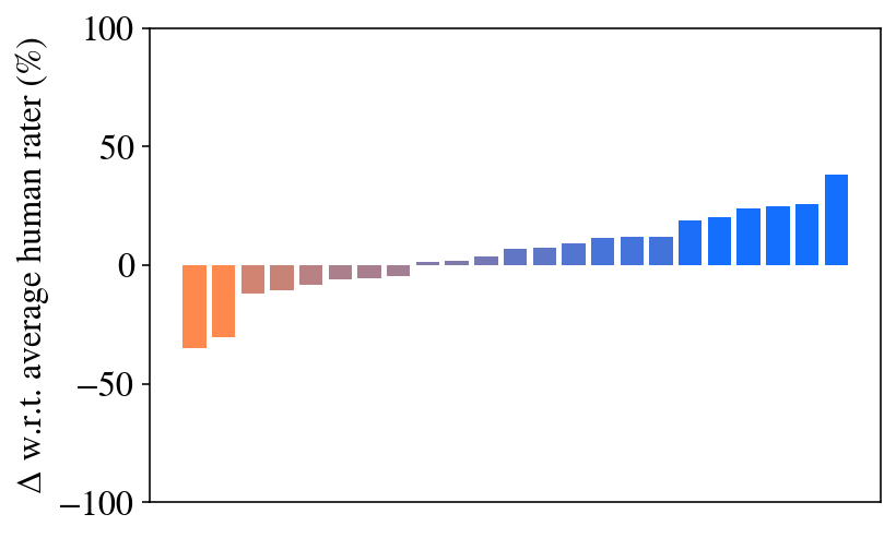
## Bar Chart: Delta w.r.t. Average Human Rater
### Overview
The image presents a bar chart illustrating the delta (Δ) with respect to the average human rater, expressed as a percentage. The chart displays a series of bars, transitioning from negative values to positive values as you move from left to right. The x-axis is not explicitly labeled, implying it represents a categorical variable or sequence of conditions.
### Components/Axes
* **Y-axis:** "Δ w.r.t. average human rater (%)" - Represents the percentage difference from the average human rater score. The scale ranges from approximately -100% to 100%.
* **X-axis:** Unlabeled. Represents the categories or conditions being compared.
* **Bars:** Represent the delta values for each category. The bars are colored in a gradient, starting with orange, transitioning to gray, and finally to blue.
### Detailed Analysis
The chart shows a clear trend of increasing delta values. The bars start with negative values, indicating scores below the average human rater, and gradually increase to positive values, indicating scores above the average.
Here's a breakdown of approximate values, reading from left to right:
1. **Orange Bar 1:** Approximately -20%
2. **Orange Bar 2:** Approximately -10%
3. **Gray Bar 3:** Approximately -5%
4. **Gray Bar 4:** Approximately 0%
5. **Gray Bar 5:** Approximately +5%
6. **Gray Bar 6:** Approximately +10%
7. **Gray Bar 7:** Approximately +15%
8. **Blue Bar 8:** Approximately +20%
9. **Blue Bar 9:** Approximately +30%
10. **Blue Bar 10:** Approximately +40%
11. **Blue Bar 11:** Approximately +50%
12. **Blue Bar 12:** Approximately +60%
The transition from orange to gray to blue appears to coincide with the crossing of the zero line (average human rater score).
### Key Observations
* The initial bars (orange) consistently show scores below the average human rater.
* There's a gradual increase in scores, crossing the average human rater level around the 4th or 5th bar (transitioning from gray to blue).
* The final bars (blue) demonstrate scores significantly above the average human rater.
* The rate of increase appears to accelerate towards the right side of the chart.
### Interpretation
The data suggests a system or method being evaluated initially performs worse than the average human rater. However, as the conditions or categories change (represented by the x-axis), the performance improves, eventually surpassing the average human rater. The accelerating trend in the later bars indicates that the improvement becomes more pronounced with each subsequent condition.
The color gradient could represent different stages of development or optimization. The initial orange bars might represent early iterations, the gray bars represent intermediate stages, and the blue bars represent the final, optimized version. The chart demonstrates a clear positive trajectory in performance, indicating successful improvement over time. The unlabeled x-axis is a limitation, as it prevents a more specific understanding of what factors are driving the observed changes.