## Grouped Bar Chart: Pairwise Comparison Win Rates
### Overview
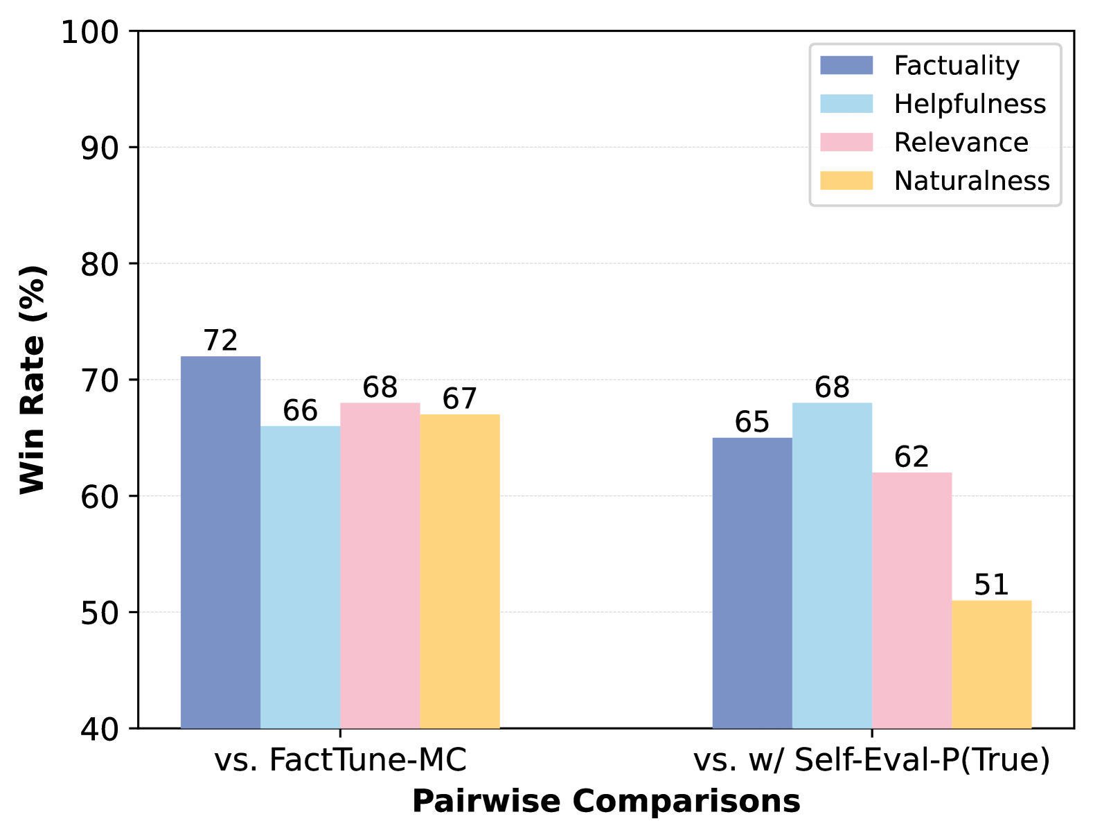
This image is a grouped bar chart displaying the win rates (in percentage) of a model or system across four evaluation metrics when compared against two different baselines or methods. The chart is designed to show comparative performance.
### Components/Axes
* **Chart Type:** Grouped Bar Chart.
* **Y-Axis:** Labeled **"Win Rate (%)"**. The scale runs from 40 to 100, with major gridlines at intervals of 10 (40, 50, 60, 70, 80, 90, 100).
* **X-Axis:** Labeled **"Pairwise Comparisons"**. It contains two primary categorical groups:
1. **"vs. FactTune-MC"** (left group)
2. **"vs. w/ Self-Eval-P(True)"** (right group)
* **Legend:** Located in the top-right corner. It defines four colored bars representing different evaluation metrics:
* **Factuality** (Dark Blue)
* **Helpfulness** (Light Blue)
* **Relevance** (Pink)
* **Naturalness** (Yellow/Orange)
### Detailed Analysis
The chart presents data for two comparison scenarios. Each scenario contains four bars, one for each metric defined in the legend.
**1. Group: "vs. FactTune-MC"**
* **Factuality (Dark Blue):** The bar reaches **72%**. This is the highest value in this group.
* **Helpfulness (Light Blue):** The bar reaches **66%**.
* **Relevance (Pink):** The bar reaches **68%**.
* **Naturalness (Yellow):** The bar reaches **67%**.
* **Trend within group:** All four metrics show strong performance, clustered between 66% and 72%. Factuality is the standout metric.
**2. Group: "vs. w/ Self-Eval-P(True)"**
* **Factuality (Dark Blue):** The bar reaches **65%**.
* **Helpfulness (Light Blue):** The bar reaches **68%**. This is the highest value in this group.
* **Relevance (Pink):** The bar reaches **62%**.
* **Naturalness (Yellow):** The bar reaches **51%**. This is the lowest value in the entire chart.
* **Trend within group:** Performance is more varied. Helpfulness is the strongest metric, followed by Factuality. There is a significant drop in the Naturalness score.
### Key Observations
1. **Performance Shift:** The model's relative strengths change depending on the comparison baseline. It leads in **Factuality** against FactTune-MC but in **Helpfulness** against the Self-Eval-P(True) method.
2. **Significant Outlier:** The **Naturalness** score of **51%** in the "vs. w/ Self-Eval-P(True)" comparison is a major outlier, being 16 percentage points lower than its score in the other comparison and the lowest data point on the chart.
3. **Consistency vs. Variability:** Performance is more consistent across all metrics when compared to "FactTune-MC" (range: 66%-72%). Performance is more variable when compared to "w/ Self-Eval-P(True)" (range: 51%-68%).
### Interpretation
This chart likely evaluates a model's output quality against two different reference systems or evaluation frameworks. The data suggests:
* **Context-Dependent Strengths:** The model being evaluated is not uniformly superior. Its advantage is most pronounced in **Factuality** when judged against the "FactTune-MC" baseline. However, when judged against a system using "Self-Eval-P(True)", its advantage shifts to **Helpfulness**, while its **Naturalness** is perceived as significantly weaker.
* **Trade-off Implication:** The drastic drop in Naturalness in the second comparison could indicate a trade-off. The process or model represented by "w/ Self-Eval-P(True)" might produce outputs that are judged as more helpful and factual but less natural-sounding compared to the evaluated model.
* **Evaluation Framework Impact:** The choice of baseline ("FactTune-MC" vs. "w/ Self-Eval-P(True)") dramatically influences the perceived performance profile of the model. This highlights the importance of the comparison context in model evaluation. The chart effectively communicates that a model's "win rate" is not an absolute measure but is relative to the specific alternative it is paired against.