\n
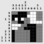
## Heatmap: Unlabeled Data Grid
### Overview
The image presents a grayscale heatmap with numerical labels along the top and left edges. The heatmap consists of a grid of cells, each shaded with a different intensity of gray, representing a value. There is no explicit legend provided, so the mapping between grayscale intensity and numerical value is inferred from the labels.
### Components/Axes
* **X-axis (Top):** Labeled with the numbers 2, 3, 2, 4, 2, 3, 3.
* **Y-axis (Left):** Labeled with the numbers 5, 1, 4, 5, 5, 6, 2, 3, 3, 1, 1, 4.
* **Grid:** A 12x7 grid of cells, each with a grayscale value.
### Detailed Analysis
The heatmap data can be represented as a matrix, where the row index corresponds to the Y-axis label and the column index corresponds to the X-axis label. The grayscale intensity of each cell represents a value. I will describe the grayscale intensity qualitatively, using "light" (closest to white), "medium" (mid-gray), and "dark" (closest to black).
Here's a breakdown of the grayscale values, row by row, column by column:
* **Row 1 (5):** Light, Light, Medium, Dark, Medium, Light, Light
* **Row 2 (1):** Light, Dark, Light, Light, Medium, Medium, Light
* **Row 3 (4):** Medium, Light, Light, Medium, Dark, Light, Light
* **Row 4 (5):** Medium, Medium, Dark, Medium, Medium, Dark, Medium
* **Row 5 (5):** Dark, Medium, Medium, Light, Medium, Medium, Medium
* **Row 6 (6):** Light, Dark, Medium, Medium, Light, Light, Light
* **Row 7 (2):** Light, Light, Dark, Medium, Medium, Light, Light
* **Row 8 (3):** Light, Medium, Medium, Light, Dark, Medium, Medium
* **Row 9 (3):** Medium, Light, Dark, Medium, Light, Light, Light
* **Row 10 (1):** Light, Light, Light, Medium, Medium, Light, Light
* **Row 11 (1):** Light, Light, Medium, Light, Light, Light, Light
* **Row 12 (4):** Light, Medium, Dark, Dark, Medium, Light, Light
### Key Observations
* The heatmap does not exhibit a clear, simple trend. The grayscale values appear somewhat randomly distributed.
* The top-right corner of the heatmap (columns 5, 6, and 7) generally contains lighter shades of gray.
* The bottom-left corner (rows 10, 11, and 12, columns 1, 2, and 3) also tends to have lighter shades.
* There are several isolated dark cells scattered throughout the grid.
### Interpretation
The image presents a data grid without a clear context or explanation. Without knowing what the X and Y axes represent, and without a legend to interpret the grayscale values, it's difficult to draw meaningful conclusions. It could represent a correlation matrix, a spatial distribution of values, or any other type of two-dimensional data. The lack of labels and a legend makes it impossible to determine the significance of the observed patterns. The data appears to be discrete, as the grayscale values seem to fall into a limited number of categories (light, medium, dark). The distribution of these categories doesn't suggest any obvious relationships or trends. It is possible that the data is noisy or represents a complex system with many interacting variables.