## Heatmap: Grid with Numerical Labels and Color-Coded Cells
### Overview
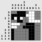
The image depicts a grid-based heatmap with numerical labels on the top row and left column. The grid cells are colored in black, white, and gray, with a legend in the top-left corner indicating the color coding. The heatmap appears to represent a matrix of values, with the numerical labels likely corresponding to categories or indices.
### Components/Axes
- **Top Row (X-axis)**: Numerical labels: `3, 2, 4, 2, 3, 3` (7 values).
- **Left Column (Y-axis)**: Numerical labels: `5, 1, 4, 5, 6, 2, 3, 3, 1, 1, 4` (11 values).
- **Legend**: Located in the top-left corner, with three color categories:
- **Black**: Darkest shade (likely highest values).
- **White**: Lightest shade (likely lowest values).
- **Gray**: Intermediate shade (moderate values).
### Detailed Analysis
- **Grid Structure**:
- The grid has 7 columns (top row) and 11 rows (left column), forming a 7x11 matrix.
- Each cell’s color corresponds to the legend, with no explicit numerical values provided in the cells themselves.
- **Color Distribution**:
- **Black cells**: Concentrated in the bottom-right quadrant (rows 6–11, columns 4–7).
- **White cells**: Scattered in the top-left quadrant (rows 1–5, columns 1–3).
- **Gray cells**: Predominantly in the middle regions (rows 3–5, columns 2–4).
- **Numerical Labels**:
- Top row labels (`3, 2, 4, 2, 3, 3`) may represent column categories or indices.
- Left column labels (`5, 1, 4, 5, 6, 2, 3, 3, 1, 1, 4`) may represent row categories or indices.
### Key Observations
1. **Concentration of Black Cells**: The bottom-right quadrant (rows 6–11, columns 4–7) has the highest density of black cells, suggesting a cluster of high-value data points.
2. **Sparse White Cells**: White cells are limited to the top-left quadrant, indicating lower values in this region.
3. **Intermediate Gray Cells**: The middle rows and columns (rows 3–5, columns 2–4) show a mix of gray cells, suggesting moderate values.
4. **Asymmetry**: The distribution of colors is uneven, with no clear symmetry in the grid.
### Interpretation
The heatmap likely visualizes a dataset where values are categorized by the numerical labels on the axes. The concentration of black cells in the bottom-right suggests a significant cluster of high-intensity or high-frequency data points in that region. The sparse white cells in the top-left may indicate rare or low-value occurrences. The gray cells in the middle could represent transitional or average values.
The numerical labels on the axes might correspond to specific categories (e.g., time periods, groups, or measurements), but without additional context, their exact meaning remains ambiguous. The legend’s color coding is critical for interpreting the data, as it directly maps visual elements to value ranges.
**Note**: The image does not include explicit numerical data points or a title, limiting the ability to quantify trends beyond visual patterns. The absence of a clear axis title or legend description further complicates interpretation.