\n
## Scatter Plots: Two-Panel Comparison
### Overview
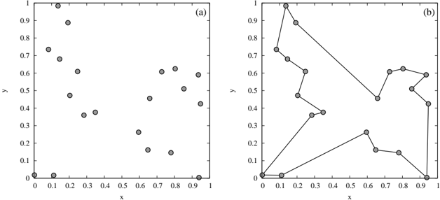
The image presents two scatter plots, labeled (a) and (b), both depicting a relationship between two variables, 'x' and 'y'. Plot (a) shows a random distribution of points, while plot (b) displays a connected line graph derived from a set of points. Both plots share the same x and y axis scales.
### Components/Axes
Both plots share the following:
* **X-axis:** Labeled "x", ranging from 0.0 to 1.0 with tick marks at 0.1 intervals.
* **Y-axis:** Labeled "y", ranging from 0.0 to 1.0 with tick marks at 0.1 intervals.
* **Plot (a):** Contains approximately 20 circular data points scattered across the plot area.
* **Plot (b):** Contains approximately 10 circular data points connected by straight lines, forming a polygonal path.
### Detailed Analysis or Content Details
**Plot (a):**
The points in plot (a) appear randomly distributed. Approximate coordinates (with uncertainty of ±0.02) are:
* (0.02, 0.02)
* (0.05, 0.62)
* (0.08, 0.85)
* (0.12, 0.55)
* (0.15, 0.42)
* (0.20, 0.35)
* (0.25, 0.68)
* (0.30, 0.48)
* (0.35, 0.32)
* (0.40, 0.50)
* (0.45, 0.40)
* (0.50, 0.25)
* (0.55, 0.60)
* (0.60, 0.52)
* (0.65, 0.22)
* (0.70, 0.45)
* (0.75, 0.65)
* (0.80, 0.58)
* (0.85, 0.42)
* (0.90, 0.38)
**Plot (b):**
The line in plot (b) exhibits a non-monotonic trend. Approximate coordinates (with uncertainty of ±0.02) are:
* (0.00, 0.00)
* (0.10, 0.95)
* (0.20, 0.70)
* (0.30, 0.35)
* (0.40, 0.40)
* (0.50, 0.55)
* (0.60, 0.62)
* (0.70, 0.48)
* (0.80, 0.20)
* (0.90, 0.40)
### Key Observations
* Plot (a) shows no clear correlation between x and y.
* Plot (b) demonstrates a complex relationship between x and y, with increasing and decreasing segments. The line initially rises sharply, then declines, fluctuates, and ends with a slight increase.
### Interpretation
The two plots likely represent different aspects of the same underlying phenomenon or two distinct phenomena. Plot (a) could represent a random sample or a system with no apparent linear relationship between the variables. Plot (b) suggests a more deterministic or process-driven relationship, where the value of 'y' is influenced by 'x' in a non-linear manner. The shape of the curve in plot (b) could indicate a cyclical process, a response to a series of inputs, or a complex interaction between multiple factors. Without further context, it's difficult to determine the specific meaning of these plots, but they clearly demonstrate contrasting data patterns. The use of a connected line in (b) implies that the data points are ordered and represent a sequence or a trajectory.