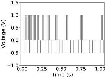
## Bar Chart: Voltage vs. Time
### Overview
The image is a bar chart displaying voltage (V) over time (s). The chart shows discrete voltage spikes at various time intervals. The voltage appears to be either 0V or 1V.
### Components/Axes
* **X-axis (Horizontal):** Time (s), ranging from 0.00 to 1.00, with tick marks at intervals of 0.25. There are also minor tick marks at intervals of 0.04166666666666667.
* **Y-axis (Vertical):** Voltage (V), ranging from -1.0 to 1.5, with tick marks at intervals of 0.5.
* **Data:** Vertical bars representing voltage at specific time points. The bars are gray.
### Detailed Analysis
The chart shows voltage spikes occurring at the following approximate times:
* Around 0.02 s: Several closely spaced spikes.
* Around 0.12 s: A single spike.
* Around 0.20 s: A single spike.
* Around 0.28 s: A single spike.
* Around 0.40 s: A single spike.
* Around 0.52 s: A single spike.
* Around 0.68 s: A single spike.
* Around 0.76 s: A single spike.
* Around 1.00 s: A single spike.
The voltage during these spikes appears to be approximately 1.0 V. At all other times, the voltage is 0 V.
### Key Observations
* The voltage is primarily at 0V, with intermittent spikes to 1V.
* The spikes are not evenly distributed over time. There is a cluster of spikes near the beginning of the time interval.
### Interpretation
The chart represents a digital signal where the voltage is either low (0V) or high (1V). The spikes indicate instances where the signal is high. The pattern of spikes suggests a specific event or process occurring at those times. The clustering of spikes at the beginning might indicate an initial setup or burst of activity.