## Bar Chart: Output Preference by Method
### Overview
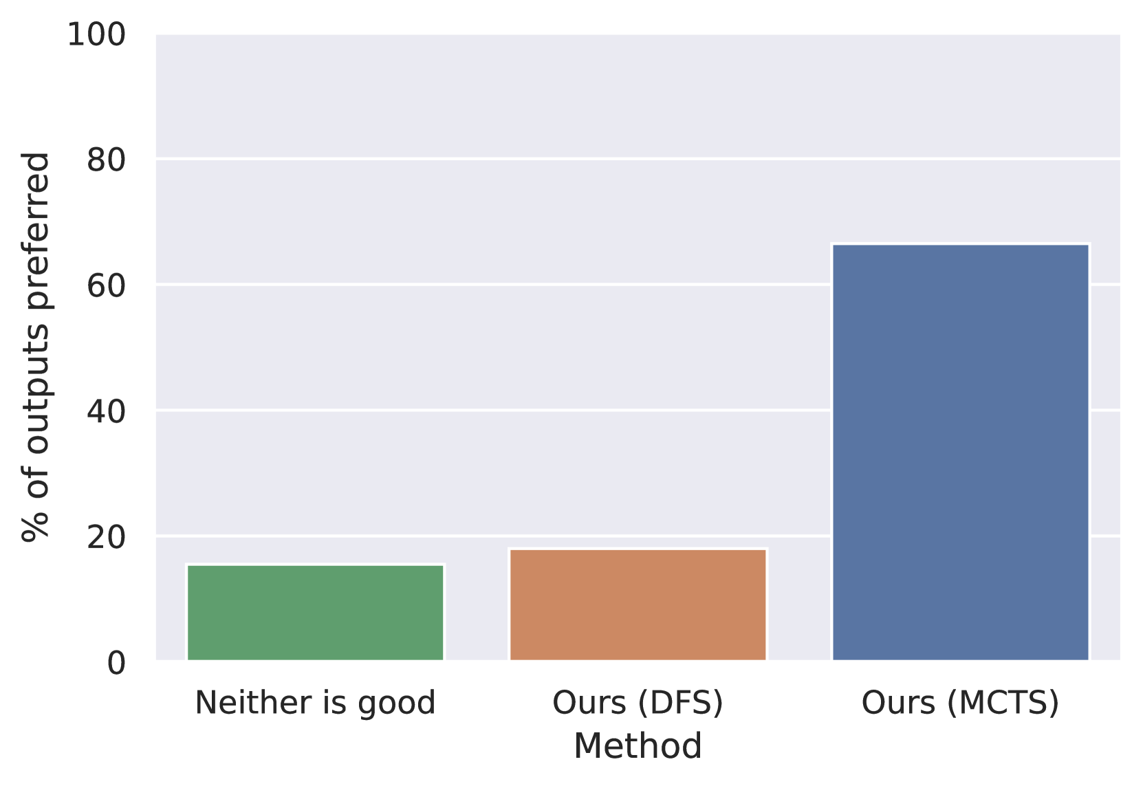
The image is a bar chart comparing the percentage of preferred outputs for three different methods: "Neither is good," "Ours (DFS)," and "Ours (MCTS)." The y-axis represents the percentage of outputs preferred, ranging from 0 to 100. The x-axis represents the method used.
### Components/Axes
* **X-axis:** "Method" with categories: "Neither is good," "Ours (DFS)," and "Ours (MCTS)."
* **Y-axis:** "% of outputs preferred," with a scale from 0 to 100. Major gridlines are present at intervals of 20.
### Detailed Analysis
* **Neither is good:** The green bar indicates approximately 15% of outputs are preferred when "Neither is good."
* **Ours (DFS):** The brown bar indicates approximately 18% of outputs are preferred when using "Ours (DFS)."
* **Ours (MCTS):** The blue bar indicates approximately 66% of outputs are preferred when using "Ours (MCTS)."
### Key Observations
* "Ours (MCTS)" has a significantly higher percentage of preferred outputs compared to the other two methods.
* "Neither is good" and "Ours (DFS)" have relatively similar percentages of preferred outputs.
### Interpretation
The bar chart suggests that the "Ours (MCTS)" method produces outputs that are preferred by users significantly more often than the "Ours (DFS)" method or when neither output is considered good. This implies that the "Ours (MCTS)" method is more effective in generating desirable outputs compared to the other two options. The difference between "Neither is good" and "Ours (DFS)" is minimal, suggesting that "Ours (DFS)" provides only a slight improvement over having no good output at all.