## Bar Chart: Preference of Outputs by Method
### Overview
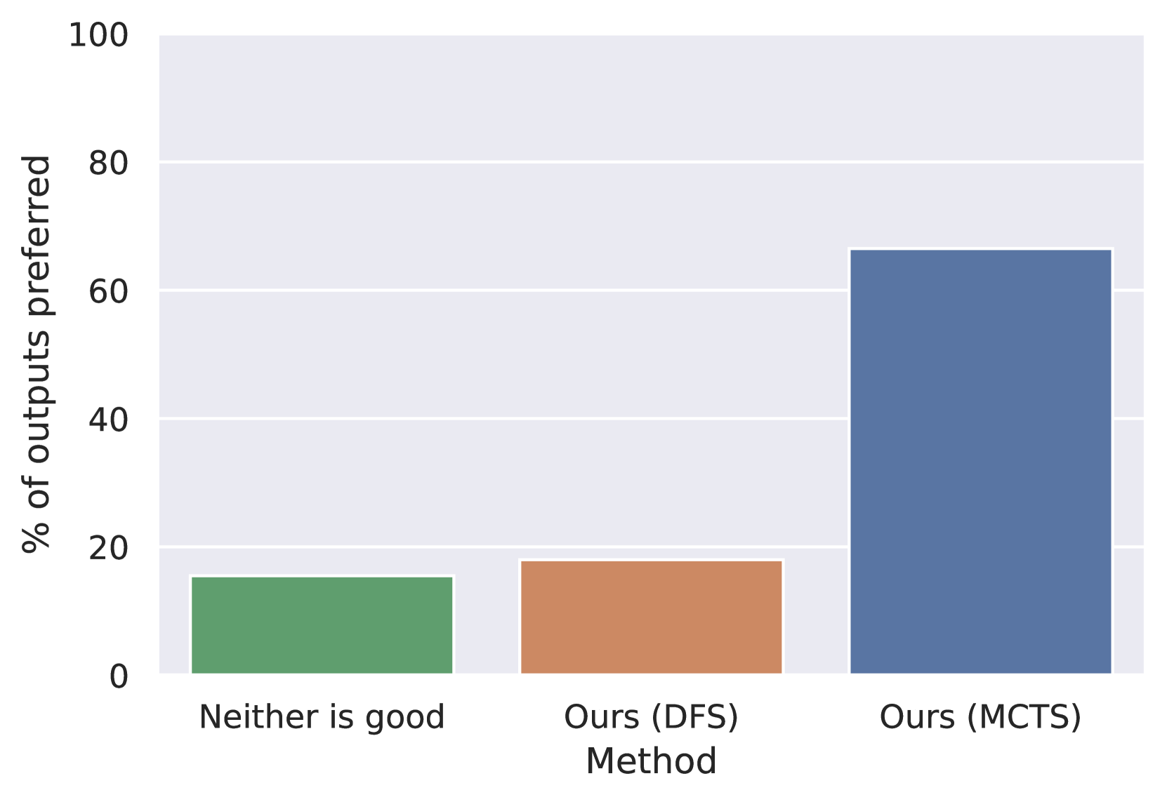
This image displays a bar chart comparing the preference of outputs generated by three different methods: "Neither is good", "Ours (DFS)", and "Ours (MCTS)". The y-axis represents the "% of outputs preferred", ranging from 0 to 100. The x-axis categorizes the methods.
### Components/Axes
* **Y-axis Title**: "% of outputs preferred"
* **Y-axis Scale**: 0, 20, 40, 60, 80, 100
* **X-axis Title**: "Method"
* **X-axis Categories**:
* "Neither is good"
* "Ours (DFS)"
* "Ours (MCTS)"
### Content Details
The chart displays three bars, each representing a method and its corresponding preference percentage:
1. **"Neither is good"**: This bar is colored green. It reaches a height of approximately 15%.
2. **"Ours (DFS)"**: This bar is colored orange/brown. It reaches a height of approximately 18%.
3. **"Ours (MCTS)"**: This bar is colored blue. It reaches a height of approximately 67%.
### Key Observations
* The "Ours (MCTS)" method has a significantly higher preference percentage compared to the other two methods.
* The "Ours (DFS)" method shows a slightly higher preference than the "Neither is good" category.
* The preference for "Ours (MCTS)" is more than three times that of "Ours (DFS)" and more than four times that of "Neither is good".
### Interpretation
The data presented in this bar chart strongly suggests that the "Ours (MCTS)" method is the most preferred among the evaluated options. The "Ours (DFS)" method shows a marginal improvement over the baseline of "Neither is good", indicating that both "Ours (DFS)" and "Neither is good" are not as effective or appealing as "Ours (MCTS)". The substantial difference in preference for "Ours (MCTS)" implies a superior performance or quality of outputs generated by this method. This could be due to various underlying factors related to the algorithms or parameters used in each method, leading to a more favorable user perception for "Ours (MCTS)".