\n
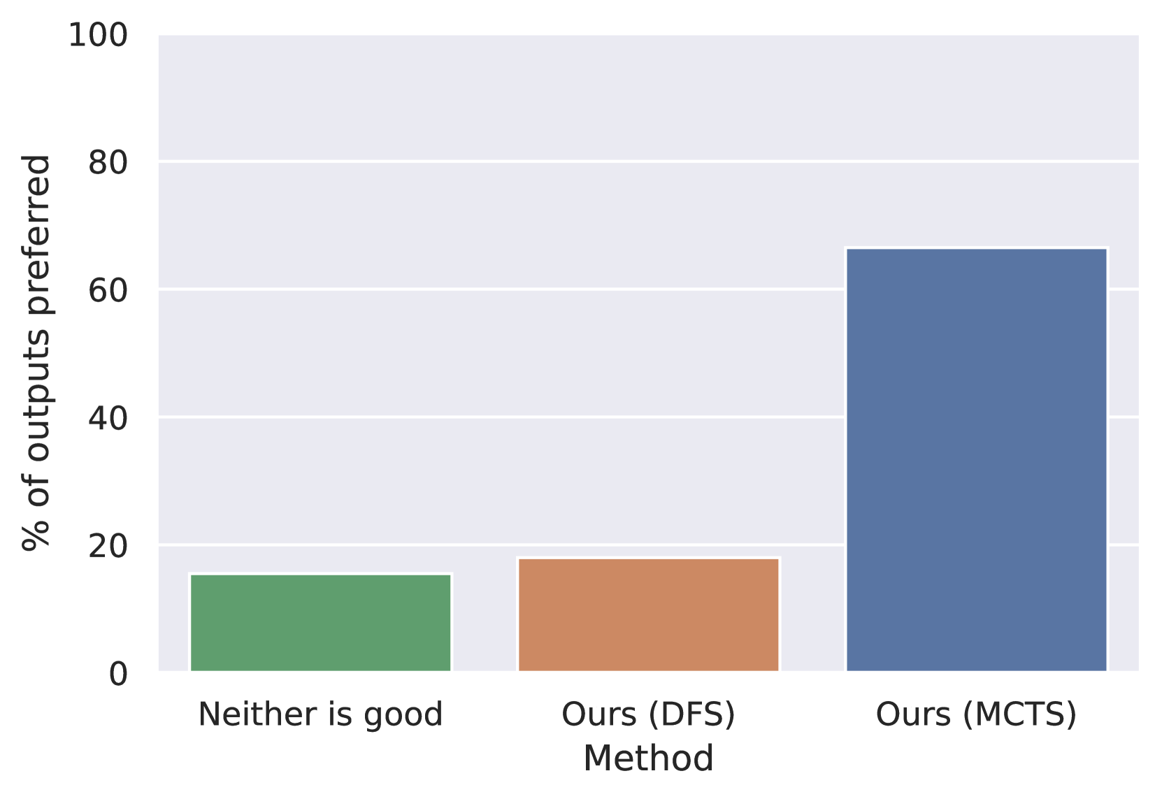
## Bar Chart: Preference for Output Methods
### Overview
This is a bar chart comparing the percentage of outputs preferred for three different methods: "Neither is good", "Ours (DFS)", and "Ours (MCTS)". The y-axis represents the percentage of outputs preferred, ranging from 0 to 100. The x-axis represents the different methods being compared.
### Components/Axes
* **X-axis Label:** "Method"
* **Y-axis Label:** "% of outputs preferred"
* **X-axis Categories:** "Neither is good", "Ours (DFS)", "Ours (MCTS)"
* **Bar Colors:**
* "Neither is good": Green
* "Ours (DFS)": Orange/Brown
* "Ours (MCTS)": Blue
### Detailed Analysis
* **"Neither is good" Bar:** The green bar starts at approximately 17% and extends to approximately 19%.
* **"Ours (DFS)" Bar:** The orange/brown bar starts at approximately 18% and extends to approximately 22%.
* **"Ours (MCTS)" Bar:** The blue bar starts at approximately 64% and extends to approximately 68%.
### Key Observations
The "Ours (MCTS)" method is significantly preferred over the other two methods. The "Neither is good" and "Ours (DFS)" methods have relatively low preference percentages, with "Ours (DFS)" being slightly higher than "Neither is good".
### Interpretation
The data suggests that the "Ours (MCTS)" method generates outputs that are substantially more desirable than those produced by "Ours (DFS)" or when neither output is considered good. This indicates that the MCTS approach is more effective in generating satisfactory results, potentially due to its search algorithm or exploration strategy. The low preference for "Neither is good" suggests that the baseline or alternative approaches are generally inadequate. The difference between "Ours (DFS)" and "Neither is good" is small, indicating that the DFS method offers a marginal improvement over having no good output. This could be due to the DFS method being a simpler approach that sometimes produces acceptable results, while the MCTS method consistently delivers better outcomes.