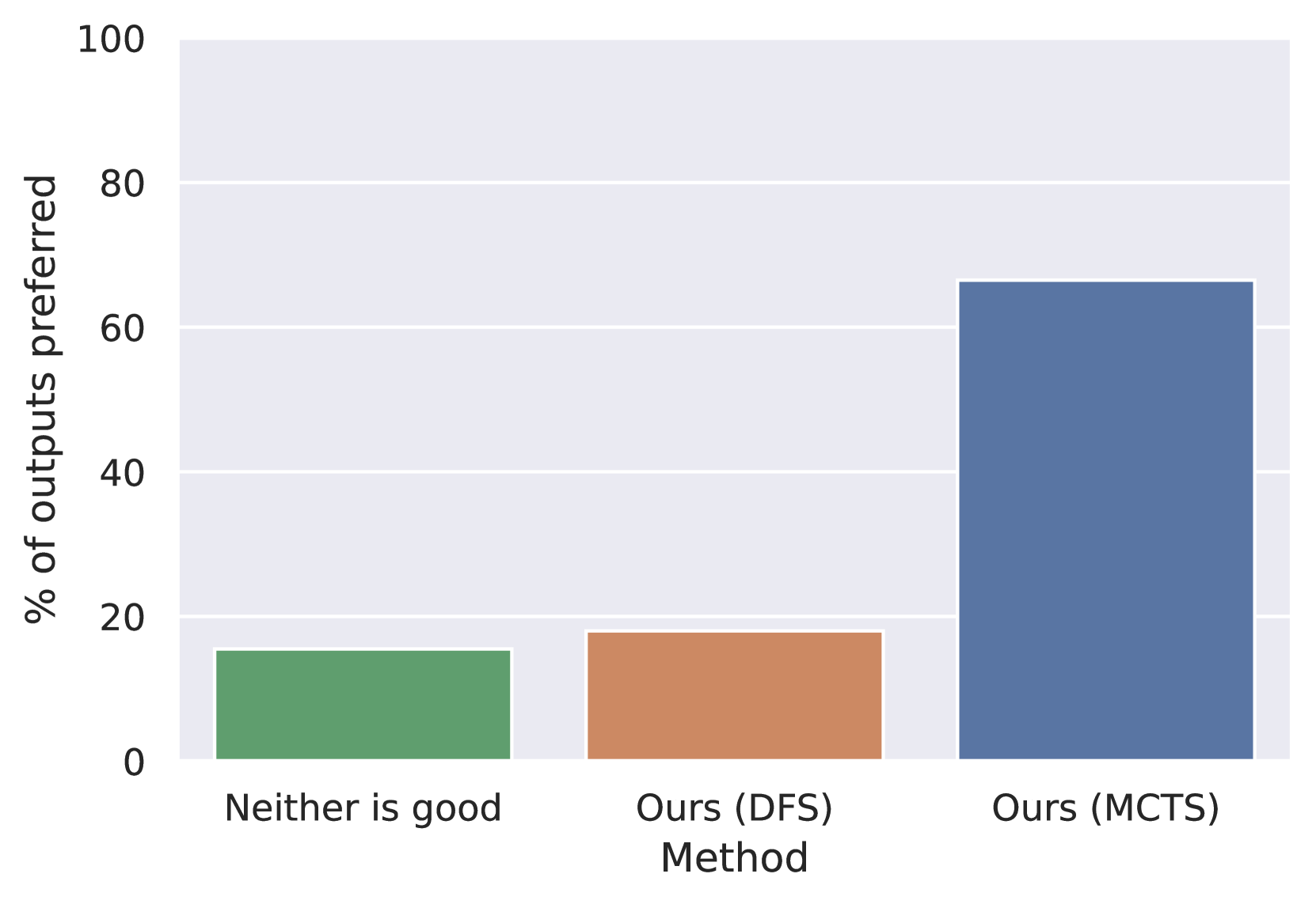
## Bar Chart: Preference Percentage by Method
### Overview
The image displays a vertical bar chart comparing the percentage of outputs preferred for three distinct categories or methods. The chart uses a simple, clean design with a light gray background and white horizontal grid lines.
### Components/Axes
* **Y-Axis (Vertical):**
* **Label:** "% of outputs preferred"
* **Scale:** Linear scale from 0 to 100.
* **Major Tick Marks:** 0, 20, 40, 60, 80, 100.
* **X-Axis (Horizontal):**
* **Label:** "Method"
* **Categories (from left to right):**
1. "Neither is good"
2. "Ours (DFS)"
3. "Ours (MCTS)"
* **Legend:** Not present as a separate element. The categories are directly labeled on the x-axis, and each bar is a distinct color corresponding to its label.
* **Spatial Layout:** The chart area occupies the majority of the image. The y-axis label is positioned vertically along the left edge. The x-axis label and category names are centered below their respective bars at the bottom.
### Detailed Analysis
The chart presents three data points, each represented by a colored bar:
1. **"Neither is good" (Green Bar, Left):**
* **Visual Trend:** The bar is the shortest of the three.
* **Approximate Value:** The top of the bar aligns between the 0 and 20 grid lines, closer to 20. Estimated value: **~15%**.
2. **"Ours (DFS)" (Orange Bar, Center):**
* **Visual Trend:** The bar is slightly taller than the green bar to its left but significantly shorter than the blue bar to its right.
* **Approximate Value:** The top of the bar is just below the 20 grid line. Estimated value: **~18%**.
3. **"Ours (MCTS)" (Blue Bar, Right):**
* **Visual Trend:** The bar is the tallest by a large margin, dominating the chart.
* **Approximate Value:** The top of the bar is above the 60 grid line but below the 80 line. It appears to be roughly one-third of the way from 60 to 80. Estimated value: **~66%**.
### Key Observations
* There is a stark disparity in preference between the "Ours (MCTS)" method and the other two categories.
* The preference for "Ours (MCTS)" is more than three times higher than that for "Ours (DFS)" and more than four times higher than "Neither is good."
* The difference in preference between "Neither is good" (~15%) and "Ours (DFS)" (~18%) is relatively small (approximately 3 percentage points).
### Interpretation
This chart likely presents results from a user preference study or an automated evaluation comparing different algorithmic approaches (DFS and MCTS variants of a proposed method) against a baseline where neither output was deemed good.
* **Primary Finding:** The "Ours (MCTS)" method is overwhelmingly preferred, suggesting it produces outputs that are considered superior in the vast majority of cases (~66%) compared to the alternative method and the failure case.
* **Secondary Finding:** The "Ours (DFS)" method shows only a marginal improvement over the "Neither is good" baseline. This indicates that the DFS variant may not offer a substantial practical benefit in terms of output quality as perceived by the evaluators.
* **Implication:** The data strongly advocates for the MCTS-based approach over the DFS-based one within the context of this evaluation. The low "Neither is good" rate (~15%) also suggests that the evaluated systems (particularly MCTS) are generally capable of producing at least acceptable outputs. The chart effectively communicates a clear performance hierarchy: MCTS >> DFS ≈ Neither.