## Bar Chart: Comparison of Output Preferences by Method
### Overview
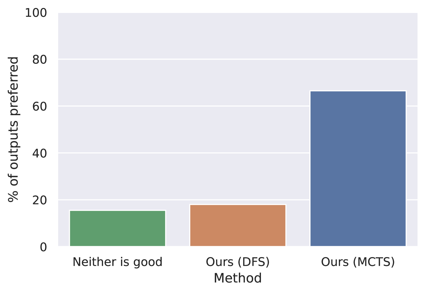
The chart compares the percentage of outputs preferred across three methods: "Neither is good," "Ours (DFS)," and "Ours (MCTS)." The y-axis represents the percentage of outputs preferred (0–100%), while the x-axis lists the methods. The data shows a stark preference for "Ours (MCTS)" over the other methods.
### Components/Axes
- **X-axis (Method)**:
- Labels: "Neither is good" (green), "Ours (DFS)" (orange), "Ours (MCTS)" (blue).
- **Y-axis (% of outputs preferred)**:
- Scale: 0 to 100% in increments of 20.
- **Legend**:
- Colors: Green (#32CD32), Orange (#FF4500), Blue (#1E90FF).
- Positioned at the bottom of the chart, aligned with the x-axis labels.
### Detailed Analysis
- **Neither is good (Green)**:
- Height: ~15% of outputs preferred.
- Color matches legend (green).
- **Ours (DFS) (Orange)**:
- Height: ~18% of outputs preferred.
- Color matches legend (orange).
- **Ours (MCTS) (Blue)**:
- Height: ~65% of outputs preferred.
- Color matches legend (blue).
### Key Observations
1. "Ours (MCTS)" is overwhelmingly preferred, with ~65% of outputs selected.
2. "Neither is good" is the least preferred method at ~15%.
3. "Ours (DFS)" has slightly higher preference (~18%) than "Neither is good" but remains far below "Ours (MCTS)."
### Interpretation
The data suggests that "Ours (MCTS)" is significantly more effective or preferred compared to the other methods. The stark contrast between "Ours (MCTS)" and the other two methods implies that MCTS may offer superior performance or user satisfaction. The near-identical preference for "Neither is good" and "Ours (DFS)" could indicate that DFS is only marginally better than the baseline ("Neither is good"), or that both are underperforming relative to MCTS. This chart highlights the dominance of MCTS in the evaluated context, warranting further investigation into its advantages.