## Pie Chart: Journal Distribution by Quarter
### Overview
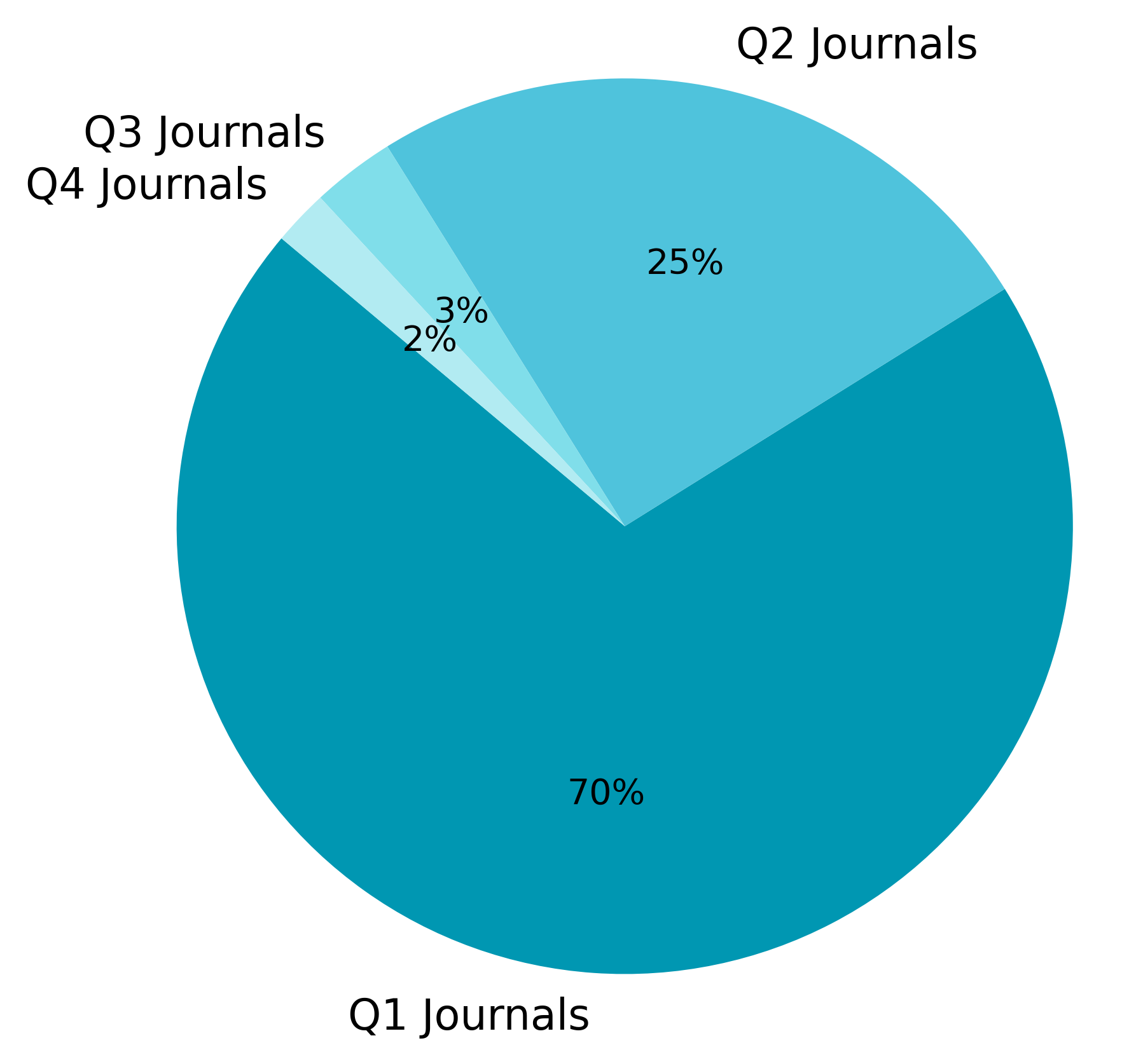
The image is a pie chart illustrating the distribution of journals across four quarters (Q1, Q2, Q3, and Q4). The chart uses different shades of blue to represent each quarter's proportion. Q1 journals make up the majority, followed by Q2, with Q3 and Q4 having smaller percentages.
### Components/Axes
* **Chart Type**: Pie Chart
* **Categories**:
* Q1 Journals
* Q2 Journals
* Q3 Journals
* Q4 Journals
* **Colors**:
* Q1 Journals: Dark Teal
* Q2 Journals: Medium Turquoise
* Q3 Journals: Light Turquoise
* Q4 Journals: Very Light Turquoise
* **Percentages**: Represented directly on the pie chart slices.
### Detailed Analysis
* **Q1 Journals**: Occupies the largest portion of the pie chart, with a value of 70%. The slice is colored dark teal.
* **Q2 Journals**: The second largest slice, colored medium turquoise, representing 25%.
* **Q3 Journals**: A smaller slice, colored light turquoise, representing 3%.
* **Q4 Journals**: The smallest slice, colored very light turquoise, representing 2%.
### Key Observations
* Q1 journals constitute a significant majority (70%) of the total.
* Q2 journals represent a substantial portion (25%), while Q3 and Q4 journals are relatively minor (3% and 2%, respectively).
* There is a clear disparity in the distribution of journals across the four quarters, with Q1 dominating.
### Interpretation
The pie chart indicates a highly uneven distribution of journals across the four quarters. The concentration of 70% of journals in Q1 suggests a potential seasonal trend, a strategic focus on Q1, or other factors influencing publication timing. The relatively small percentages for Q3 and Q4 might indicate a slowdown in journal publications during those periods. Further investigation would be needed to determine the underlying reasons for this distribution.