\n
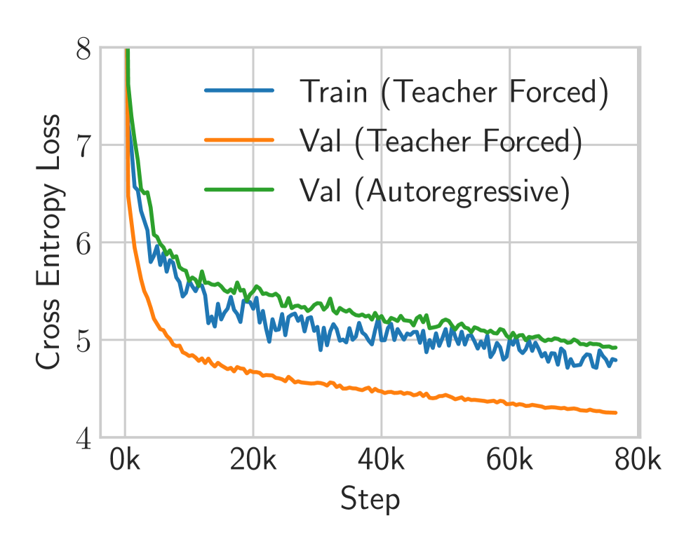
## Line Chart: Training and Validation Cross Entropy Loss
### Overview
The image displays a line chart tracking the cross entropy loss of a machine learning model over the course of training. It compares three different loss curves: training loss using teacher forcing, validation loss using teacher forcing, and validation loss using autoregressive generation. The chart illustrates the model's learning progression and the performance gap between training and validation under different inference modes.
### Components/Axes
* **Chart Type:** Line chart.
* **Y-Axis (Vertical):**
* **Label:** "Cross Entropy Loss"
* **Scale:** Linear scale ranging from 4 to 8.
* **Major Tick Marks:** 4, 5, 6, 7, 8.
* **X-Axis (Horizontal):**
* **Label:** "Step"
* **Scale:** Linear scale representing training steps, marked in thousands (k).
* **Major Tick Marks:** 0k, 20k, 40k, 60k, 80k.
* **Legend:**
* **Position:** Top-right quadrant of the chart area.
* **Series 1:** Blue line, labeled "Train (Teacher Forced)".
* **Series 2:** Orange line, labeled "Val (Teacher Forced)".
* **Series 3:** Green line, labeled "Val (Autoregressive)".
### Detailed Analysis
**1. Train (Teacher Forced) - Blue Line:**
* **Trend:** Starts at a very high loss (off the chart, >8 at step 0), experiences a steep initial descent, then transitions to a noisy, gradually decreasing trend with significant variance.
* **Approximate Data Points:**
* Step ~0k: Loss > 8 (initial point not fully visible).
* Step ~5k: Loss ≈ 6.0.
* Step ~20k: Loss ≈ 5.3 (with fluctuations between ~5.1 and 5.5).
* Step ~40k: Loss ≈ 5.1 (fluctuating between ~4.9 and 5.3).
* Step ~60k: Loss ≈ 5.0 (fluctuating between ~4.8 and 5.2).
* Step ~80k: Loss ≈ 4.8 (fluctuating between ~4.7 and 5.0).
**2. Val (Teacher Forced) - Orange Line:**
* **Trend:** Starts high, descends very steeply and smoothly in the initial phase, then continues a steady, smooth decline with minimal noise, consistently maintaining the lowest loss of the three series.
* **Approximate Data Points:**
* Step ~0k: Loss ≈ 7.5.
* Step ~5k: Loss ≈ 5.5.
* Step ~20k: Loss ≈ 4.7.
* Step ~40k: Loss ≈ 4.5.
* Step ~60k: Loss ≈ 4.4.
* Step ~80k: Loss ≈ 4.2.
**3. Val (Autoregressive) - Green Line:**
* **Trend:** Starts at the highest visible point, descends steeply but less sharply than the orange line, then follows a smooth, gradual decline. It remains consistently above the "Val (Teacher Forced)" line throughout training.
* **Approximate Data Points:**
* Step ~0k: Loss ≈ 8.0.
* Step ~5k: Loss ≈ 6.2.
* Step ~20k: Loss ≈ 5.5.
* Step ~40k: Loss ≈ 5.2.
* Step ~60k: Loss ≈ 5.1.
* Step ~80k: Loss ≈ 5.0.
### Key Observations
1. **Performance Hierarchy:** The validation loss under teacher forcing (orange) is consistently the lowest, followed by the training loss (blue), with the validation loss under autoregressive generation (green) being the highest.
2. **Convergence:** All three loss curves show a clear downward trend, indicating the model is learning. The rate of improvement slows significantly after approximately 20,000 to 40,000 steps.
3. **Noise vs. Smoothness:** The training loss (blue) exhibits considerable high-frequency noise or variance, which is typical as it's calculated on mini-batches. Both validation curves (orange and green) are much smoother, as they are likely computed over the entire validation set.
4. **Generalization Gap:** There is a persistent gap between the two validation curves. The "Val (Autoregressive)" loss is approximately 0.8 to 1.0 points higher than the "Val (Teacher Forced)" loss at the end of training (80k steps). This quantifies the performance degradation when the model generates sequences autoregressively (using its own predictions) versus when it is guided by ground-truth tokens (teacher forcing) during validation.
### Interpretation
This chart is a diagnostic tool for sequence model training (e.g., a language model or time-series forecaster). The data suggests:
* **Successful Learning:** The model is effectively minimizing cross entropy loss on both training and validation data, indicating it is learning the underlying patterns in the dataset.
* **Teacher Forcing vs. Autoregressive Inference:** The significant and persistent gap between the orange and green validation curves highlights a core challenge in sequence modeling: **exposure bias**. The model performs better when its predictions are conditioned on perfect ground-truth data (teacher forcing) than when it must rely on its own, potentially erroneous, previous predictions during autoregressive generation. This gap represents the real-world performance penalty the model will incur during deployment.
* **Training Dynamics:** The noisy blue training curve suggests the use of stochastic gradient descent with mini-batches. The smooth validation curves indicate stable evaluation. The plateauing of all curves after ~40k steps suggests diminishing returns from further training under the current hyperparameters (learning rate, etc.), and that the model may be approaching its capacity for this specific task and dataset.
* **Potential for Overfitting:** While both validation losses are decreasing, the fact that the training loss (blue) remains higher than the "Val (Teacher Forced)" loss (orange) is unusual. Typically, training loss is lower than validation loss. This could indicate a specific characteristic of the loss calculation, regularization techniques (like dropout) active only during training, or that the training set is more challenging than the validation set. It does not show classic overfitting (where training loss continues to drop while validation loss rises).
In summary, the chart demonstrates a model that learns effectively but suffers from a measurable exposure bias, and its training process is stable but may benefit from hyperparameter tuning to close the generalization gap and reduce the noise in the training loss.