## Chart: Velocity vs. Radius
### Overview
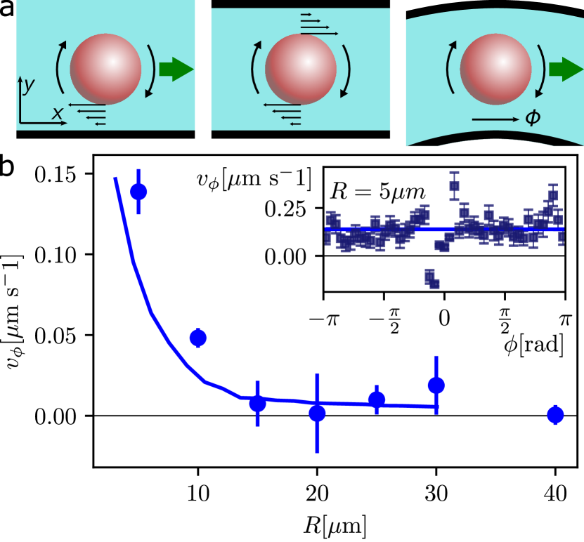
The image consists of two parts: a schematic diagram at the top illustrating a sphere moving through different channel geometries, and a graph at the bottom showing the relationship between velocity (v_φ) and radius (R). An inset graph shows v_φ as a function of angle φ for a fixed radius.
### Components/Axes
**Top Schematic Diagrams:**
* Three diagrams showing a sphere (red) moving through a channel (light blue).
* Diagram 1: Sphere moving in a straight channel. Arrows indicate the direction of motion and fluid flow. x and y axes are labeled.
* Diagram 2: Sphere rotating in a straight channel. Arrows indicate the direction of motion, fluid flow, and rotation.
* Diagram 3: Sphere moving in a curved channel. Arrows indicate the direction of motion and fluid flow. Angle φ is labeled.
**Main Chart:**
* **X-axis:** R [µm] (Radius in micrometers). Scale ranges from 0 to 40 µm, with tick marks at 10, 20, 30, and 40 µm.
* **Y-axis:** v_φ [µm s⁻¹] (Velocity in micrometers per second). Scale ranges from 0.00 to 0.15 µm s⁻¹, with tick marks at 0.00, 0.05, 0.10, and 0.15 µm s⁻¹.
* Data points are shown as blue circles with error bars.
* A blue line connects the data points, showing the trend.
* A horizontal line at y = 0.00.
**Inset Chart:**
* **X-axis:** φ [rad] (Angle in radians). Scale ranges from -π to π, with tick marks at -π, -π/2, 0, π/2, and π.
* **Y-axis:** v_φ [µm s⁻¹] (Velocity in micrometers per second). Scale ranges from 0.00 to 0.25 µm s⁻¹.
* Data points are shown as blue squares with error bars.
* A blue line shows the average velocity.
* A horizontal line at y = 0.00.
* Label: R = 5µm
### Detailed Analysis
**Main Chart Data:**
* **Trend:** The blue line shows a decreasing trend in velocity (v_φ) as the radius (R) increases. The velocity drops sharply initially and then plateaus.
* **Data Points:**
* R ≈ 5 µm: v_φ ≈ 0.14 µm s⁻¹
* R ≈ 10 µm: v_φ ≈ 0.05 µm s⁻¹
* R ≈ 20 µm: v_φ ≈ 0.01 µm s⁻¹
* R ≈ 30 µm: v_φ ≈ 0.02 µm s⁻¹
* R ≈ 40 µm: v_φ ≈ 0.00 µm s⁻¹
**Inset Chart Data:**
* **Trend:** The blue line shows a relatively constant velocity (v_φ) as the angle (φ) changes.
* **Data Points:** The data points are scattered around the average velocity line, indicating some variation.
* The average velocity is approximately 0.15 µm s⁻¹.
### Key Observations
* The velocity decreases as the radius increases in the main chart.
* The velocity is relatively constant with respect to the angle in the inset chart.
* The inset chart represents the velocity at a fixed radius of 5 µm.
### Interpretation
The data suggests that the velocity of the sphere is strongly influenced by the radius of the channel. As the channel widens (larger radius), the velocity decreases, possibly due to reduced confinement or changes in the flow profile. The inset chart indicates that, for a fixed radius, the velocity is relatively independent of the angular position. This could imply that the flow is uniform around the sphere at that specific radius. The initial sharp drop in velocity with increasing radius suggests a critical channel size where the confinement effects are most pronounced.