## Line Chart: Accuracy vs. Top η (%)
### Overview
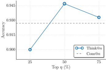
The image is a line chart showing the relationship between "Accuracy" and "Top η (%)". There are two data series: "Think@n" represented by a solid blue line with circle markers, and "Cons@n" represented by a dashed gray line. The chart shows how accuracy changes as the top percentage (η) varies.
### Components/Axes
* **X-axis:** "Top η (%)" with markers at 25, 50, and 75.
* **Y-axis:** "Accuracy" with markers at 0.900, 0.915, 0.930, and 0.945.
* **Legend:** Located at the bottom-right of the chart.
* "Think@n": Solid blue line with circle markers.
* "Cons@n": Dashed gray line.
### Detailed Analysis
* **Think@n:**
* At Top η = 25%, Accuracy ≈ 0.900.
* At Top η = 50%, Accuracy ≈ 0.946.
* At Top η = 75%, Accuracy ≈ 0.931.
* The line slopes upward from 25% to 50%, then slopes downward from 50% to 75%.
* **Cons@n:**
* The dashed gray line is horizontal and constant.
* Accuracy ≈ 0.928 for all values of Top η.
### Key Observations
* The "Think@n" series shows a peak accuracy at Top η = 50%.
* The "Cons@n" series maintains a constant accuracy across all Top η values.
* The "Think@n" series outperforms "Cons@n" at Top η = 50%, but underperforms at Top η = 25%.
### Interpretation
The chart suggests that the "Think@n" method achieves its highest accuracy when considering the top 50% of the data. The "Cons@n" method provides a consistent level of accuracy regardless of the top percentage considered. The "Think@n" method is more sensitive to the choice of Top η, with a noticeable peak in performance at 50%. The "Cons@n" method might be preferred when a stable and predictable accuracy is desired.