\n
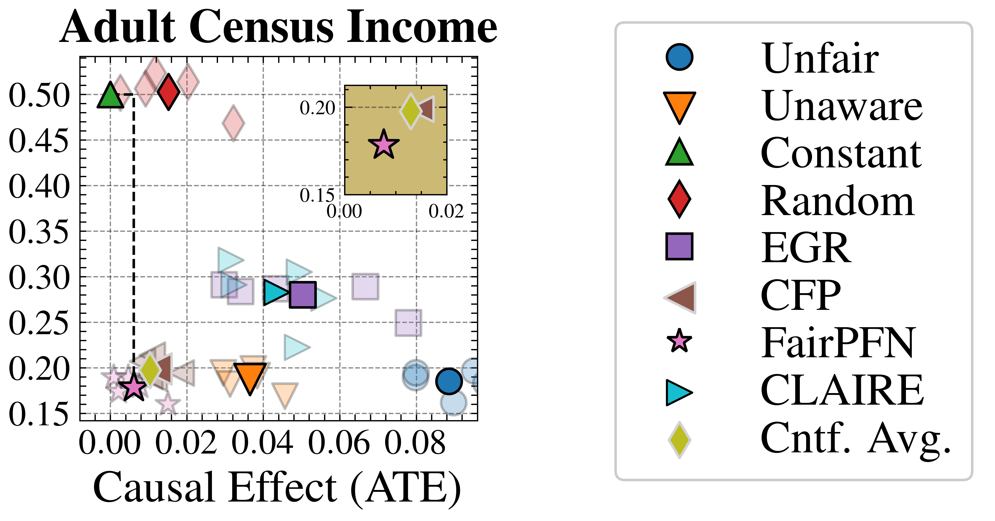
## Scatter Plot: Adult Census Income - Fairness vs. Causal Effect
### Overview
The image is a scatter plot comparing various algorithmic fairness methods on the "Adult Census Income" dataset. It plots each method's performance on two metrics: the y-axis represents a fairness metric (likely a disparity measure, where lower is fairer), and the x-axis represents the "Causal Effect (ATE)" or Average Treatment Effect. A legend on the right maps specific symbols to method names. An inset plot in the top-right corner provides a zoomed-in view of a specific cluster of data points.
### Components/Axes
* **Main Plot Title:** "Adult Census Income" (top-left, above the plot area).
* **Y-Axis:** Numerical scale from 0.15 to 0.50, with major ticks at 0.05 intervals (0.15, 0.20, 0.25, 0.30, 0.35, 0.40, 0.45, 0.50). The axis label is not explicitly written, but based on context, it represents a fairness disparity metric (lower values indicate higher fairness).
* **X-Axis:** Labeled "Causal Effect (ATE)". Numerical scale from 0.00 to 0.08, with major ticks at 0.02 intervals (0.00, 0.02, 0.04, 0.06, 0.08).
* **Legend:** Positioned to the right of the main plot. It lists 10 categories with corresponding symbols:
1. **Unfair:** Blue circle (●)
2. **Unaware:** Orange downward-pointing triangle (▼)
3. **Constant:** Green upward-pointing triangle (▲)
4. **Random:** Red diamond (◆)
5. **EGR:** Purple square (■)
6. **CFP:** Brown left-pointing triangle (◀)
7. **FairPFN:** Pink star (★)
8. **CLAIRE:** Cyan right-pointing triangle (▶)
9. **Cntf. Avg.:** Yellow diamond (◆)
* **Inset Plot:** A smaller plot with a yellow background, located in the top-right quadrant of the main plot area.
* **Inset Y-Axis:** Scale from 0.15 to 0.20.
* **Inset X-Axis:** Scale from 0.00 to 0.02.
* It contains a subset of data points, primarily the pink star (FairPFN) and yellow diamond (Cntf. Avg.), allowing for clearer visualization of their close proximity.
### Detailed Analysis
The plot displays multiple data points for several methods, suggesting results from different runs or configurations. The spatial distribution reveals a clear trade-off.
* **High Fairness, Low Causal Effect Cluster (Top-Left):**
* **Constant (Green ▲):** Positioned at approximately (ATE ≈ 0.00, Fairness ≈ 0.50). This is the highest point on the y-axis, indicating the worst fairness score but a near-zero causal effect.
* **Random (Red ◆):** Several points clustered near (ATE ≈ 0.01, Fairness ≈ 0.50).
* **Cntf. Avg. (Yellow ◆):** Points are located around (ATE ≈ 0.01, Fairness ≈ 0.20). One point is highlighted in the inset at approximately (ATE ≈ 0.015, Fairness ≈ 0.19).
* **Low Fairness, Higher Causal Effect Cluster (Bottom-Right):**
* **Unfair (Blue ●):** Points are clustered at the far right, around (ATE ≈ 0.08, Fairness ≈ 0.18). This represents the baseline with the highest measured causal effect but poor fairness.
* **Intermediate Methods (Central Region):**
* **Unaware (Orange ▼):** Points are near (ATE ≈ 0.04, Fairness ≈ 0.20).
* **EGR (Purple ■):** Points are scattered between ATE 0.03-0.07 and Fairness 0.25-0.30.
* **CFP (Brown ◀):** Points are near (ATE ≈ 0.02, Fairness ≈ 0.20).
* **CLAIRE (Cyan ▶):** Points are scattered between ATE 0.03-0.05 and Fairness 0.25-0.30.
* **FairPFN (Pink ★):** This method is a key focus. In the main plot, its points are clustered in the bottom-left corner near (ATE ≈ 0.005, Fairness ≈ 0.18). The inset plot zooms in on this region, showing the FairPFN star at approximately (ATE ≈ 0.008, Fairness ≈ 0.175), very close to the Cntf. Avg. diamond.
### Key Observations
1. **Pareto Frontier:** The data points form a rough Pareto frontier from the top-left (high fairness, low effect) to the bottom-right (low fairness, high effect). Methods like "Constant" and "Random" are at one extreme, while "Unfair" is at the other.
2. **FairPFN's Position:** FairPFN achieves a very low fairness disparity score (≈0.175-0.18), comparable to the "Unfair" baseline, while maintaining a small but positive causal effect (ATE ≈ 0.008). This suggests it successfully mitigates bias without completely sacrificing predictive utility related to the treatment.
3. **Inset Purpose:** The inset is crucial for distinguishing between FairPFN and Cntf. Avg., which are overlapping in the main plot. It confirms they occupy a similar region of high fairness and low positive causal effect.
4. **Method Variability:** Methods like EGR and CLAIRE show significant spread in their results, indicating sensitivity to initialization or hyperparameters.
### Interpretation
This chart visualizes the fundamental tension in causal fairness: modifying a model to reduce unfairness (lower y-axis value) often comes at the cost of reducing its estimated causal effect on the outcome (lower x-axis value, ATE).
* **What the data suggests:** The "Unfair" model has the strongest measured causal relationship between treatment and outcome but is the most biased. The "Constant" model eliminates bias by making a constant prediction, thereby nullifying any causal effect. The goal of advanced methods like FairPFN, CLAIRE, and EGR is to navigate this trade-off.
* **How elements relate:** The position of each method on this 2D plane is a direct measure of its performance on these two competing objectives. The ideal method would be in the bottom-right corner (high causal effect, high fairness), but the frontier suggests this is difficult to achieve. FairPFN appears to find a favorable compromise, achieving near-optimal fairness with a small, non-zero causal effect.
* **Notable anomalies:** The "Random" method performs surprisingly poorly on fairness (high y-value), indicating that random predictions do not inherently solve bias problems in this context. The significant scatter of some methods (EGR, CLAIRE) highlights the importance of robust evaluation across multiple runs.