## Scatter Plot: Adult Census Income vs. Causal Effect (ATE)
### Overview
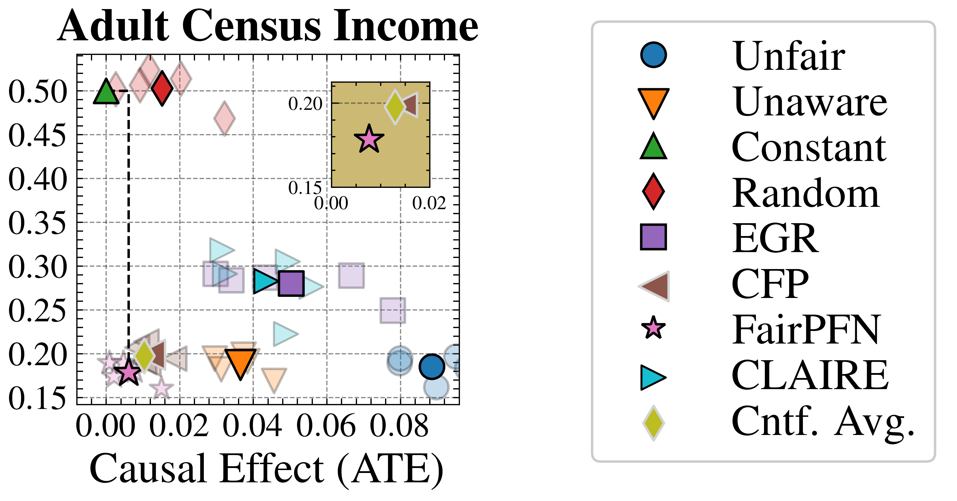
The image is a scatter plot comparing "Adult Census Income" (y-axis) against "Causal Effect (ATE)" (x-axis). Data points are represented by distinct symbols and colors, each corresponding to a method or category (e.g., Unfair, Unaware, Constant). A highlighted box in the top-right corner emphasizes a specific region of interest.
### Components/Axes
- **X-axis (Causal Effect (ATE))**: Ranges from 0.00 to 0.08 in increments of 0.02.
- **Y-axis (Adult Census Income)**: Ranges from 0.15 to 0.50 in increments of 0.05.
- **Legend**: Located on the right, mapping symbols/colors to categories:
- Blue circle: Unfair
- Orange triangle: Unaware
- Green triangle: Constant
- Red diamond: Random
- Purple square: EGR
- Brown triangle: CFP
- Pink star: FairPFN
- Cyan triangle: CLAIRE
- Yellow diamond: Cntf. Avg.
### Detailed Analysis
- **Data Points**:
- **FairPFN (Pink star)**: Positioned at (0.01, 0.18), within the highlighted box.
- **Cntf. Avg. (Yellow diamond)**: Positioned at (0.015, 0.19), also within the highlighted box.
- **Constant (Green triangle)**: At (0.01, 0.48), high income but low causal effect.
- **Random (Red diamond)**: At (0.02, 0.49), slightly higher causal effect than Constant.
- **Unaware (Orange triangle)**: At (0.03, 0.20), mid-range values.
- **Unfair (Blue circle)**: Clustered near (0.07–0.08, 0.15–0.20), low performance in both axes.
- **EGR (Purple square)**: At (0.05, 0.28), moderate values.
- **CFP (Brown triangle)**: At (0.04, 0.27), similar to EGR.
- **CLAIRE (Cyan triangle)**: At (0.06, 0.25), higher causal effect but lower income.
- **Highlighted Box**: A shaded rectangle spans x=0.00–0.02 and y=0.15–0.20, containing FairPFN and Cntf. Avg.
### Key Observations
1. **FairPFN and Cntf. Avg.** are the only points within the highlighted box, suggesting they balance causal effect and income optimally.
2. **Constant** and **Random** methods achieve high income (y ≈ 0.48–0.49) but low causal effect (x ≈ 0.01–0.02), indicating potential trade-offs.
3. **Unfair** methods cluster at the lower end of both axes, performing poorly.
4. **Unaware**, **EGR**, **CFP**, and **CLAIRE** occupy mid-to-high causal effect ranges but vary in income.
### Interpretation
The plot evaluates methods based on their ability to balance "Causal Effect (ATE)" and "Adult Census Income."
- **FairPFN** and **Cntf. Avg.** appear most effective, operating within the highlighted optimal region.
- **Constant** and **Random** methods prioritize income over causal effect, possibly overlooking fairness or causal relationships.
- **Unfair** methods underperform in both metrics, suggesting systemic biases or inefficiencies.
- The highlighted box likely represents a target region where both metrics are sufficiently high, guiding method selection for balanced outcomes.