## Line Chart: Language Model Loss Scaling with Compute
### Overview
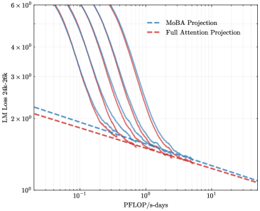
The image is a log-log line chart illustrating the relationship between computational resources (measured in PFLOP/s-days) and the loss of a 30-billion parameter language model evaluated on a 30,000-token context (LM Loss 30B-30K). It displays multiple empirical scaling curves alongside two theoretical projection lines, demonstrating how model performance improves with increased training compute.
### Components/Axes
* **Chart Type:** Log-Log Line Chart.
* **X-Axis:**
* **Label:** `PFLOP/s-days`
* **Scale:** Logarithmic (base 10).
* **Range & Major Ticks:** Spans from approximately `10^-1` (0.1) to `10^1` (10). Major tick marks are visible at `10^-1`, `10^0` (1), and `10^1`.
* **Y-Axis:**
* **Label:** `LM Loss 30B-30K`
* **Scale:** Logarithmic (base 10).
* **Range & Major Ticks:** Spans from `10^0` (1) to `6 × 10^0` (6). Major tick marks are visible at `10^0`, `2 × 10^0`, `3 × 10^0`, `4 × 10^0`, and `6 × 10^0`.
* **Legend:**
* **Position:** Top-right corner of the plot area.
* **Entries:**
1. `MoBA Projection` - Represented by a blue dashed line (`--`).
2. `Full Attention Projection` - Represented by a red dashed line (`--`).
* **Data Series:**
* There are approximately 7-8 solid lines in various colors (including shades of purple, blue, and gray). These represent empirical data from different model training runs or configurations. Their specific labels are not provided in the chart.
### Detailed Analysis
* **Empirical Data Curves (Solid Lines):**
* **Trend:** All solid lines exhibit a strong, consistent downward slope from left to right. This indicates a clear inverse relationship: as `PFLOP/s-days` (compute) increases, the `LM Loss` decreases.
* **Shape:** The curves are not perfectly straight on the log-log plot, showing a slight convex curvature. They start at higher loss values (between ~4 and 6) at low compute (~0.1 PFLOP/s-days) and converge toward lower loss values (approaching 1) at high compute (~10 PFLOP/s-days).
* **Convergence:** The curves are more spread out at the low-compute end (left side) and become tightly clustered, almost merging, at the high-compute end (right side).
* **Projection Lines (Dashed Lines):**
* **MoBA Projection (Blue Dashed):** A straight line on the log-log plot, indicating a power-law relationship. It starts at a loss of approximately `2.2` at `0.1` PFLOP/s-days and slopes downward to a loss of approximately `1.1` at `10` PFLOP/s-days.
* **Full Attention Projection (Red Dashed):** Also a straight line, positioned slightly below the MoBA projection. It starts at a loss of approximately `2.1` at `0.1` PFLOP/s-days and slopes downward to a loss of approximately `1.05` at `10` PFLOP/s-days.
* **Relationship to Data:** The empirical solid lines generally lie *above* both projection lines across most of the compute range, especially at lower compute values. They appear to asymptotically approach the projection lines as compute increases.
### Key Observations
1. **Power-Law Scaling:** The linear trend of the projection lines on a log-log scale confirms that language model loss is expected to follow a power-law scaling relationship with training compute.
2. **Diminishing Returns:** The convex shape of the empirical curves suggests diminishing returns; each doubling of compute yields a smaller absolute reduction in loss as the model scales.
3. **Projection vs. Reality:** The actual model performance (solid lines) is consistently worse (higher loss) than the theoretical projections (dashed lines) at equivalent compute levels, particularly in the lower-compute regime. The gap narrows significantly at higher compute.
4. **Convergence of Architectures:** The tight clustering of the solid lines at high compute suggests that different model configurations or architectures may converge to similar performance levels when provided with sufficient resources.
### Interpretation
This chart provides a technical visualization of **scaling laws** in large language model training. It demonstrates that increasing computational investment (PFLOP/s-days) reliably improves model performance (reduces loss), but with diminishing returns.
The key insight lies in the relationship between the empirical data and the projections. The "Full Attention" and "MoBA" (likely a model architecture variant) projections represent idealized, efficient scaling trajectories. The fact that real-world runs (solid lines) sit above these projections indicates **sub-optimal compute utilization** or **scaling inefficiencies** in practice, especially when resources are limited. The convergence of the solid lines toward the projections at the high-compute end suggests that these inefficiencies become less pronounced as models are trained to extreme scales, or that the models are approaching a fundamental performance limit defined by the architecture and data.
For a researcher or engineer, this chart is crucial for **forecasting training costs** and **setting performance expectations**. It answers the question: "How much more compute do I need to achieve a target loss reduction?" The gap between the solid and dashed lines also highlights an opportunity for optimization—improving training algorithms or model architectures to make real-world scaling track closer to the idealized projections.