## Chart/Diagram Type: Combined Density Plot and Bar Chart
### Overview
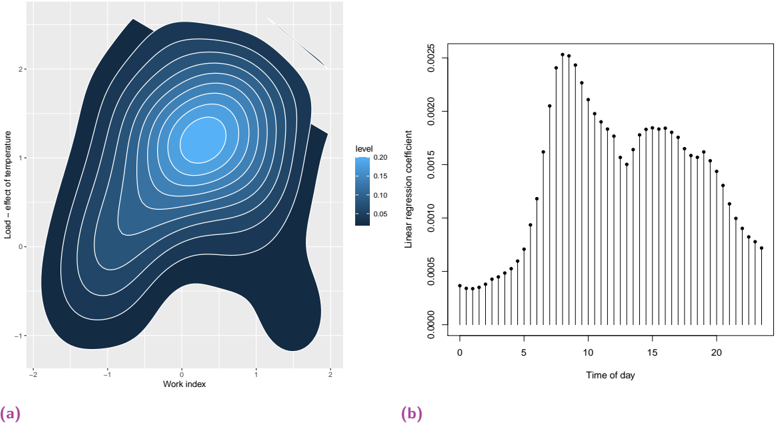
The image presents two charts side-by-side. Chart (a) is a density plot showing the relationship between "Work index" and "Load - effect of temperature". Chart (b) is a bar chart displaying the "Linear regression coefficient" over "Time of day".
### Components/Axes
**Chart (a): Density Plot**
* **X-axis:** "Work index", ranging from approximately -2 to 2.
* **Y-axis:** "Load - effect of temperature", ranging from approximately -1 to 2.
* **Density Levels:** Represented by color shading from dark blue to light blue, with a legend indicating the following levels:
* Dark Blue: 0.05
* Medium Blue: 0.10
* Light Blue: 0.15
* Very Light Blue: 0.20
**Chart (b): Bar Chart**
* **X-axis:** "Time of day", ranging from 0 to 24.
* **Y-axis:** "Linear regression coefficient", ranging from 0.0000 to 0.0025.
### Detailed Analysis
**Chart (a): Density Plot**
The density plot shows the concentration of data points in the "Work index" and "Load - effect of temperature" space. The highest density (lightest blue) is centered around a "Work index" of -0.5 to 0.5 and a "Load - effect of temperature" of approximately 1.0. There's a secondary, less dense region around a "Work index" of 1.0 to 2.0 and a "Load - effect of temperature" of -1.0 to 0.0.
**Chart (b): Bar Chart**
The bar chart shows the "Linear regression coefficient" at different times of the day. The coefficient starts at approximately 0.0004 at time 0, increases to a peak of approximately 0.0025 around time 9-10, and then gradually decreases to approximately 0.0010 by time 24. There is a slight plateau or secondary peak around time 16-18.
* Time 0: ~0.0004
* Time 6: ~0.0010
* Time 9: ~0.0025
* Time 12: ~0.0022
* Time 16: ~0.0019
* Time 18: ~0.0019
* Time 24: ~0.0010
### Key Observations
* The density plot indicates a strong positive correlation between "Work index" and "Load - effect of temperature" in the central region.
* The bar chart shows a clear diurnal pattern in the "Linear regression coefficient", with a peak in the morning and a gradual decline throughout the day.
### Interpretation
The density plot suggests that higher work indices are associated with a greater load effect of temperature, particularly in the central region of the data. The bar chart indicates that the linear regression coefficient, which could represent the impact of time of day on some outcome, is highest during the morning hours. This could be related to increased activity or demand during those hours. The secondary peak in the late afternoon might reflect another period of increased activity. The two charts, when considered together, could be illustrating how work patterns and temperature effects interact to influence a particular load or outcome.