TECHNICAL ASSET FINGERPRINT
2bb8b21e1acbd9fd643e3690
Click to view fullscreen
Press ESC or click to close
FOUND IN PAPERS
EXPERT: healer-alpha-free VERSION 1
RUNTIME: free/openrouter/healer-alpha
INTEL_VERIFIED
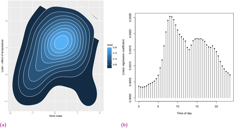
## [Chart/Diagram Type]: Dual-Panel Statistical Visualization
### Overview
The image displays two distinct statistical plots side-by-side, labeled (a) and (b) in purple text at the bottom-left of each respective panel. Panel (a) is a contour plot (or 2D kernel density estimate plot) showing the relationship between two variables. Panel (b) is a stem plot (or impulse plot) showing a time series of regression coefficients. The overall aesthetic is a standard scientific/statistical graphic with a white background and black axes.
### Components/Axes
**Panel (a) - Left:**
- **Type:** Contour Plot / 2D Density Plot.
- **X-axis:** Label: "Work index". Scale: Linear, ranging from approximately -2 to 2, with major ticks at -2, -1, 0, 1, 2.
- **Y-axis:** Label: "Load - effect of temperature". Scale: Linear, ranging from approximately -1 to 2, with major ticks at -1, 0, 1, 2.
- **Legend/Color Scale:** Located to the right of the plot. Title: "level". It is a vertical color bar with a gradient from dark blue (bottom) to light blue (top). The associated numerical values are: 0.05, 0.10, 0.15, 0.20. This indicates the density or probability level represented by the contour lines and filled regions.
- **Spatial Layout:** The plot area is square. The color legend is positioned in the center-right margin, outside the main axes.
**Panel (b) - Right:**
- **Type:** Stem Plot / Impulse Plot.
- **X-axis:** Label: "Time of day". Scale: Linear, ranging from 0 to just past 20, with major ticks at 0, 5, 10, 15, 20.
- **Y-axis:** Label: "Linear regression coefficient". Scale: Linear, ranging from 0.0000 to 0.0025, with major ticks at 0.0000, 0.0005, 0.0010, 0.0015, 0.0020, 0.0025.
- **Data Series:** A single series of data points represented by black dots, each connected to the x-axis by a thin vertical black line (the "stem").
- **Spatial Layout:** The plot area is rectangular, wider than it is tall. There is no separate legend, as there is only one data series.
### Detailed Analysis
**Panel (a) Analysis:**
- **Trend Verification:** The plot shows a single, continuous density distribution. The contour lines form concentric, irregular oval shapes, indicating a single peak (mode) in the data density. The trend is a concentration of data points around a central region, with density decreasing as you move away from that center.
- **Data Points & Values:**
- **Peak Density (Highest "level"):** The innermost, lightest blue contour corresponds to a "level" of approximately 0.20. This peak is centered roughly at coordinates **(Work index ≈ 0, Load ≈ 1)**.
- **Density Gradient:** Moving outward from the peak, the color darkens and the "level" value decreases. The contours represent levels of approximately 0.15, 0.10, and 0.05.
- **Spatial Spread:** The distribution is not perfectly symmetrical. It extends further along the positive "Load" axis (up to ~2) than the negative (down to ~-1). Along the "Work index" axis, it spans from about -1.5 to 1.5. The shape is somewhat skewed, with a broader spread in the lower-left quadrant (negative Work index, lower Load).
- **Component Isolation:** The main region is the contoured density field. The header contains no title. The footer contains the label "(a)".
**Panel (b) Analysis:**
- **Trend Verification:** The data series shows a clear, non-linear trend over time. It starts low, rises sharply to a peak, declines, exhibits a secondary smaller peak, and then gradually tails off.
- **Data Points & Values (Approximate):**
- **Initial Phase (Time 0-5):** Coefficients are low, starting near **0.0003** at Time 0 and rising slowly to about **0.0005** by Time 5.
- **Sharp Rise & Primary Peak (Time 5-9):** A steep increase occurs. The maximum value (global peak) is reached at approximately **Time = 8 or 9**, with a coefficient value of **~0.0025**.
- **Decline & Secondary Peak (Time 9-16):** After the peak, values decline steadily until around Time 13 (~0.0015). A secondary, smaller peak or plateau occurs between **Time 14 and 16**, with values around **0.0018**.
- **Final Decline (Time 16-23):** From the secondary peak, the coefficients decrease steadily, ending at approximately **0.0007** by the last visible data point around Time 23.
- **Component Isolation:** The main region is the plot area with the stem-and-dot series. The header contains no title. The footer contains the label "(b)".
### Key Observations
1. **Panel (a):** The data has a strong central tendency. The highest density of observations occurs where the "Work index" is near zero and the "Load - effect of temperature" is around 1. The relationship appears unimodal (one peak).
2. **Panel (b):** The "Linear regression coefficient" is highly dependent on the "Time of day." The effect is not constant; it is strongest in the morning (peaking around 8-9 AM if "Time of day" is in hours) and shows a notable secondary increase in the mid-afternoon.
3. **Contrast:** Panel (a) shows a static, joint distribution of two variables. Panel (b) shows how a specific statistical parameter (a regression coefficient) varies dynamically over a temporal dimension.
### Interpretation
This composite figure likely comes from an analytical study, possibly in fields like energy load forecasting, human factors engineering, or environmental physiology.
- **What the data suggests:** Panel (a) suggests that the "Load" (perhaps electrical load, or a physiological load metric) is most frequently observed at a moderate level (value ~1) when the "Work index" (a measure of task demand or activity) is average (value ~0). Extreme combinations of very high/low work and very high/low load are less common.
- **How elements relate:** Panel (b) provides a temporal context that the static distribution in (a) does not. It indicates that the relationship between variables (the "linear regression coefficient," which could quantify how Load changes with Work) is **not stable throughout the day**. The strength of this relationship peaks in the morning, suggesting that factors influencing Load are most sensitive or most strongly coupled to Work during that period. The secondary afternoon peak might correspond to a post-lunch activity resurgence or a circadian effect.
- **Notable anomalies/patterns:** The most significant pattern is the **diurnal rhythm** in panel (b). The coefficient doesn't just vary randomly; it follows a structured, bimodal daily pattern. This implies that any model using "Work index" to predict "Load" must account for the time of day to be accurate, as the predictive power of "Work index" changes dramatically. The outlier is the very sharp, narrow primary peak, indicating a specific, short window of maximum sensitivity.
- **Peircean investigative reading:** The icon (the contour plot) represents a **habitus**—the established, typical state of the system (the common pairing of Work and Load). The diagram (the stem plot) represents a **legisign**—a rule or law governing how a sign (the regression coefficient) behaves over time. Together, they show that the typical state (a) is governed by a time-dependent law (b). An investigator would conclude that to understand or predict the system, one must know both the typical operating range *and* the time-varying rules that connect its variables.
DECODING INTELLIGENCE...