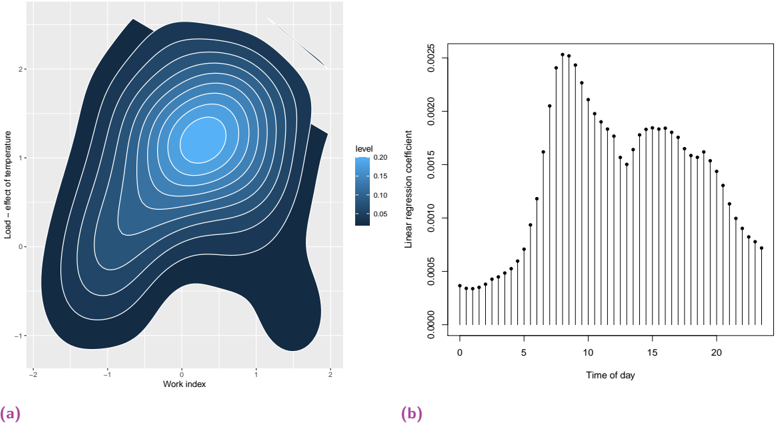
## Contour Plot: Load – Effect of Temperature vs. Work Index
### Overview
The image contains two subplots: (a) a contour plot and (b) a bar chart. Subplot (a) visualizes a two-dimensional relationship between "Work index" (x-axis) and "Load – effect of temperature" (y-axis), with contour lines indicating varying levels of a metric (likely "level" as per the legend). Subplot (b) displays a bar chart of "Linear regression coefficient" values across "Time of day."
### Components/Axes
#### Subplot (a): Contour Plot
- **X-axis**: "Work index" (ranges from -2 to 2, with grid lines at integer intervals).
- **Y-axis**: "Load – effect of temperature" (ranges from -1 to 2, with grid lines at integer intervals).
- **Color Scale**: A gradient from dark blue (0.05) to light blue (0.20), labeled "level" in the legend.
- **Legend**: Positioned on the right side of the plot, with a vertical color bar.
- **Contour Lines**: Concentric, with the innermost circle (lightest blue) centered at approximately (0, 1).
#### Subplot (b): Bar Chart
- **X-axis**: "Time of day" (ranges from 0 to 20, with integer intervals).
- **Y-axis**: "Linear regression coefficient" (ranges from 0.0000 to 0.0025, with increments of 0.0005).
- **Bars**: Black vertical bars with error bars (vertical lines with caps).
- **Legend**: Positioned on the right side of the plot, though no explicit labels are visible in the image.
### Detailed Analysis
#### Subplot (a): Contour Plot
- The contour lines form a roughly circular pattern, with the highest "level" (0.20) at the center (0, 1).
- The "level" decreases radially outward, with the darkest blue (0.05) dominating the outer regions.
- The plot is asymmetrical, with a bulge on the right side (x > 1) and a narrower region on the left (x < -1).
#### Subplot (b): Bar Chart
- The "Linear regression coefficient" peaks at **time 10** (value ~0.0022), then declines sharply.
- A secondary peak occurs around **time 15** (value ~0.0018).
- The coefficient is lowest at **time 0** (~0.0002) and **time 20** (~0.0003).
- Error bars are present for all bars, with lengths varying slightly but remaining consistent in scale.
### Key Observations
1. **Contour Plot**:
- The relationship between "Work index" and "Load – effect of temperature" is non-linear, with a clear maximum at (0, 1).
- The asymmetry suggests a directional dependency (e.g., higher "Work index" values may correlate with specific "Load" effects).
2. **Bar Chart**:
- The "Linear regression coefficient" exhibits a bimodal pattern, with peaks at **time 10** and **time 15**.
- The coefficient decreases after time 15, suggesting a temporal decay or cyclical behavior.
### Interpretation
- **Contour Plot**: The data implies a localized "hotspot" of maximum "level" at (0, 1), possibly indicating an optimal or critical condition for the system being modeled. The asymmetry may reflect external constraints or non-uniform interactions.
- **Bar Chart**: The bimodal pattern suggests two distinct time intervals (around 10 and 15) where the "Linear regression coefficient" is most significant. This could indicate periodic or event-driven influences on the modeled relationship.
- **Cross-Plot Relationships**: While the two subplots are independent, the contour plot’s focus on spatial relationships (Work index vs. Load) contrasts with the bar chart’s temporal focus (Time of day vs. coefficient). Together, they may represent complementary aspects of a larger system (e.g., spatial-temporal dynamics).
## Bar Chart: Linear Regression Coefficient vs. Time of Day
### Overview
Subplot (b) presents a bar chart of "Linear regression coefficient" values across "Time of day." The y-axis ranges from 0.0000 to 0.0025, with black bars and error bars.
### Components/Axes
- **X-axis**: "Time of day" (0–20, integer intervals).
- **Y-axis**: "Linear regression coefficient" (0.0000–0.0025, increments of 0.0005).
- **Bars**: Black vertical bars with error bars (vertical lines with caps).
- **Legend**: Positioned on the right, though no explicit labels are visible.
### Detailed Analysis
- **Peak at Time 10**: The highest coefficient (~0.0022) occurs at time 10, with a sharp decline afterward.
- **Secondary Peak at Time 15**: A smaller peak (~0.0018) at time 15, followed by a gradual decline.
- **Low Values at Extremes**: The coefficient is lowest at time 0 (~0.0002) and time 20 (~0.0003).
### Key Observations
- The bimodal pattern suggests two distinct time intervals (10 and 15) with heightened significance.
- The error bars are consistent in scale, indicating uniform measurement precision across time points.
### Interpretation
- The peaks at times 10 and 15 may correspond to specific events, operational cycles, or environmental conditions that amplify the "Linear regression coefficient."
- The decline after time 15 could indicate a damping effect or a shift in the underlying system’s behavior.
- The low values at the start and end of the time range may reflect baseline or transitional states.
## Final Notes
- **Legend Consistency**: The contour plot’s legend (color scale) matches the gradient of the contour lines. The bar chart’s legend is present but lacks explicit labels, so its purpose remains ambiguous.
- **Spatial Grounding**: Subplot (a) is in the top-left, while subplot (b) occupies the bottom-right. Both share a grid background, suggesting a unified analytical framework.
- **Uncertainties**: Approximate values (e.g., peak coefficients) are inferred from visual inspection, as exact numerical data is not provided in the image.