## Heatmap with Contour Lines: Accuracy Analysis for "Countries" and "Tip Sheets"
### Overview
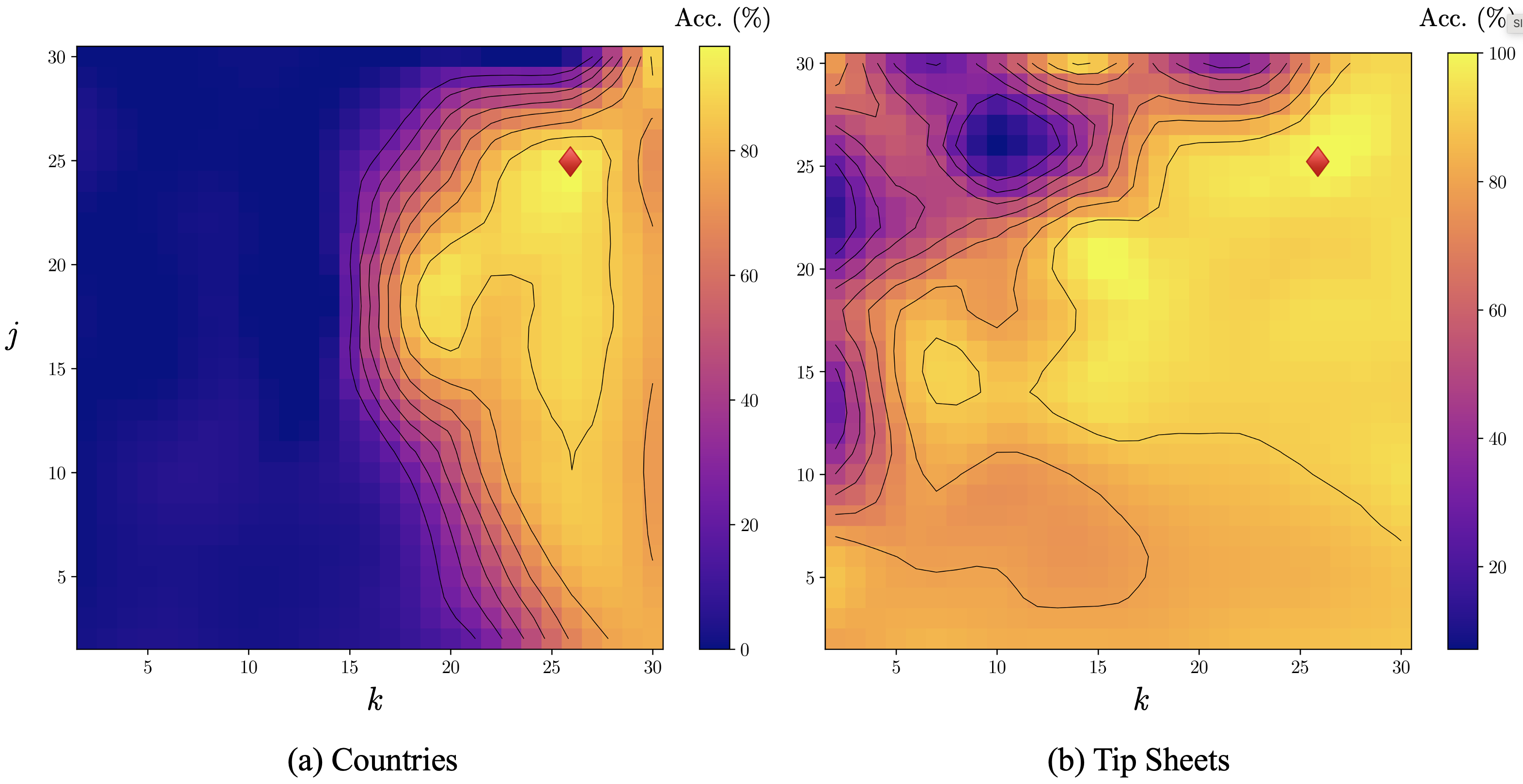
The image displays two side-by-side heatmaps, each overlaid with contour lines, visualizing a metric labeled "Acc. (%)" (Accuracy percentage) as a function of two parameters, `j` and `k`. The left plot is labeled "(a) Countries" and the right plot is labeled "(b) Tip Sheets". Both plots share identical axes and color scales. A red diamond marker is present in each plot, indicating a specific point of interest, likely a peak or optimal configuration.
### Components/Axes
* **Plot Type:** 2D Heatmap with overlaid contour lines.
* **X-Axis (Both Plots):** Labeled `k`. The axis has major tick marks at intervals of 5, ranging from 0 to 30.
* **Y-Axis (Both Plots):** Labeled `j`. The axis has major tick marks at intervals of 5, ranging from 0 to 30.
* **Color Scale (Both Plots):** A vertical color bar positioned to the right of each heatmap.
* **Title:** `Acc. (%)`
* **Range:** 0 to 100.
* **Gradient:** Dark blue/purple (0%) → Purple → Orange → Yellow (100%).
* **Tick Marks:** Labeled at 0, 20, 40, 60, 80, and 100.
* **Contour Lines:** Black lines overlaid on the heatmaps, connecting points of equal accuracy value. The density of lines indicates the steepness of the gradient.
* **Marker:** A red diamond (♦) is present in each plot.
* In plot (a), it is located at approximately `k=25`, `j=25`.
* In plot (b), it is located at approximately `k=26`, `j=25`.
* **Plot Labels:**
* Left: `(a) Countries`
* Right: `(b) Tip Sheets`
### Detailed Analysis
**Plot (a) Countries:**
* **Trend Verification:** The heatmap shows a clear, smooth gradient. Accuracy is very low (dark blue) in the bottom-left region (low `j`, low `k`). It increases steadily as both `j` and `k` increase, forming a diagonal band of rising accuracy from the bottom-left to the top-right. The highest accuracy (bright yellow) is concentrated in the top-right quadrant.
* **Data Points & Distribution:**
* **Low Accuracy Region (0-20%):** Dominates the area where `k` < ~15 and `j` < ~20. The darkest blue (0-10%) is in the extreme bottom-left corner.
* **Medium Accuracy Region (40-60%):** Forms a transition band running diagonally. Contour lines are densely packed here, indicating a rapid change in accuracy.
* **High Accuracy Region (80-100%):** Occupies the top-right area. The peak, marked by the red diamond at `(k≈25, j≈25)`, is within the brightest yellow zone, suggesting accuracy near or at 100%.
* **Contour Pattern:** The contour lines are relatively smooth and run roughly parallel to the diagonal gradient, confirming the consistent trend.
**Plot (b) Tip Sheets:**
* **Trend Verification:** The pattern is more complex and less uniform than in plot (a). While there is a general trend of higher accuracy in the top-right, there are significant regions of lower accuracy interspersed, particularly in the top-left and center.
* **Data Points & Distribution:**
* **High Accuracy Region (80-100%):** A large, dominant yellow area covers most of the right half and bottom of the plot (`k` > ~15). The red diamond at `(k≈26, j≈25)` sits within this high-accuracy zone.
* **Low Accuracy "Valleys":** There are distinct pockets of lower accuracy:
1. A deep blue/purple region (20-40%) in the top-left corner (`k` < 10, `j` > 20).
2. A smaller, isolated purple region (~40%) near the center-left (`k≈7, j≈15`).
* **Medium Accuracy Region (40-60%):** Forms irregular bands and islands, particularly surrounding the low-accuracy valleys and in the top-center.
* **Contour Pattern:** The contour lines are more convoluted and irregular, especially around the low-accuracy valleys, indicating a more volatile relationship between `j`, `k`, and accuracy for the "Tip Sheets" dataset.
### Key Observations
1. **Fundamental Difference in Landscape:** The "Countries" plot (a) shows a smooth, predictable performance landscape where increasing both parameters reliably improves accuracy. The "Tip Sheets" plot (b) reveals a more rugged landscape with local minima (performance valleys), suggesting that parameter tuning is more critical and non-intuitive for this task.
2. **Optimal Point Similarity:** Despite the different landscapes, the red diamond markers indicating optimal (or chosen) parameters are located in very similar positions (`j≈25`, `k≈25-26`) for both tasks, within high-accuracy zones.
3. **Parameter Sensitivity:** In plot (a), accuracy is highly sensitive to both `j` and `k` simultaneously (diagonal gradient). In plot (b), for a large portion of the parameter space (right side), accuracy remains high even as `j` varies, suggesting less sensitivity in that region.
4. **Presence of Local Minima:** Plot (b) contains clear local minima (the blue valleys), which could trap optimization algorithms, whereas plot (a) appears to have a single global maximum region.
### Interpretation
This visualization compares the performance sensitivity of a model or algorithm on two different tasks ("Countries" and "Tip Sheets") across a two-dimensional parameter space (`j`, `k`).
* **What the data suggests:** The "Countries" task appears to be "easier" or more straightforward for the model, as its performance improves monotonically with increased model complexity or capacity (assuming `j` and `k` represent such parameters). The "Tip Sheets" task is more complex or has a different structure, leading to a non-monotonic performance landscape where certain parameter combinations (`j` high, `k` low) lead to poor results, possibly due to overfitting, underfitting, or an unfavorable inductive bias.
* **How elements relate:** The contour lines translate the color gradient into precise topographic information. The red diamonds likely represent the parameters selected by an automated search (like grid search) or chosen for a final model, showing that the selection process successfully found high-performing regions in both landscapes.
* **Notable implications:** The stark contrast between the two plots underscores the importance of task-specific hyperparameter tuning. A parameter set that works optimally for one task (`Countries`) may be near a dangerous performance valley for another (`Tip Sheets`). The existence of local minima in (b) warns that simple hill-climbing optimization strategies might fail to find the best solution for the "Tip Sheets" task. The analysis implies that the underlying data distributions or the model's interaction with them differ significantly between the two tasks.