## Heatmap: Accuracy vs. k and j
### Overview
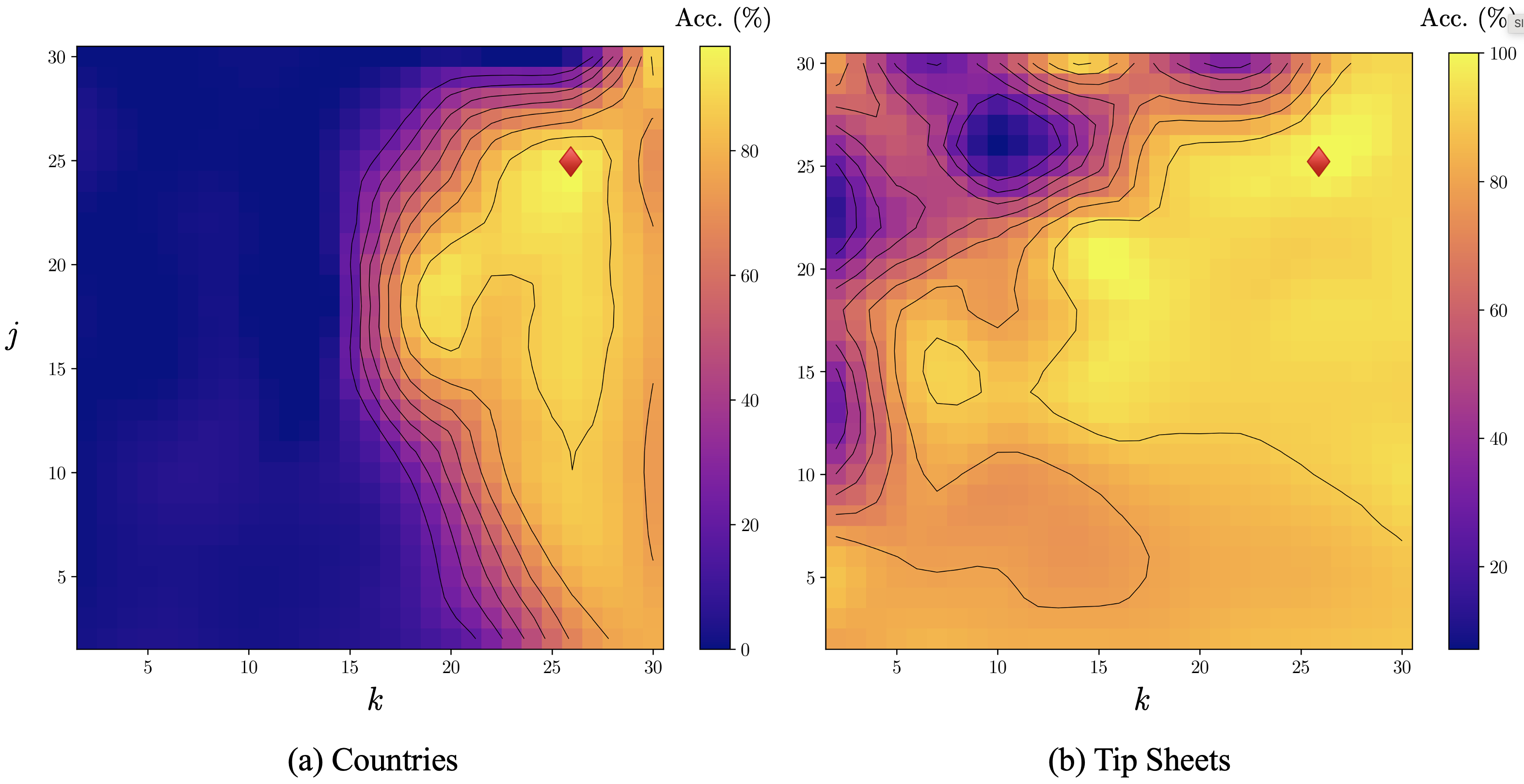
The image contains two heatmaps, each representing accuracy (Acc.) as a function of two variables, k and j. The heatmaps use a color gradient from dark blue (low accuracy) to bright yellow (high accuracy). Black contour lines are overlaid on the heatmaps, indicating regions of similar accuracy. A red diamond is present on each heatmap, marking a specific point. The left heatmap is labeled "(a) Countries" and the right heatmap is labeled "(b) Tip Sheets".
### Components/Axes
* **X-axis (k):** Ranges from approximately 1 to 30 in both heatmaps.
* **Y-axis (j):** Ranges from approximately 1 to 30 in both heatmaps.
* **Color Scale (Accuracy):**
* Left heatmap: Ranges from 0% (dark blue) to 80% (yellow).
* Right heatmap: Ranges from 0% (dark blue) to 100% (yellow).
* **Contour Lines:** Black lines indicating levels of accuracy.
* **Red Diamond:** Marks a specific (k, j) coordinate on each heatmap.
### Detailed Analysis
#### (a) Countries Heatmap
* **General Trend:** Accuracy is generally low (dark blue) for smaller values of k (approximately k < 15). Accuracy increases significantly as k increases beyond 15 and j increases beyond 10, reaching a peak in the upper-right region.
* **Specific Values:**
* At k=5, j=5, accuracy is approximately 0-20%.
* At k=25, j=25, accuracy is approximately 80%.
* **Red Diamond Position:** Located at approximately k=27, j=25. The accuracy at this point is approximately 80%.
* **Contour Lines:** Concentrated in the region where accuracy transitions from low to high, indicating a steep gradient.
#### (b) Tip Sheets Heatmap
* **General Trend:** The accuracy varies more across the heatmap compared to the "Countries" heatmap. There are regions of both high and low accuracy scattered throughout. A region of low accuracy (dark blue) is present in the upper-left corner.
* **Specific Values:**
* At k=5, j=5, accuracy is approximately 40-60%.
* At k=25, j=25, accuracy is approximately 80-100%.
* **Red Diamond Position:** Located at approximately k=27, j=25. The accuracy at this point is approximately 80-100%.
* **Contour Lines:** More dispersed compared to the "Countries" heatmap, reflecting the greater variability in accuracy.
### Key Observations
* The "Countries" heatmap shows a more consistent trend of increasing accuracy with increasing k and j, while the "Tip Sheets" heatmap exhibits more localized variations.
* The red diamond marks a point of high accuracy in both heatmaps, but the accuracy is higher in the "Tip Sheets" heatmap (80-100%) compared to the "Countries" heatmap (80%).
* The contour lines highlight the regions where accuracy changes most rapidly.
### Interpretation
The heatmaps visualize the accuracy of a model or system under different conditions, represented by the variables k and j. The "Countries" heatmap suggests that higher values of k and j generally lead to better accuracy in that context. The "Tip Sheets" heatmap indicates a more complex relationship, where accuracy is not solely determined by k and j, and other factors may be at play. The red diamond likely represents a specific configuration or parameter setting, and its position indicates that this setting results in high accuracy for both "Countries" and "Tip Sheets," although the accuracy is slightly better for "Tip Sheets." The contour lines help to identify the regions where fine-tuning of k and j would have the most significant impact on accuracy.