\n
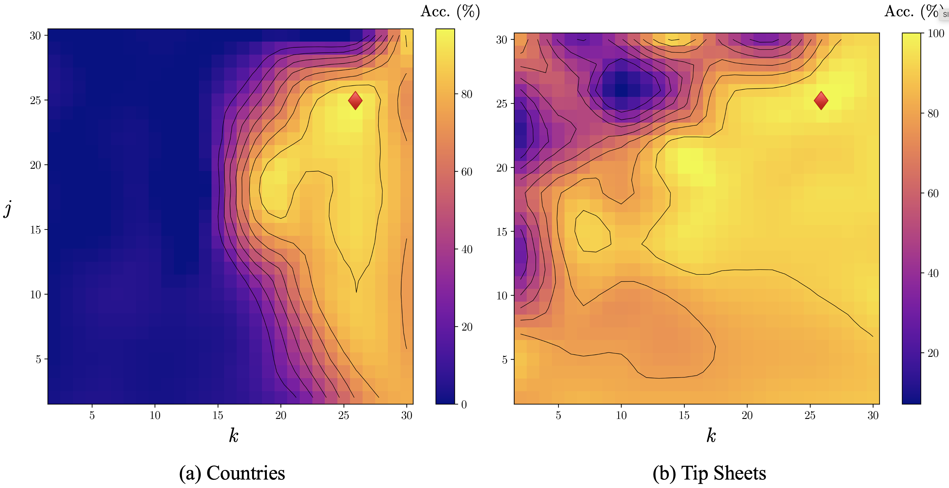
## Heatmaps: Accuracy vs. Parameters k and j
### Overview
The image presents two heatmaps, labeled (a) "Countries" and (b) "Tip Sheets". Both heatmaps visualize accuracy (Acc. (%)) as a function of two parameters, 'k' and 'j'. The color gradient represents the accuracy percentage, ranging from dark blue (low accuracy) to bright yellow/white (high accuracy). Each heatmap also contains a single diamond-shaped marker, presumably indicating a specific parameter configuration.
### Components/Axes
Both heatmaps share the following components:
* **X-axis:** Labeled 'k', ranging from approximately 0 to 32.
* **Y-axis:** Labeled 'j', ranging from approximately 0 to 32.
* **Color Scale:** A vertical color bar on the right side of each heatmap, representing accuracy in percentage (Acc. (%)). The scale ranges from 0 to 100%.
* **Diamond Marker:** A single diamond-shaped marker is present in each heatmap.
Heatmap (a) "Countries" is positioned on the left, while heatmap (b) "Tip Sheets" is on the right.
### Detailed Analysis or Content Details
**Heatmap (a) - Countries:**
* **Trend:** The accuracy generally increases as 'k' increases, peaking around k=28-30. Accuracy is low for small values of 'j' (below 10) and increases with 'j' until around j=20, then plateaus or slightly decreases.
* **Diamond Marker:** Located at approximately k=28, j=26. The color of the diamond corresponds to an accuracy of approximately 90-95%.
* **Data Points (approximate):**
* k=5, j=5: Accuracy ~ 10% (dark blue)
* k=15, j=10: Accuracy ~ 30% (purple)
* k=20, j=15: Accuracy ~ 50% (yellow-orange)
* k=28, j=20: Accuracy ~ 80% (light yellow)
* k=30, j=30: Accuracy ~ 85% (light yellow)
**Heatmap (b) - Tip Sheets:**
* **Trend:** The accuracy is highest in a localized region around k=10-15 and j=20-25. There's a distinct "peak" of high accuracy in this area. Accuracy decreases significantly as 'k' or 'j' move away from this peak.
* **Diamond Marker:** Located at approximately k=12, j=24. The color of the diamond corresponds to an accuracy of approximately 95-100%.
* **Data Points (approximate):**
* k=5, j=5: Accuracy ~ 20% (blue)
* k=10, j=10: Accuracy ~ 40% (purple)
* k=15, j=20: Accuracy ~ 90% (light yellow)
* k=20, j=25: Accuracy ~ 70% (yellow-orange)
* k=30, j=30: Accuracy ~ 30% (purple)
### Key Observations
* The "Tip Sheets" heatmap shows a much more localized peak of high accuracy compared to the "Countries" heatmap, which has a broader region of relatively high accuracy.
* The diamond markers in both heatmaps indicate parameter configurations that yield high accuracy, but the optimal parameter ranges differ significantly between the two datasets.
* The accuracy in the "Countries" heatmap appears to be more consistently increasing with 'k' than in the "Tip Sheets" heatmap.
### Interpretation
These heatmaps likely represent the performance of a model or algorithm on two different datasets: "Countries" and "Tip Sheets". The parameters 'k' and 'j' likely control some aspect of the model's configuration or training process.
The differences in the heatmap shapes suggest that the optimal parameter settings for achieving high accuracy are different for the two datasets. The "Countries" dataset seems to benefit from higher values of 'k', while the "Tip Sheets" dataset has a more specific optimal region.
The diamond markers highlight the best-performing parameter configurations found for each dataset. The fact that these configurations are different suggests that the underlying characteristics of the "Countries" and "Tip Sheets" datasets are different, requiring different model settings to achieve optimal performance.
The localized peak in the "Tip Sheets" heatmap could indicate a more sensitive relationship between the parameters and accuracy for that dataset. Small changes in 'k' or 'j' away from the optimal region can lead to a significant drop in accuracy.