## Heatmap: Accuracy Analysis Across Countries and Tip Sheets
### Overview
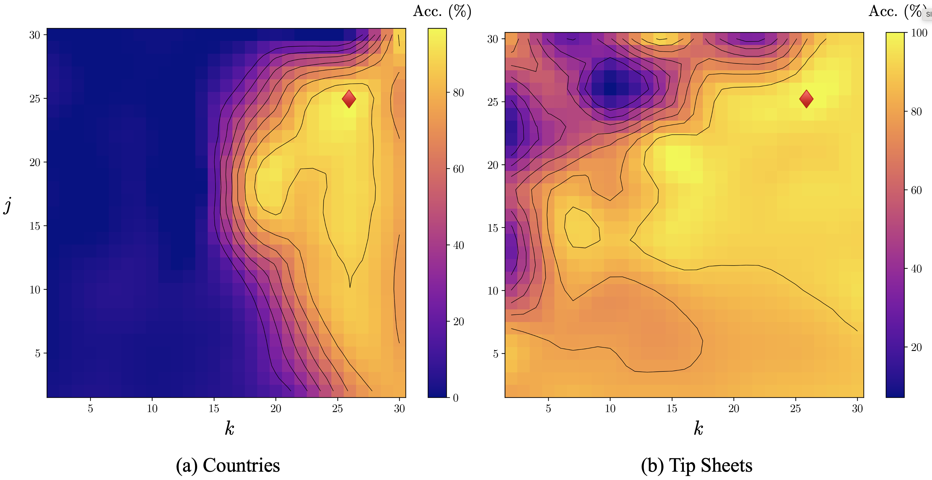
The image presents two side-by-side heatmaps comparing accuracy percentages (Acc. (%)) across two variables: **k** (x-axis) and **j** (y-axis). Each panel represents a different context: **(a) Countries** and **(b) Tip Sheets**. Both heatmaps use a color gradient from dark purple (0%) to yellow (100%) to indicate accuracy levels, with contour lines marking thresholds. A red diamond highlights a specific data point in each panel.
---
### Components/Axes
1. **Axes**:
- **x-axis (k)**: Ranges from 5 to 30 in both panels.
- **y-axis (j)**: Ranges from 5 to 30 in both panels.
- **Color Scale**: Accuracy (%) from 0% (dark purple) to 100% (yellow), with intermediate thresholds (20%, 40%, 60%, 80%).
2. **Legends**:
- Located on the right of each panel.
- Gradient bar labeled "Acc. (%)" with numerical thresholds.
3. **Annotations**:
- Red diamond markers in both panels:
- **(a) Countries**: Positioned at **k=25, j=25**.
- **(b) Tip Sheets**: Positioned at **k=25, j=20**.
---
### Detailed Analysis
#### **(a) Countries Panel**
- **Color Distribution**:
- Dominated by dark purple (low accuracy) in the bottom-left quadrant (k=5–15, j=5–15).
- Gradual transition to yellow (high accuracy) in the top-right quadrant (k=20–30, j=20–30).
- Contour lines indicate sharp transitions in accuracy near the red diamond (k=25, j=25).
- **Red Diamond**:
- Located at **k=25, j=25**, where accuracy reaches ~80% (yellow region).
- Surrounded by contour lines suggesting a local peak in accuracy.
#### **(b) Tip Sheets Panel**
- **Color Distribution**:
- Mixed gradients: Dark purple (low accuracy) in the top-left (k=5–15, j=25–30) and bottom-right (k=20–30, j=5–15).
- Yellow (high accuracy) dominates the central region (k=10–25, j=10–25).
- Contour lines show irregular boundaries, indicating variable accuracy.
- **Red Diamond**:
- Located at **k=25, j=20**, where accuracy is ~60% (orange region).
- Positioned near a contour line threshold (~60%), suggesting moderate accuracy.
---
### Key Observations
1. **Accuracy Peaks**:
- **(a) Countries**: Highest accuracy (~80%) at **k=25, j=25**.
- **(b) Tip Sheets**: Highest accuracy (~80%) in the central region, but the red diamond (k=25, j=20) shows only ~60% accuracy.
2. **Regional Variability**:
- **(a) Countries**: Clear gradient from low to high accuracy.
- **(b) Tip Sheets**: Fragmented accuracy patterns, with no single dominant peak.
3. **Red Diamond Placement**:
- In **(a)**, the diamond aligns with a high-accuracy zone.
- In **(b)**, the diamond is in a moderate-accuracy zone, despite the central region having higher accuracy.
---
### Interpretation
The data suggests that **optimal combinations of k and j** differ between countries and tip sheets:
- For **countries**, the red diamond at **k=25, j=25** represents a high-accuracy configuration, likely due to systematic factors (e.g., resource allocation, policy alignment).
- For **tip sheets**, the red diamond at **k=25, j=20** indicates a suboptimal configuration, as the central region (k=10–25, j=10–25) shows higher accuracy. This could reflect contextual mismatches (e.g., tip sheets being less adaptable to variable conditions).
The contour lines highlight **non-linear relationships** between k and j, emphasizing that accuracy is not uniformly distributed. The stark contrast between the two panels underscores the importance of context-specific optimization.