# Technical Document Extraction: Probability Distribution Bar Chart
## 1. Image Classification and Overview
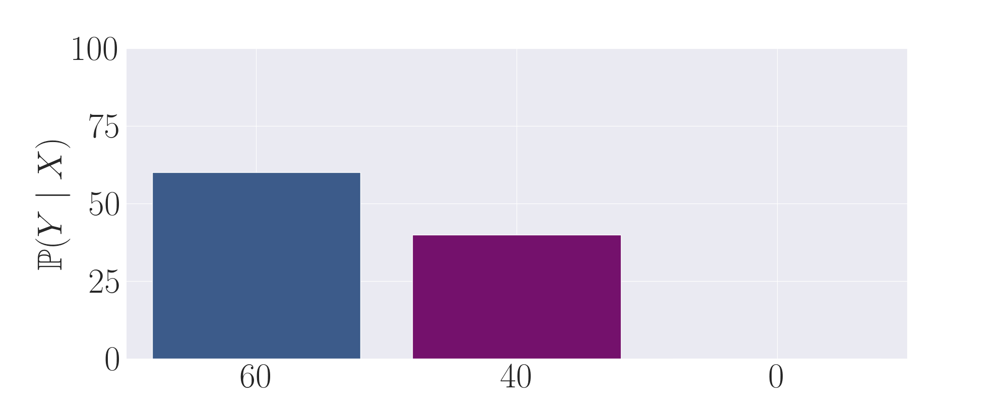
This image is a **bar chart** representing a discrete probability distribution. It illustrates the conditional probability of a variable $Y$ given $X$, denoted as $\mathbb{P}(Y \mid X)$. The chart features three distinct categories on the x-axis with corresponding vertical bars.
## 2. Component Isolation
### Header / Title
* **Content:** None present.
### Main Chart Area (Data Visualization)
* **Background:** Light grey with a white grid. Horizontal grid lines are aligned with the y-axis major ticks. Vertical grid lines are centered behind each x-axis label.
* **Y-Axis (Vertical):**
* **Label:** $\mathbb{P}(Y \mid X)$ (Rendered in LaTeX-style serif font).
* **Scale:** Linear, ranging from 0 to 100.
* **Markers (Ticks):** 0, 25, 50, 75, 100.
* **X-Axis (Horizontal):**
* **Label:** None explicitly titled, but contains three categorical labels.
* **Categories:** "60", "40", and "0".
* **Data Series:** Three bars of different colors and heights.
### Footer / Legend
* **Content:** None present. The values are indicated by the x-axis labels and the height relative to the y-axis.
---
## 3. Data Extraction and Table Reconstruction
The following table reconstructs the data presented in the chart. Values are estimated based on their alignment with the y-axis grid lines.
| Category (X-axis Label) | Bar Color | Estimated Value ($\mathbb{P}(Y \mid X)$) | Visual Trend Description |
| :--- | :--- | :--- | :--- |
| **60** | Dark Blue / Slate | ~60 | The tallest bar; its top sits exactly on the level of the "60" mark (interpolated between 50 and 75). |
| **40** | Purple / Magenta | ~40 | The middle bar; its top sits slightly below the 50 grid line. |
| **0** | N/A | 0 | No bar is visible; the value is at the baseline. |
---
## 4. Detailed Technical Analysis
### Trend Verification
The chart shows a **decreasing trend** from left to right based on the labels provided:
1. The first category labeled **"60"** has a probability value of approximately **60%**.
2. The second category labeled **"40"** has a probability value of approximately **40%**.
3. The third category labeled **"0"** has a probability value of **0%**.
### Mathematical Observation
The sum of the values represented by the bars ($60 + 40 + 0$) equals **100**. This confirms that the y-axis represents percentages and the chart depicts a complete probability distribution where the total probability sums to 1 (or 100%).
### Spatial Grounding
* **Y-Axis Label:** Located at the far left, rotated 90 degrees counter-clockwise.
* **Y-Axis Ticks:** Located to the left of the vertical axis line.
* **X-Axis Labels:** Centered directly beneath their respective data positions.
* **Grid:** The horizontal grid lines occur at intervals of 25 units.
## 5. Language Declaration
The text in this image is entirely in **English** (using standard Arabic numerals and mathematical notation $\mathbb{P}(Y \mid X)$).